Wood Cabinets at
Particleboard Prices

CA Lic.# 1048615
Before and After $10,000 to $15,000
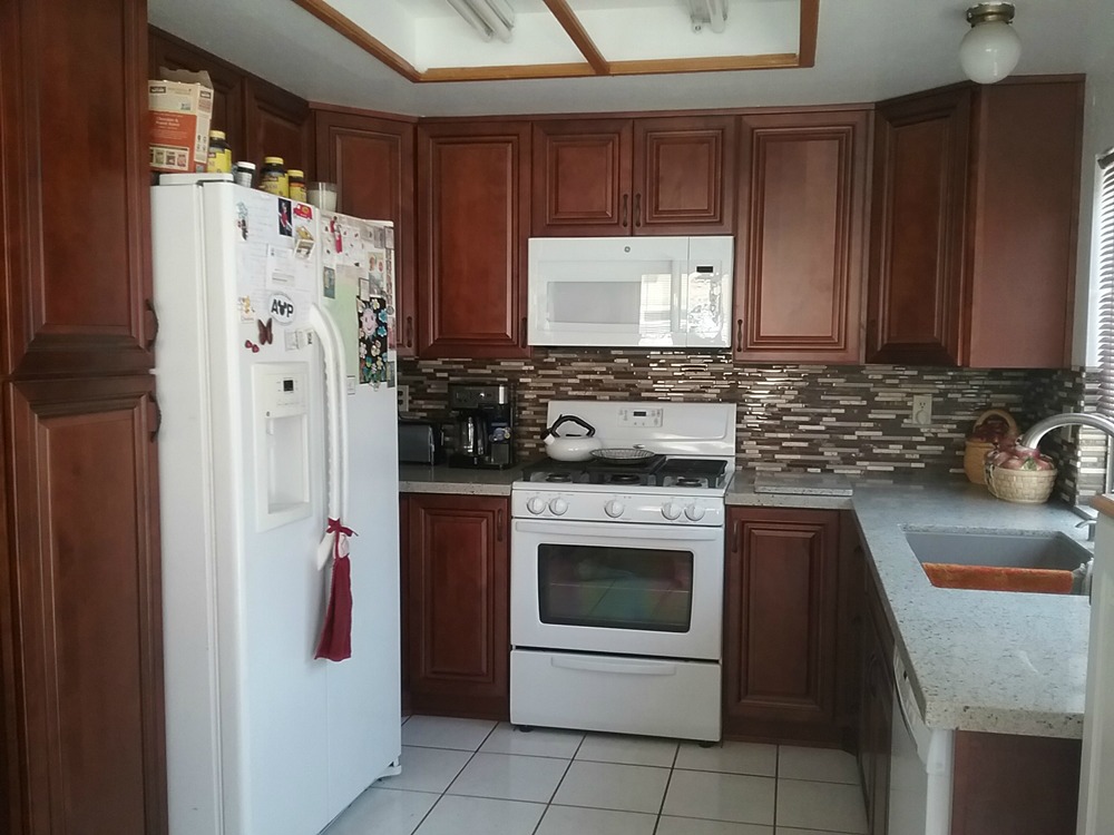
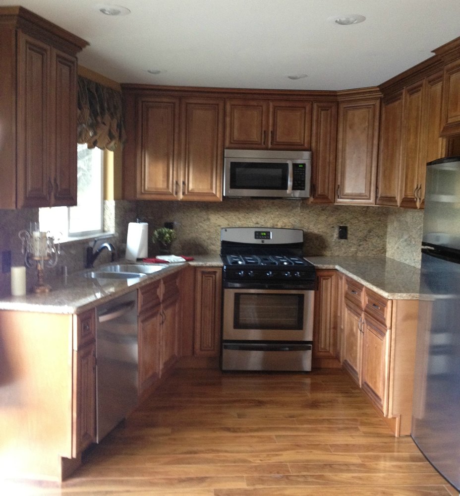
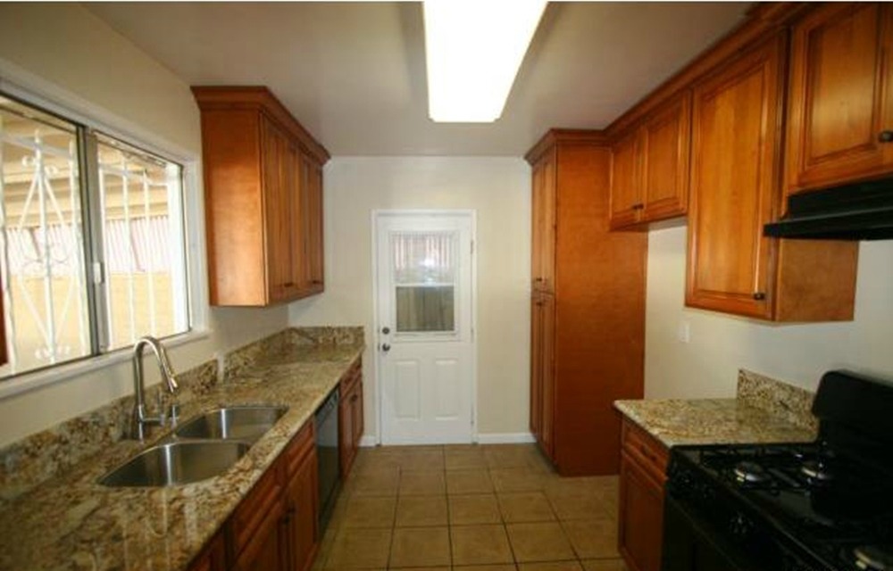
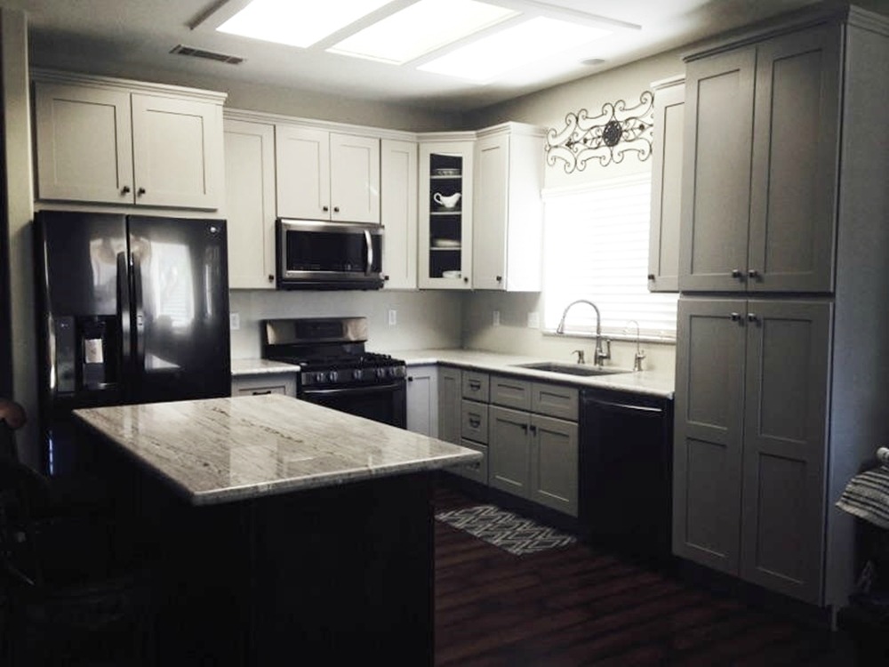
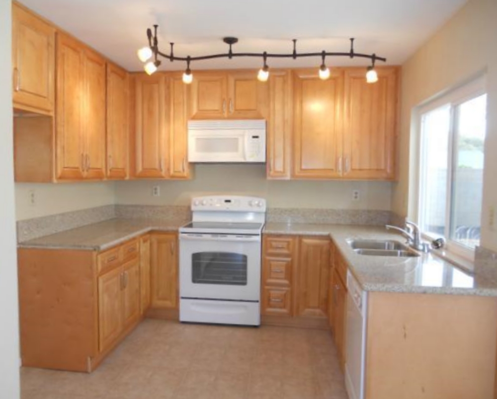
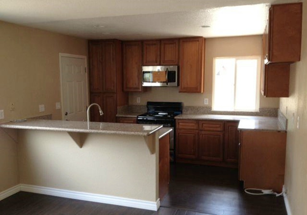
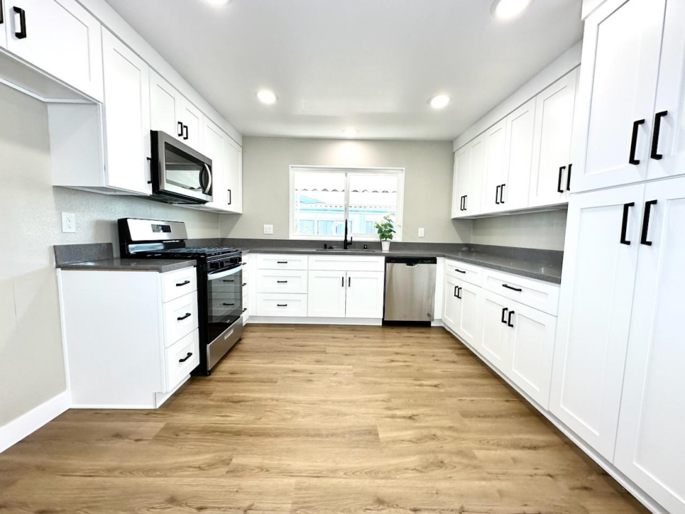
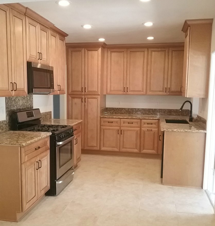
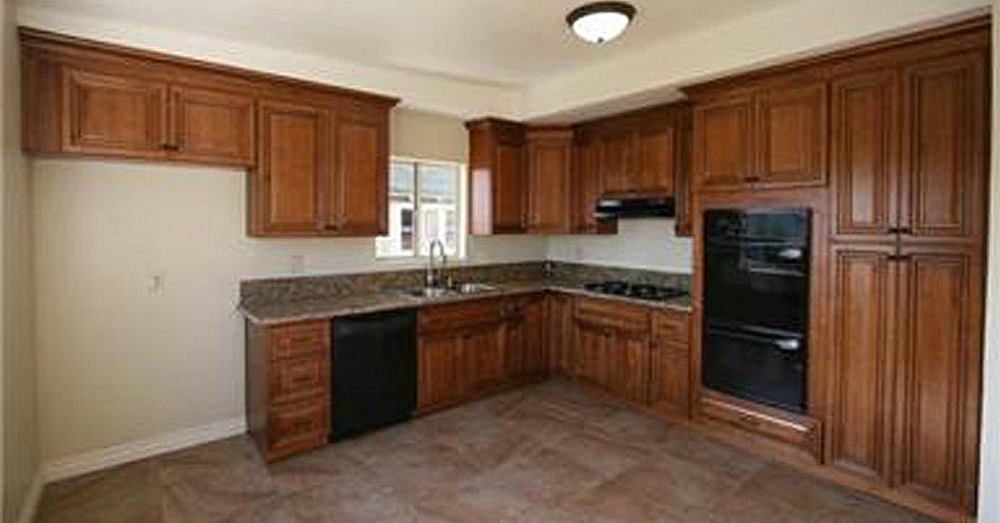
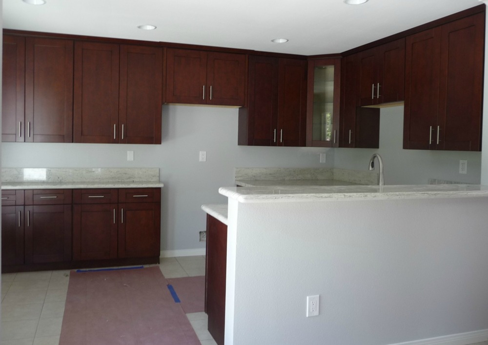
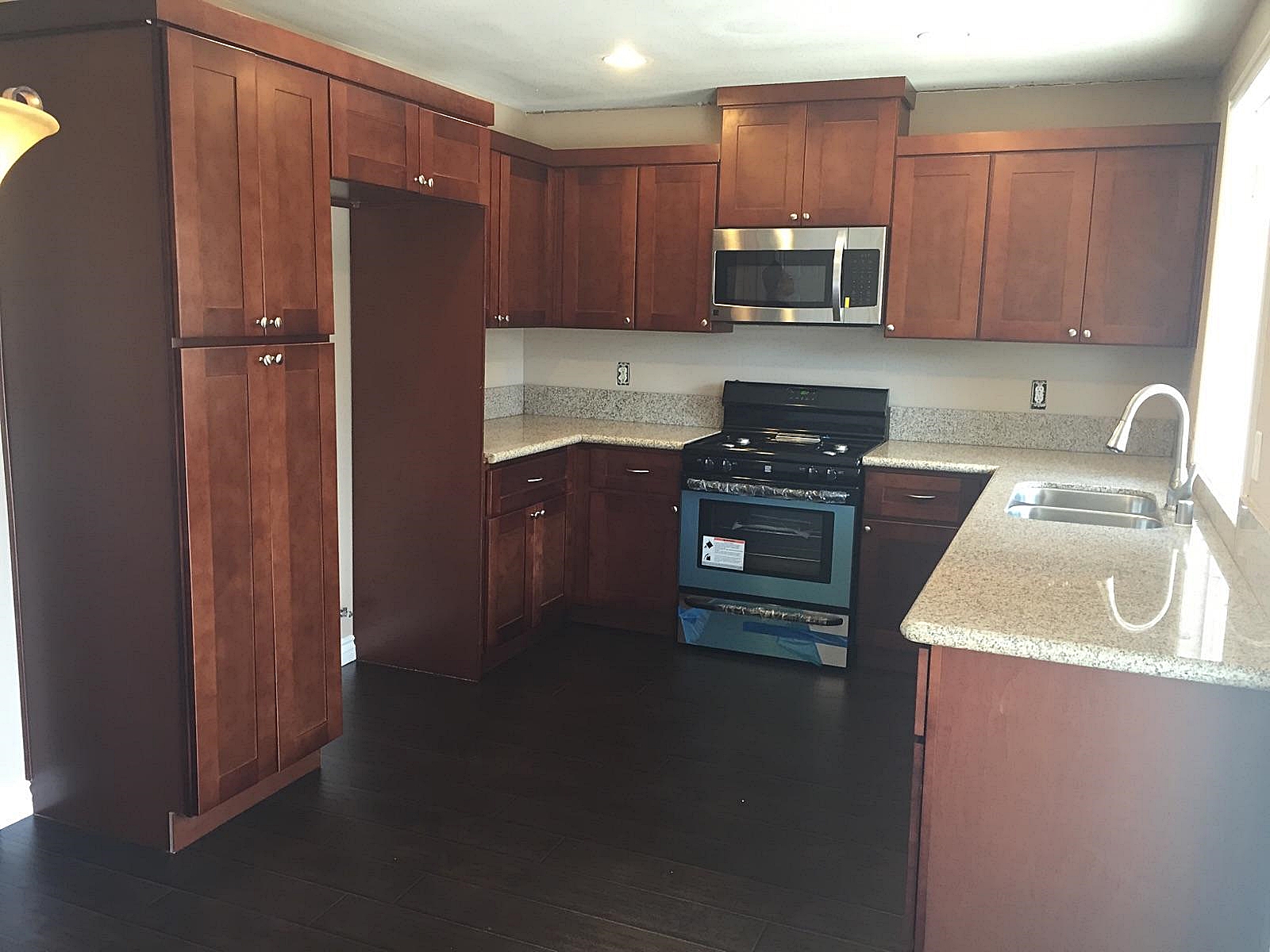
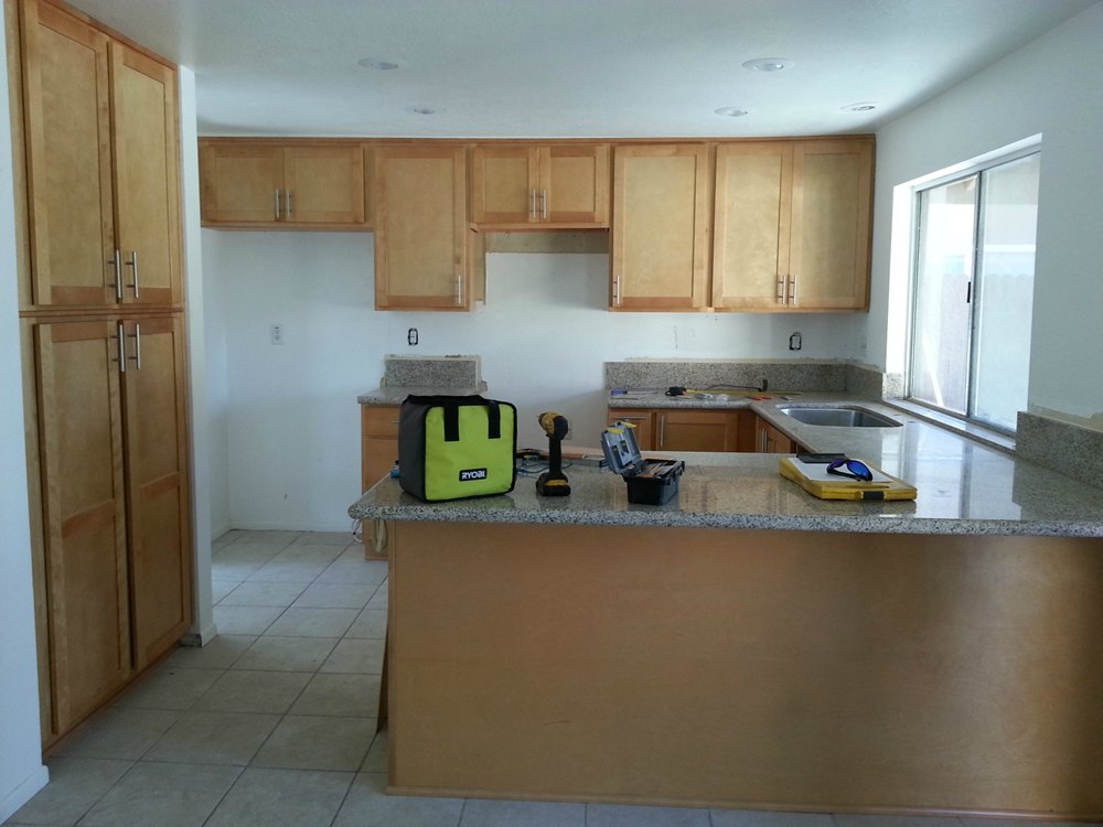
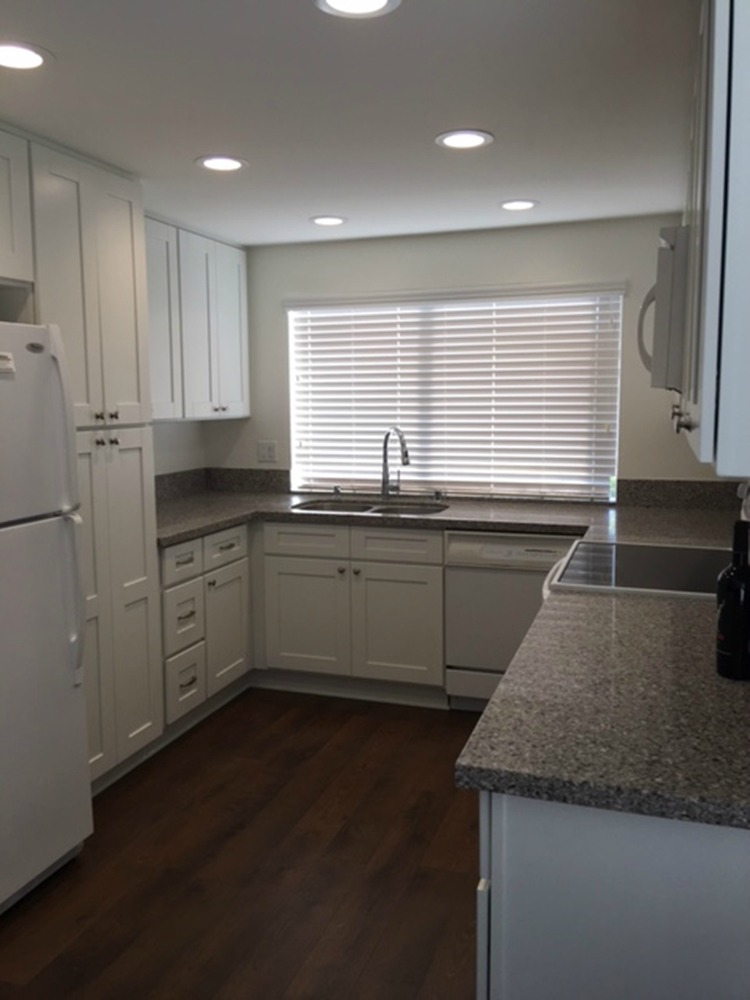
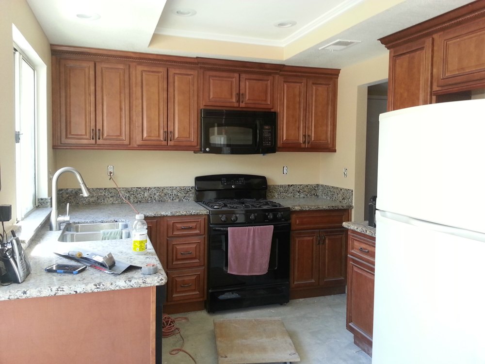
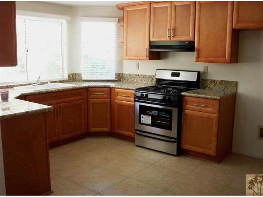
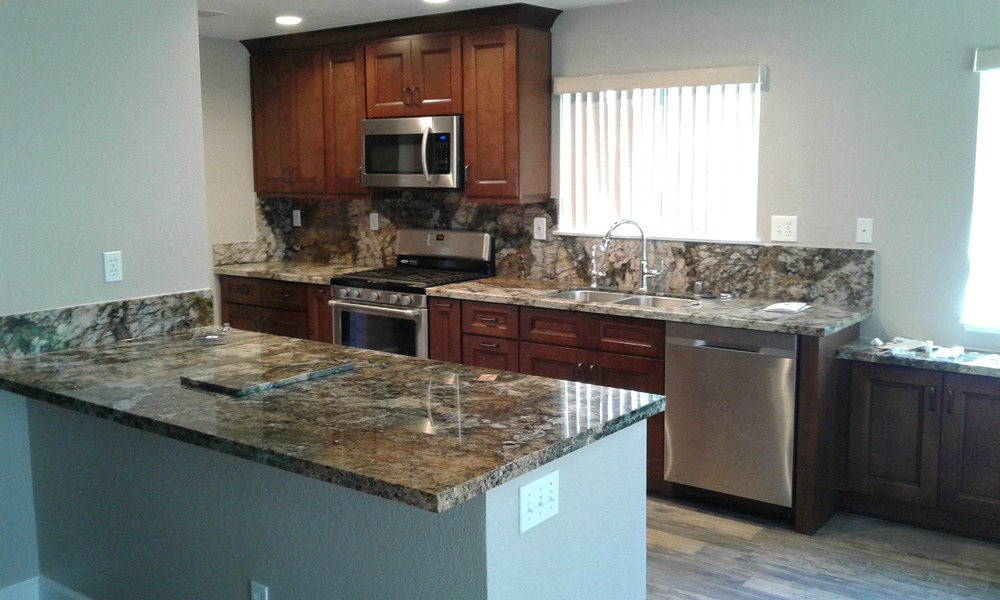
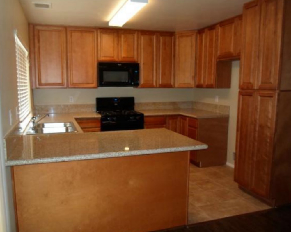
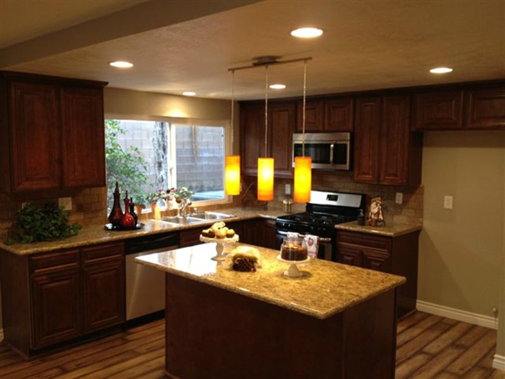
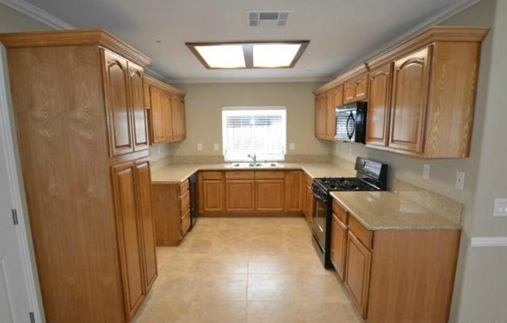
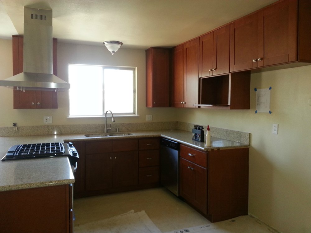
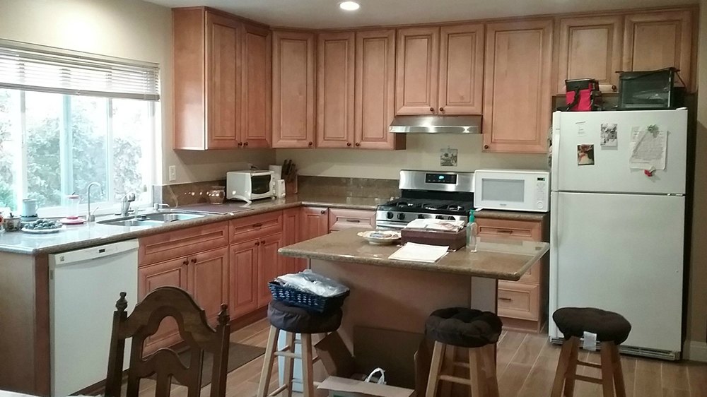
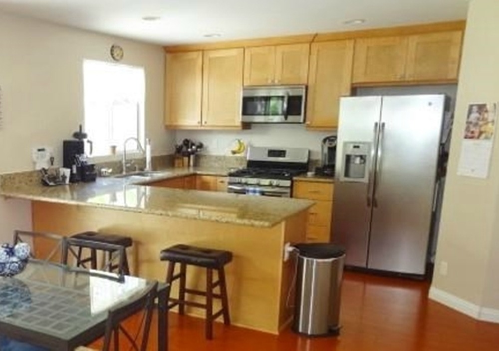
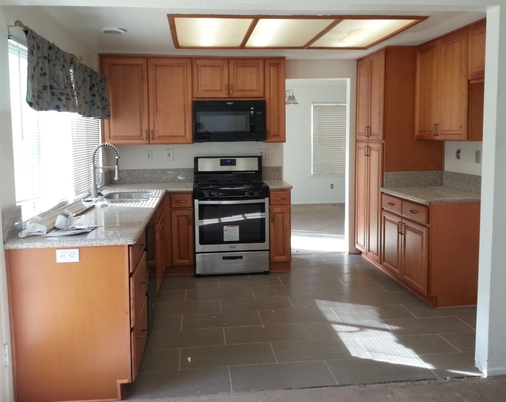
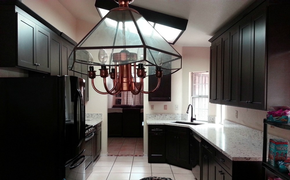
The “before and after” photos below show some kitchens we have completed in the $10,000 to $15,000 price range. Prices are for cabinets, countertops, and installation only. Other elements (such as flooring, backsplash, lighting, paint, and appliances) were an additional price. At the bottom of this page are other projects in this price range.
Cocoa Shaker cabinets and Cashmir quartz – The original builder designed kitchen had a small “U” shape with the stove and sink at right angles to each other. The “U” was so small that only one person at a time could be working in the kitchen. Removing the under used peninsula and relocating the stove now allows for multiple cooks. Raising the center of the ceiling allows the kitchen to flow into the adjacent dining room making both rooms appear larger.
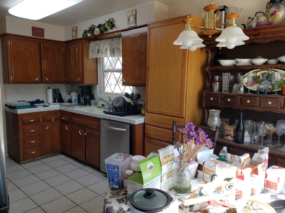
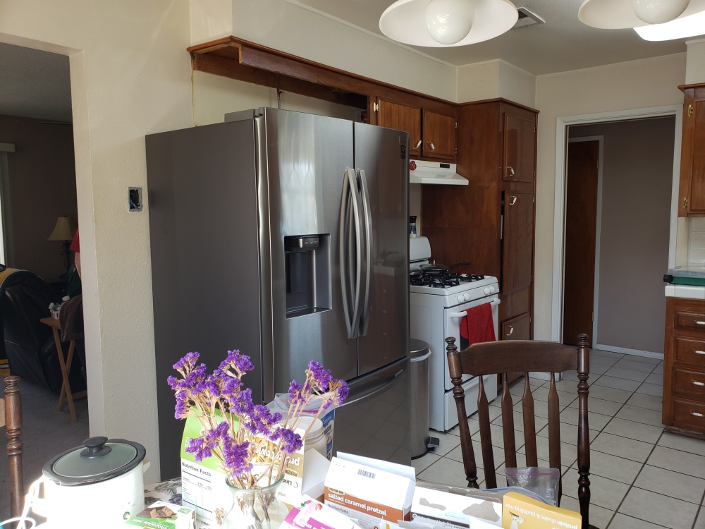
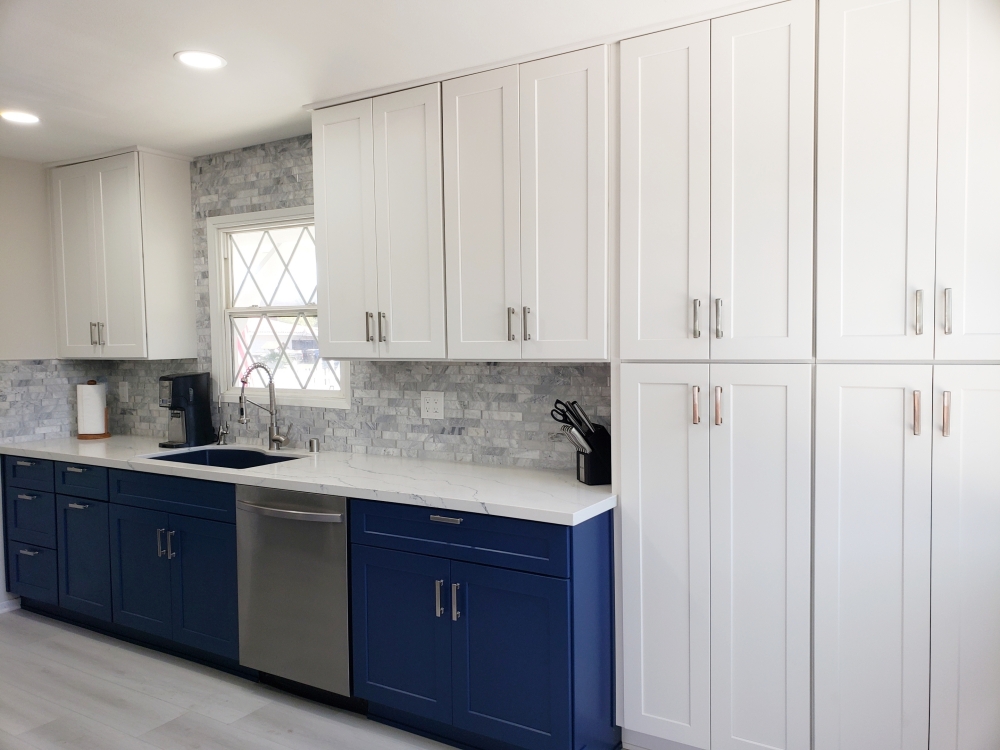
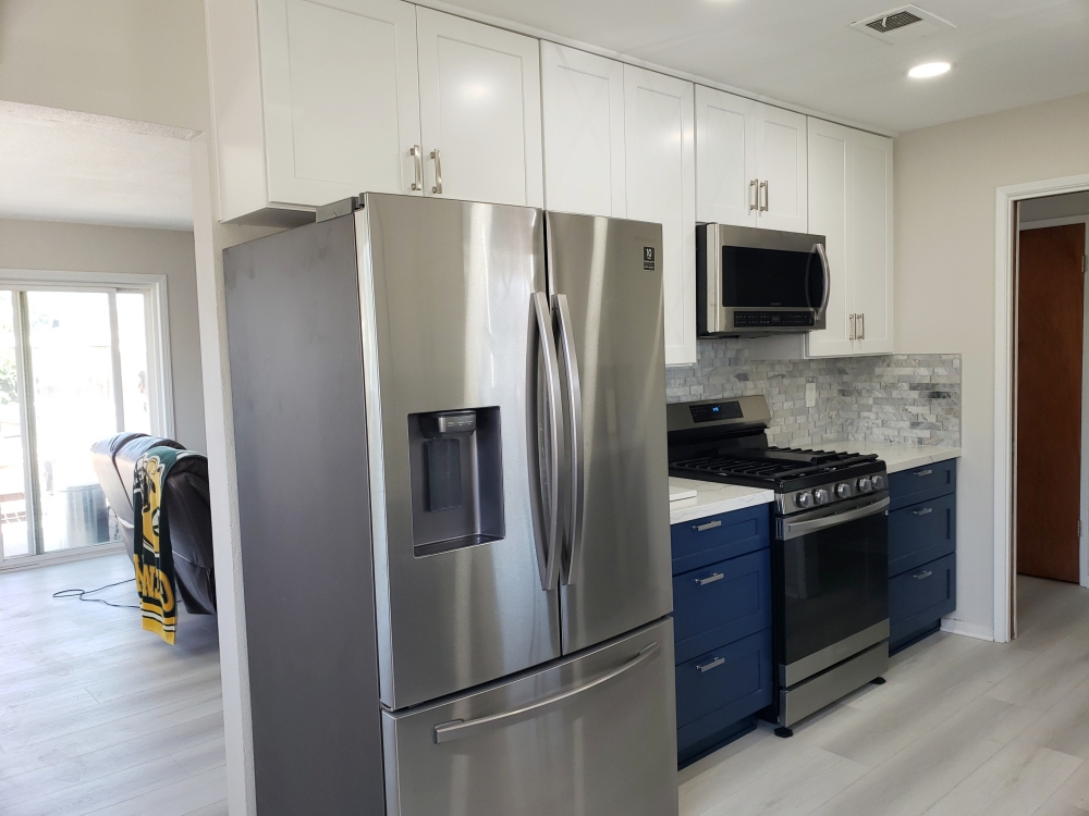
Royal Blue Shaker and White Shaker cabinets and Calacatas Glacier quartz – The original kitchen had the dark wood cabinets, white tile countertops, and cabinet soffits that were typical of its construction time. The owners decided that it had served them well, but it was time to modernize the space. Removing the ceiling soffit allows for taller cabinets with more storage. Changing the dark wood cabinets for bright white and blue makes the kitchen more inviting (and a bit playful). Replacing the tile counters with quartz eliminates cleaning the grout. The pantries were reduced from the standard 24 inches to 12 inches deep. This depth allows for the storage of most items, while not infringing into the dining space. It also allows the top pantry doors to align with the other wall cabinets for a sleak look. To further accent the blue cabinets, a white quartz with blue veins and a dark blue sink were used. The tile backsplash incorporates whites, blues, grays, and bits of silver to tie all the kitchen elements together.
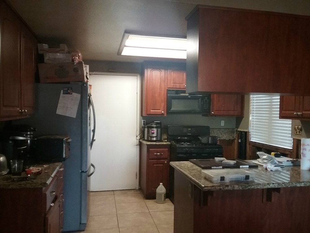
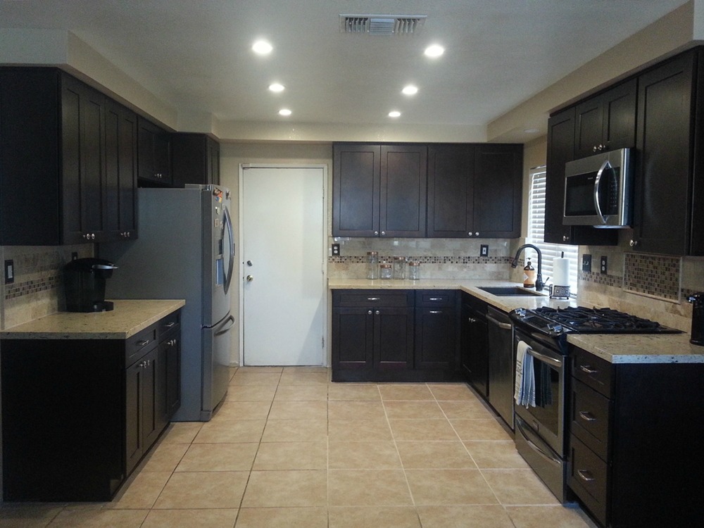
Dark Honey Shaker cabinets and Africa Persa granite – The original breakfast bar was too narrow to sit at comfortably and stools blocked the patio door. Removing the breakfast bar allowed us to extend the cabinets and countertop, and it did away with the kitchen entry “pinch point” (between the old breakfast bar to the pantry). Exchanging the old recessed light fixture for a new “light box” adds ceiling interest.
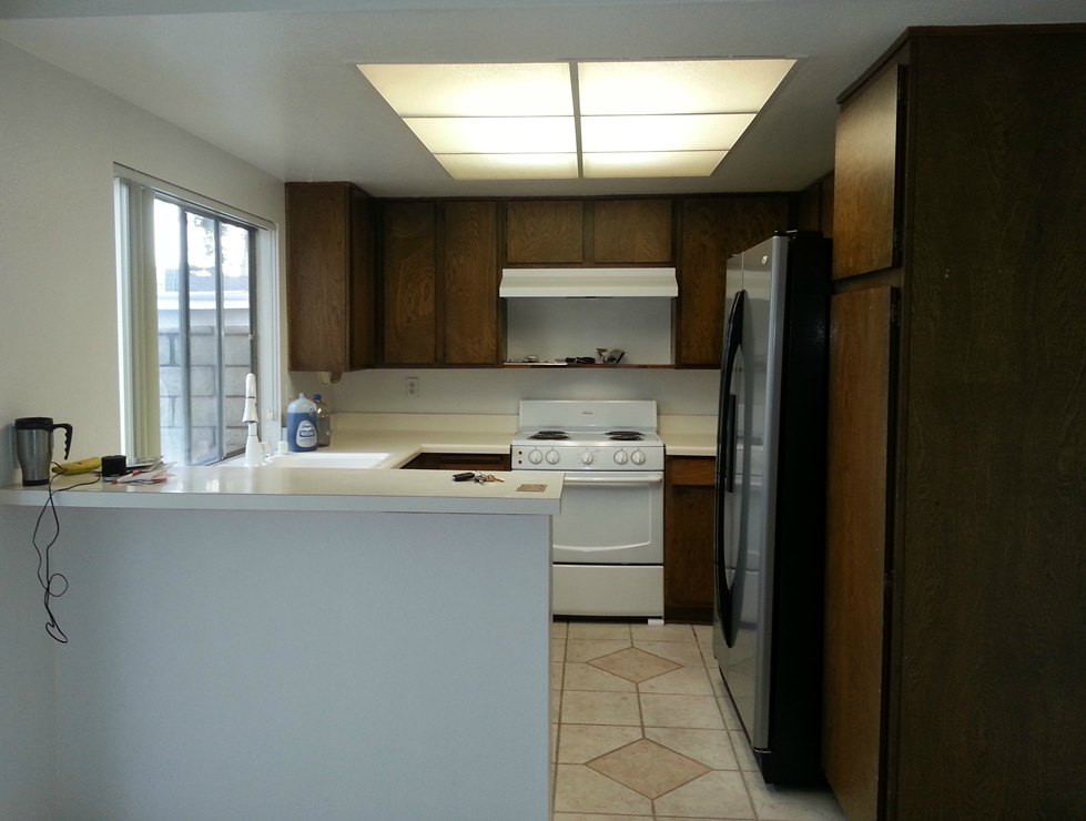
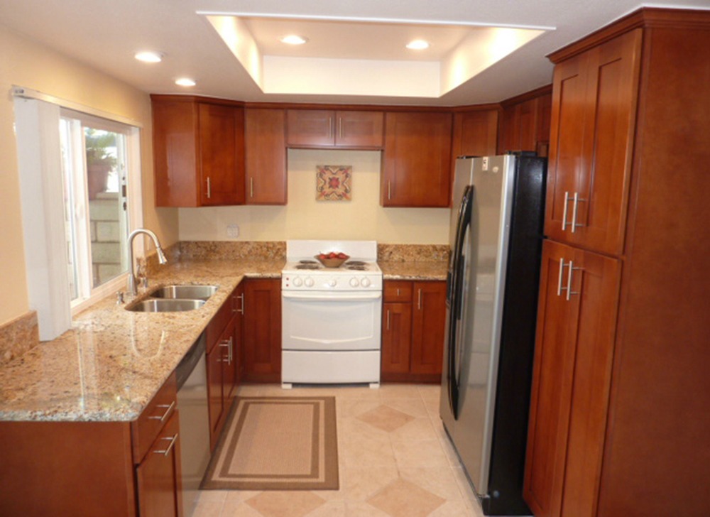
White Shaker cabinets and Oyster Beige quartz – Since the previous owner had lowered the entire peninsula (instead of just the eating bar portion), it made the cooktop very low and difficult to use. Raising the countertop to all one level, makes the entire kitchen more useable. By removing the wall of cabinets over the peninsula and the end wall, the kitchen is now open to the dining room. This allows light to flow between the spaces. The original kitchen had both the wall oven and a water heater (to the right of the wall oven) taking up precious space. By relocating the water heater into the adjacent garage, a pantry was able to be placed in that spot. By using a free-standing range (rather than a cooktop and separate wall oven), the refrigerator was able to be slid to the right resulting in more countertop space to the left of the refrigerator. The microwave (which had been in the wall oven stack) is now located in the pantry.
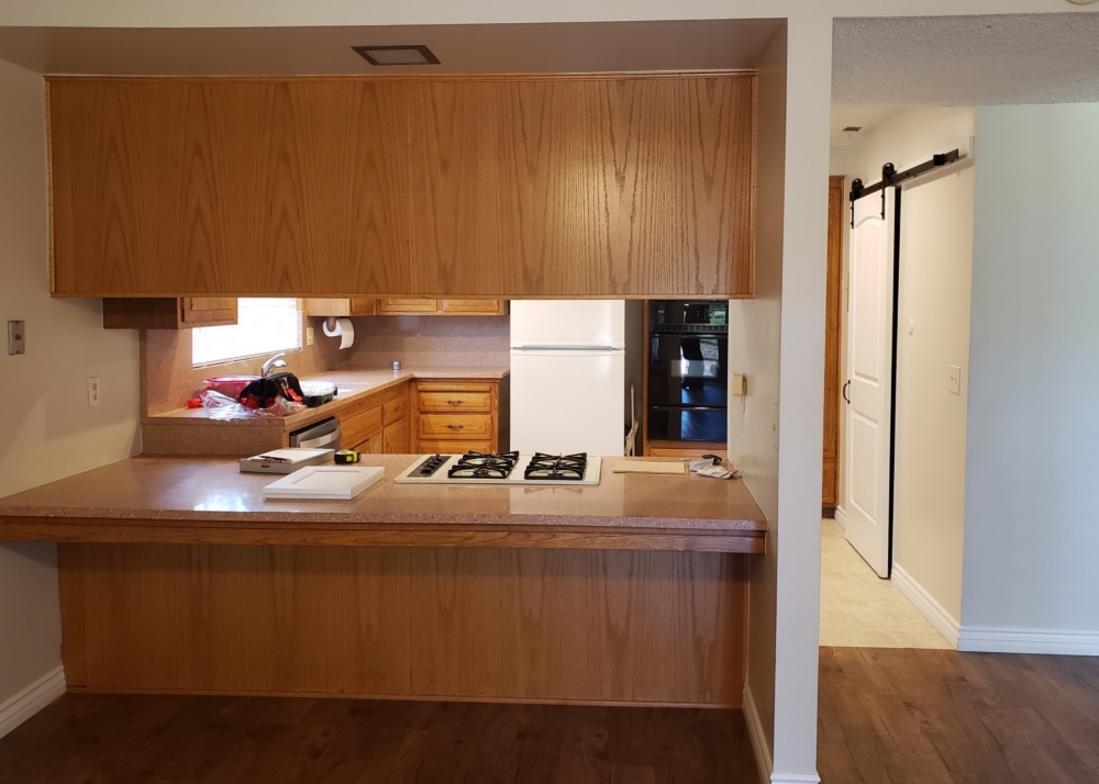
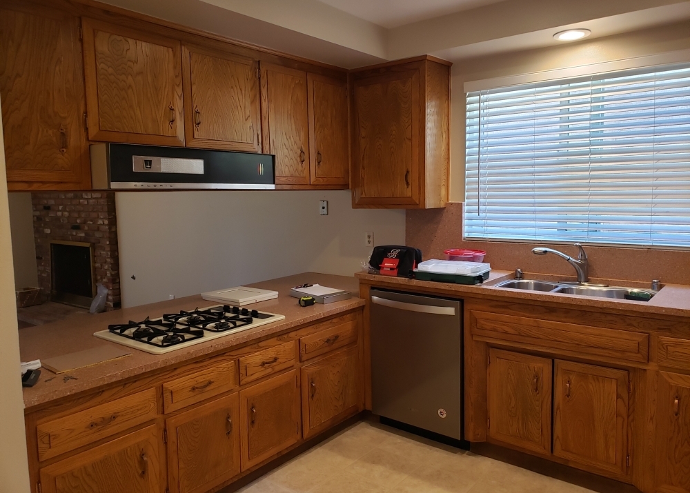
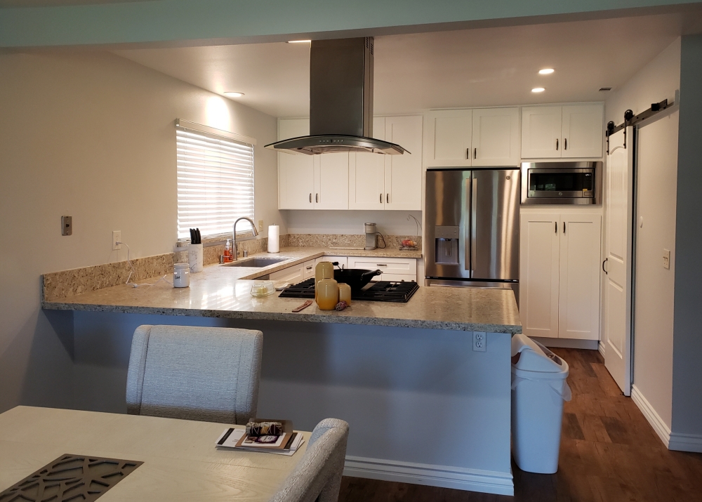
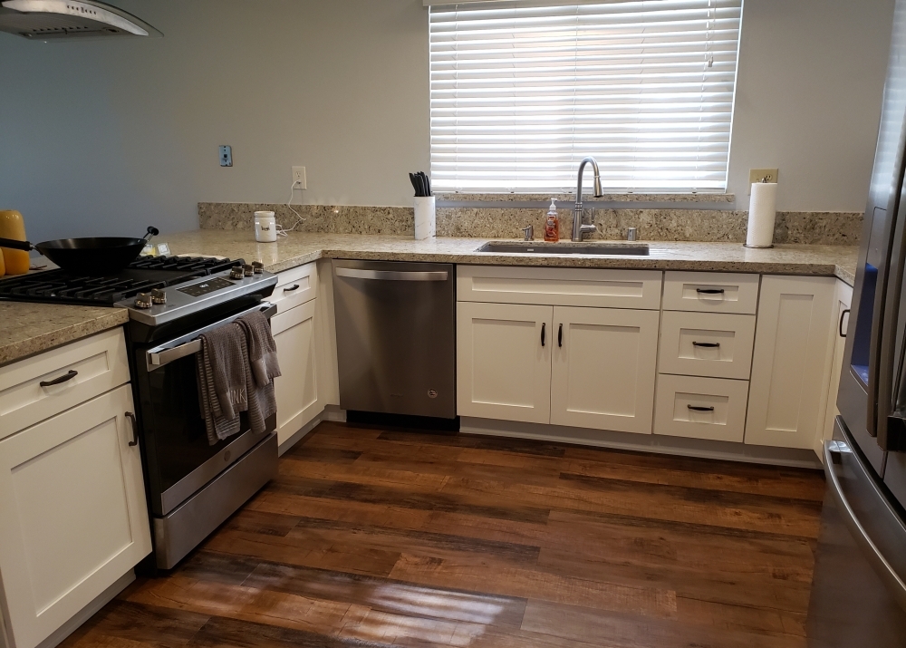
Saddle Shaker cabinets and White Pebble quartz – Lowering the breakfast bar really opens up the kitchen to the adjacent rooms. Bringing the cabinets up to the ceiling, and adding recessed can lights helps to give a contemporary appeal. For extra storage, we added cabinets to the left of the pantry, a full depth cabinet over the refrigerator, a cabinet over the sink, and a decorative shelf at the end.
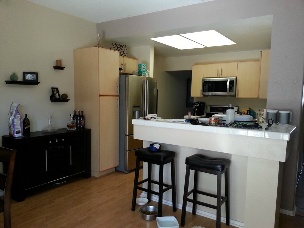
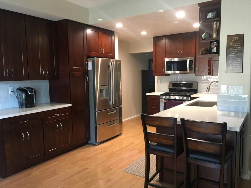
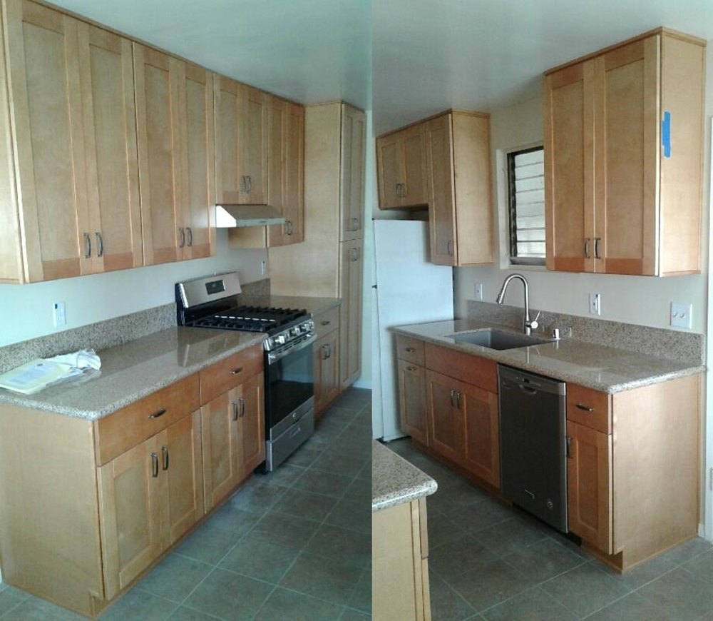
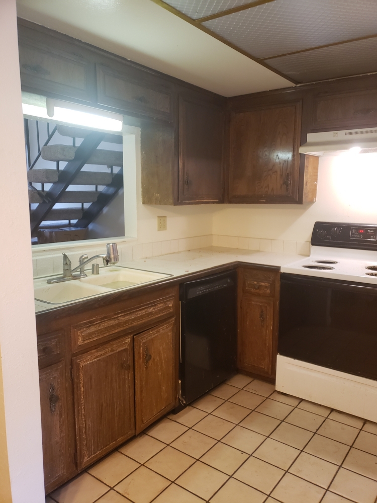
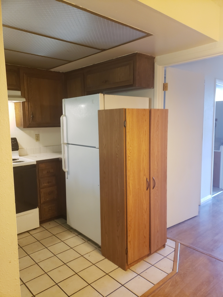
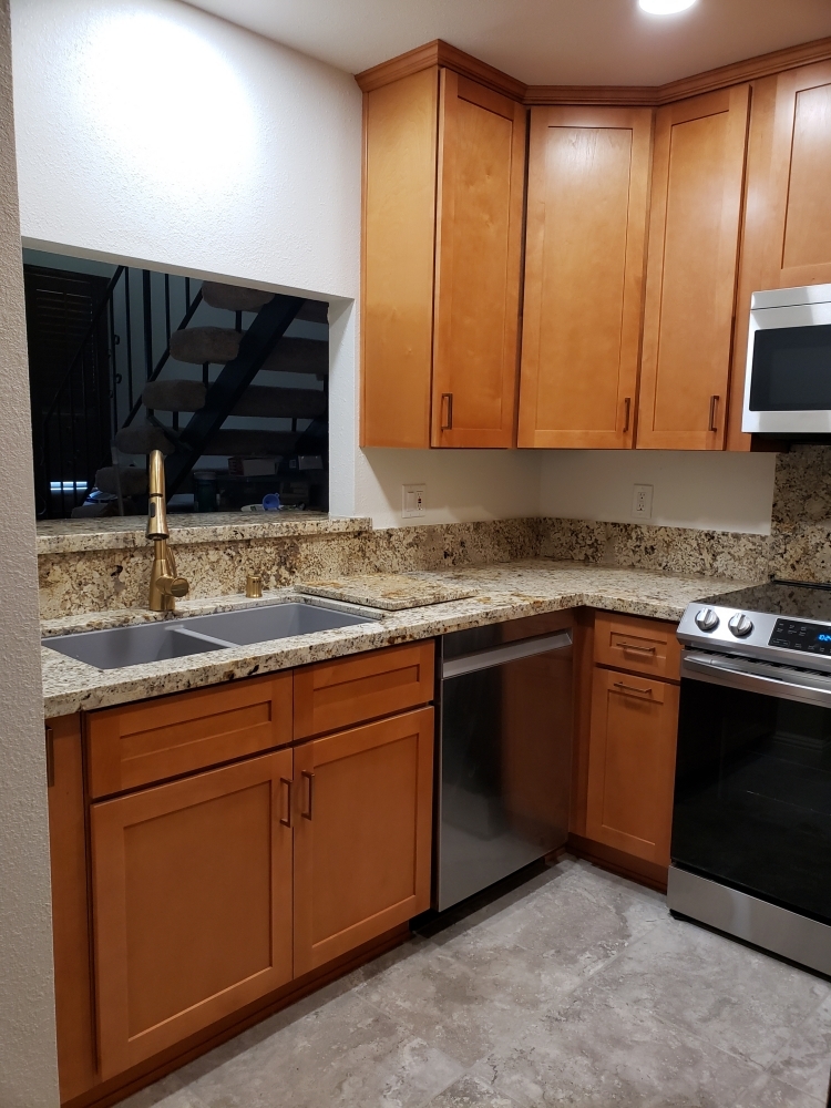
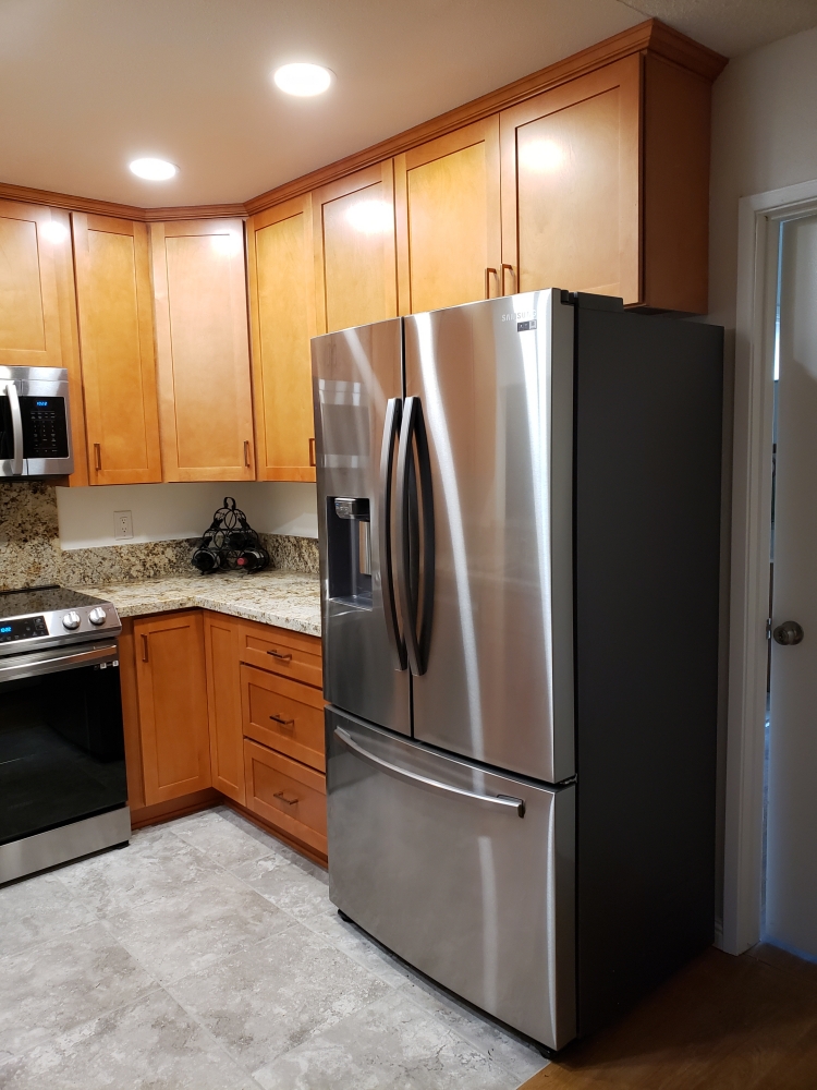
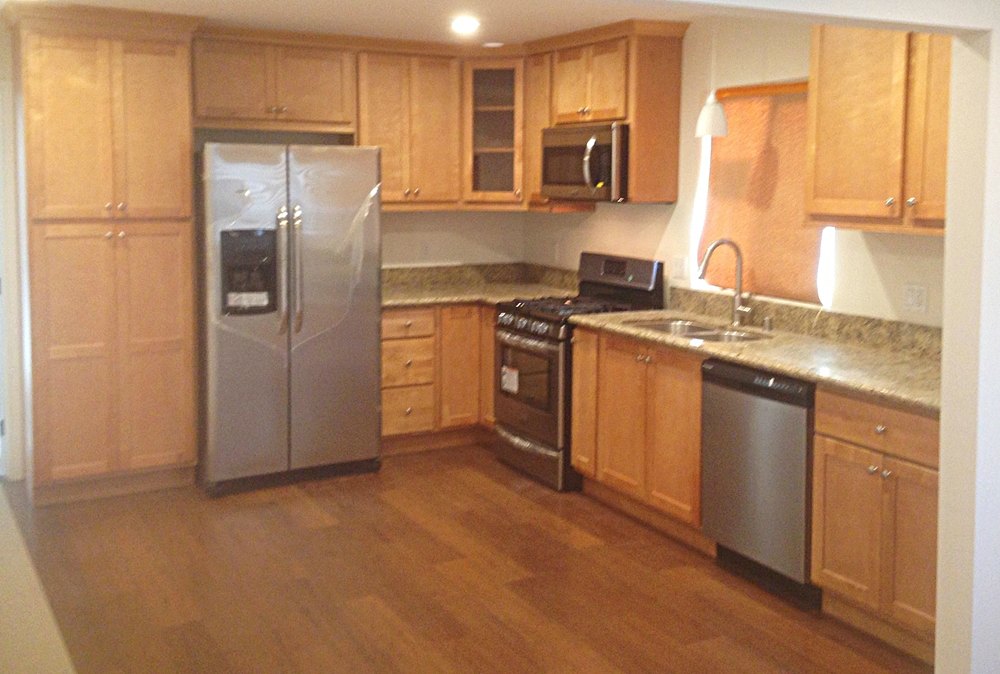
Honey Shaker cabinets with Namib Gold granite – This small original kitchen had a dropped ceiling which restricted the ceiling height to 84 inches high. By removing the dropped ceiling and recessed light fixture, the owner was able to gain an additional 12 inches of storage space in all the wall cabinets. Removing the cabinets over the sink allows for plenty of light for the sink area. The original kitchen had a double door to a back bedroom next to the refrigerator. By converting it to a single door, we were able to reuse the space gained for additional cabinet and countertop space to the left of the refrigerator.
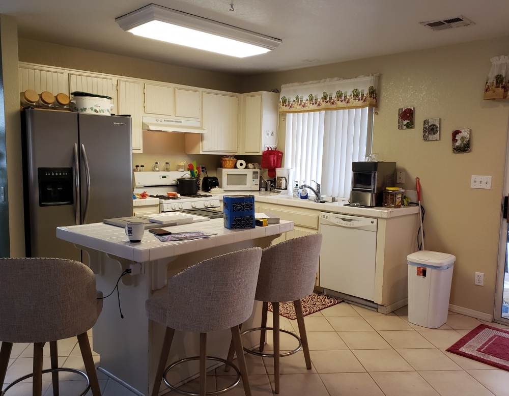
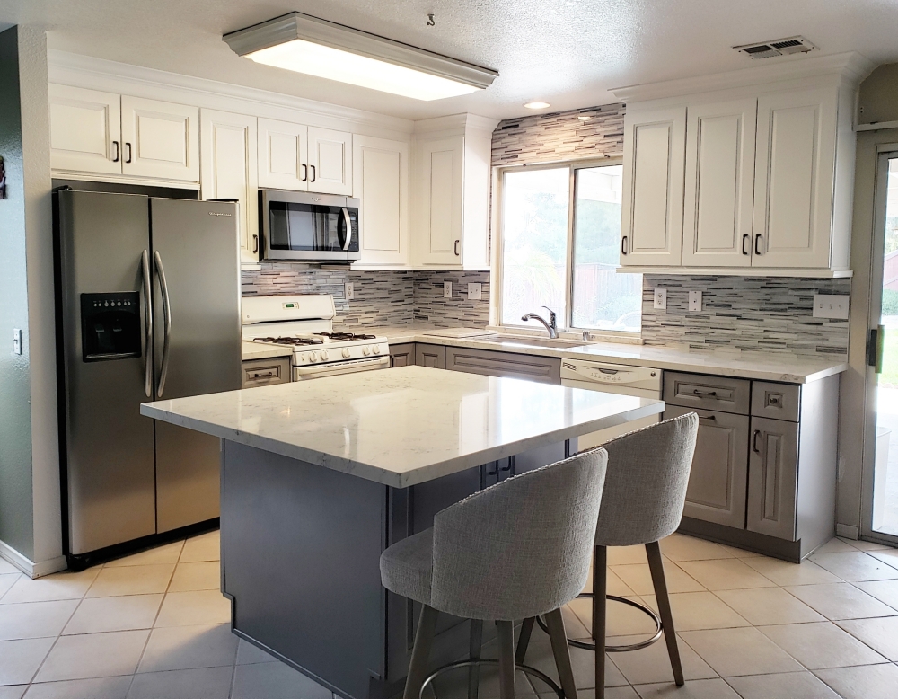
Snow Traditional and Light Gray Traditional with Helix quartz – Using a combination of two colors keeps this small kitchen interesting. The darker cabinets are on the bottom, while the lighter cabinets (in the same door style) are on the top. The sink wall cabinets were extened to the sliding patio door for more storage and countertop space. The island now not only has cabinets facing the refrigerator, but it also has cabinets under the breakfast bar for additional storage. The island top was enlarged to allow for seating on two sides. A crown molding completes the traditional look, and a white and gray glass backsplash add some sparkle.
Cayenne cabinets and New Venetian Gold granite – The dark cabinets and countertop made this narrow kitchen look even smaller. By using bright cherry cabinets, lighter countertops, some glass doors, and glass mosaic tile backsplash, the kitchen looks much larger.
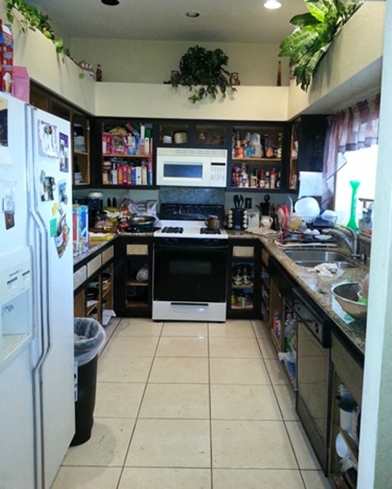
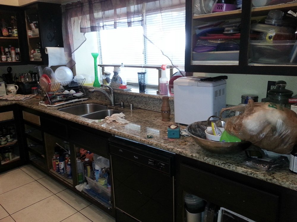
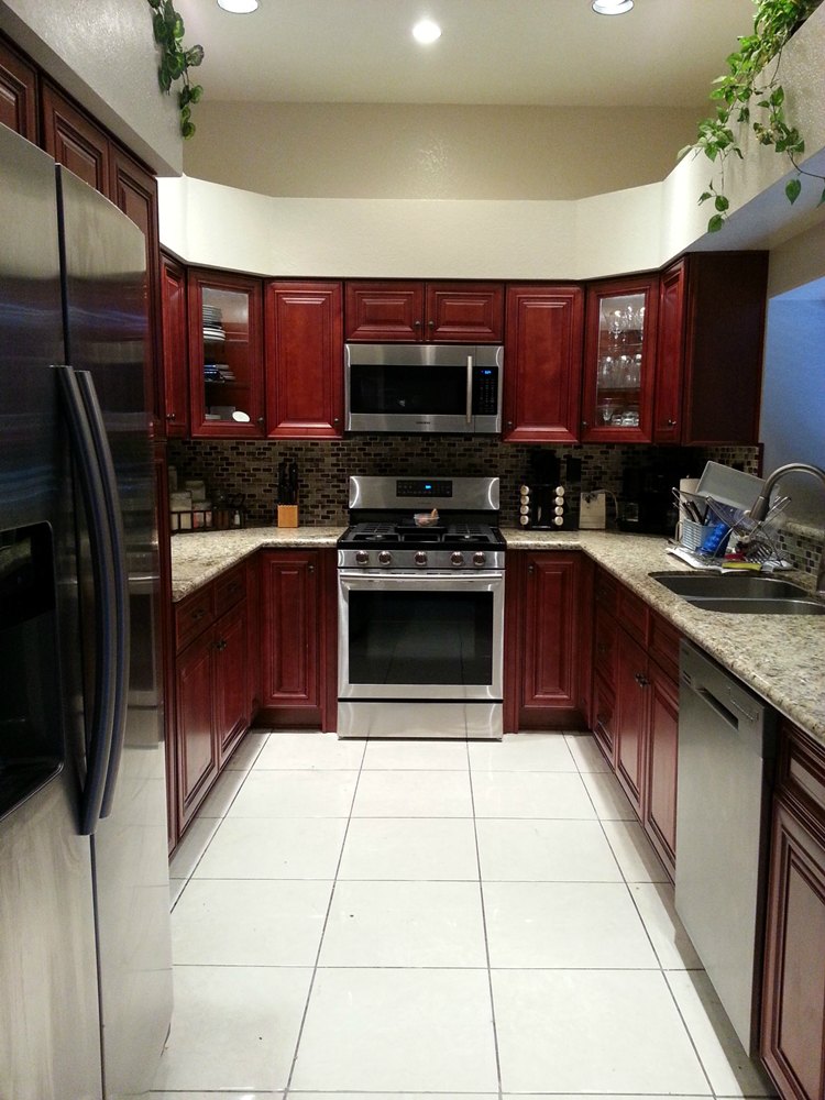
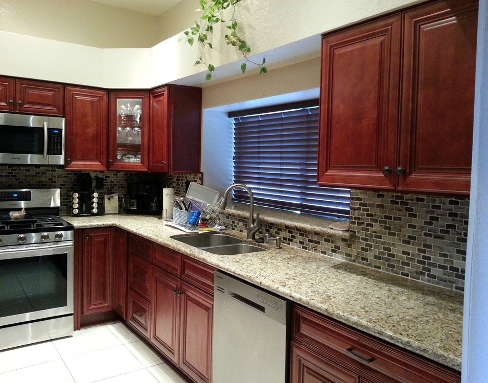
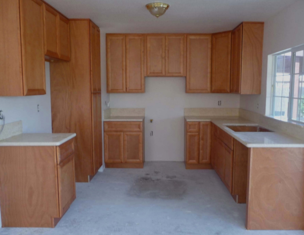
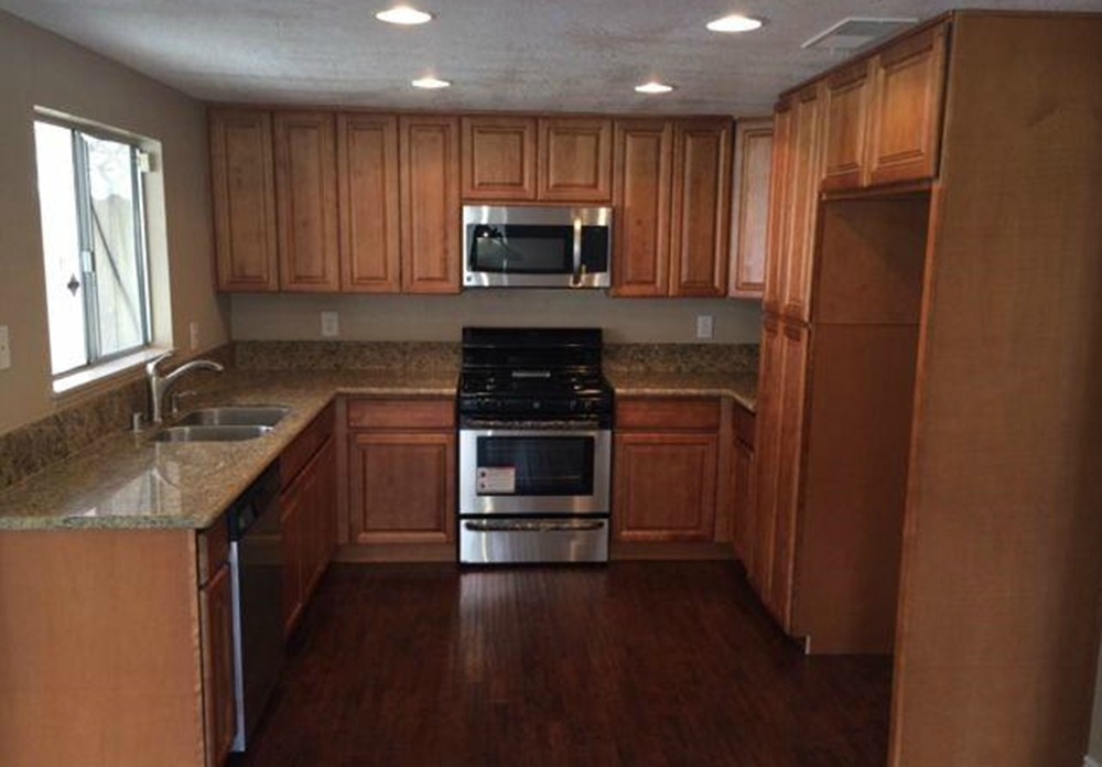
Cordova cabinets with Wild Horse granite – The oak and particleboard builder grade cabinets had been patched and painted, but were falling apart. The original kitchen only had four lower cabinets, and they all had small openings. The new kitchen still has four cabinets, but they now have larger openings to utilize the space more efficiently. The pantry to the left of the dishwasher helps to divide the kitchen from the dining area, and gives much needed additional storage space.
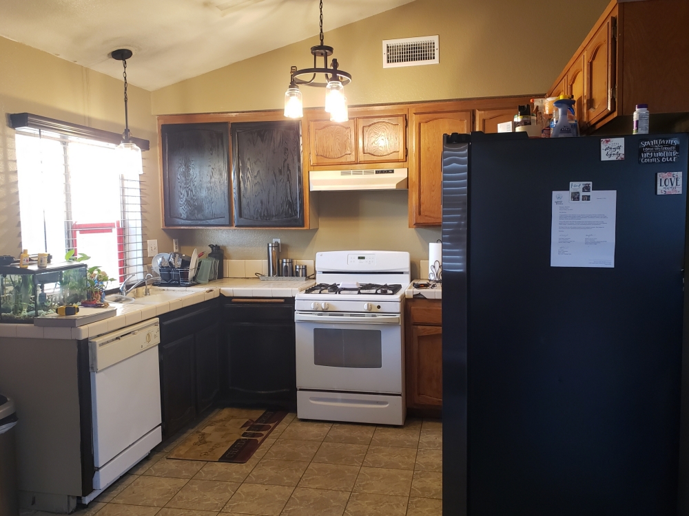
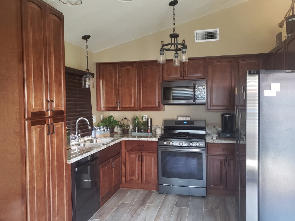
Suede cabinets and Giallo Fiorito granite – The original kitchen felt small and compact. By removing the wall between the kitchen and living room, the kitchen now feels much larger. An island now acts as the room separater, and adds additional work space and storage. The fancier cabinets and travertine backsplash add to the Spanish feel that the owners were after.
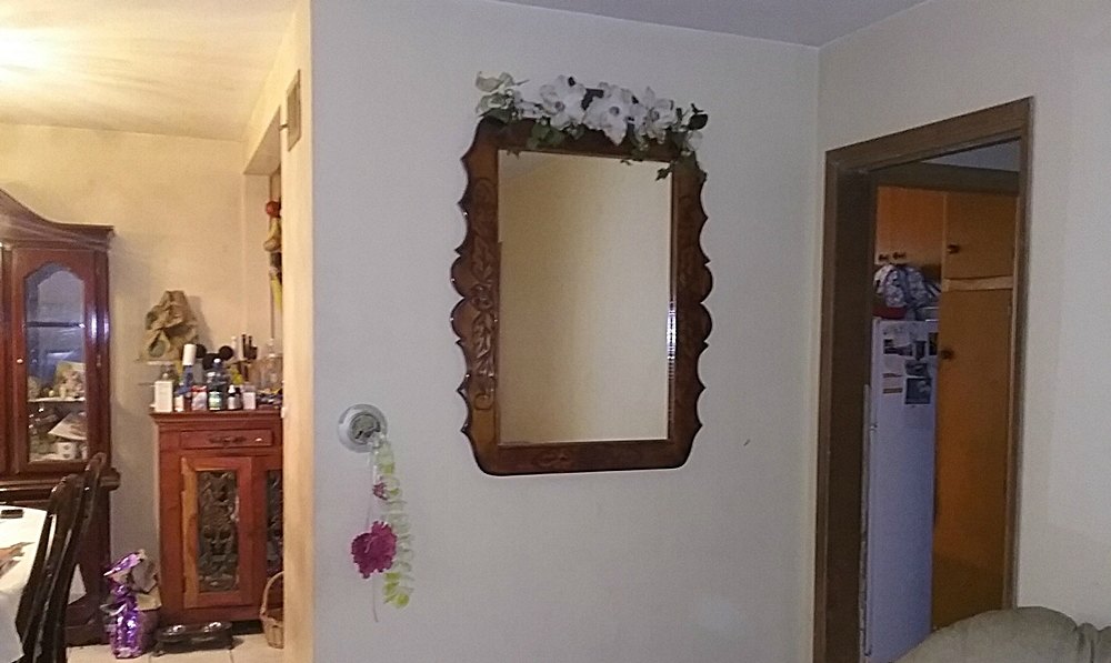
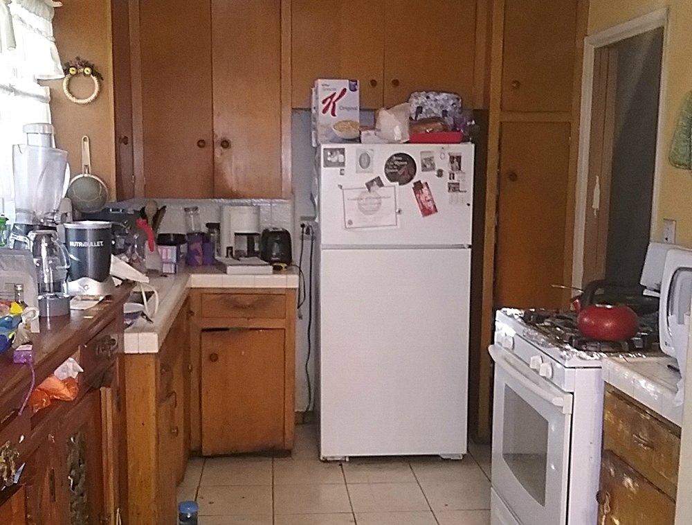
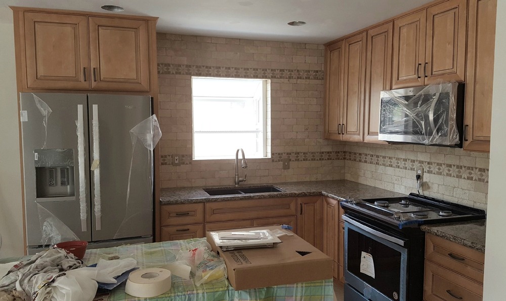
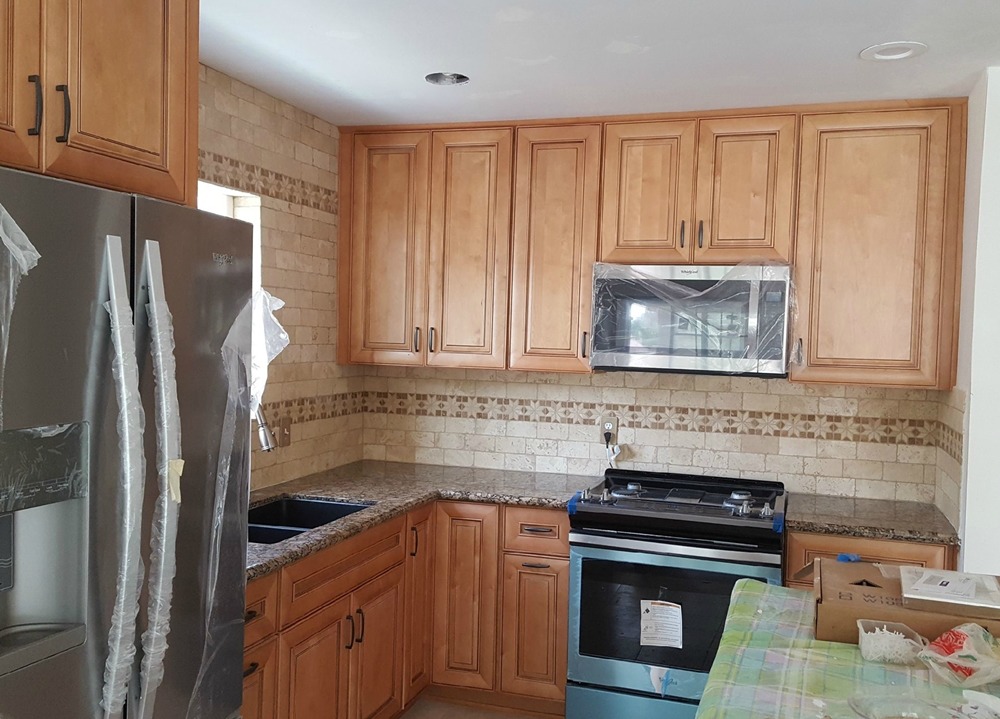
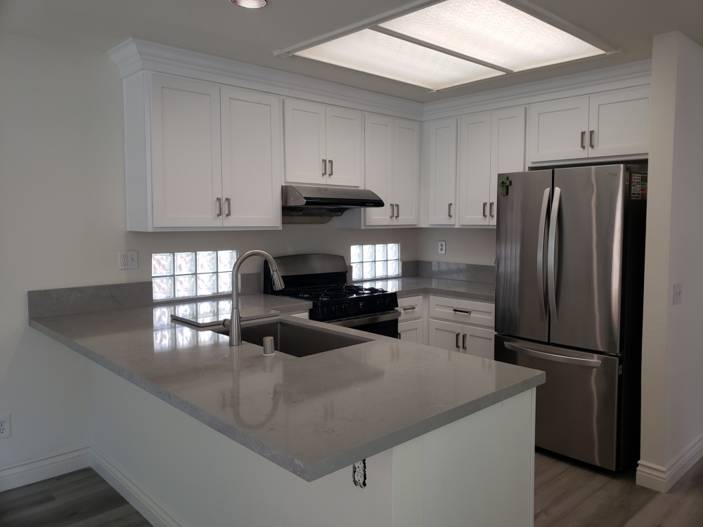
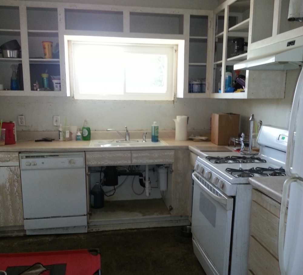
White Shaker cabinets and Tephros quartz – Although the layout remains the same, the look has been refreshed on a tight budget. The original builder cabinets had been painted over in a light gray color. They were usable, but certainly worn. When the kitchen had a flood, it provided a perfect opportunity for an upgrade. The new white shaker kitchen has slightly shorter wall cabinets to allow for some crown molding on top. This gives a nicer finish overall. The gray quatz and single bowl under mount sink replaces the original builder white tile counters for a more modern look.
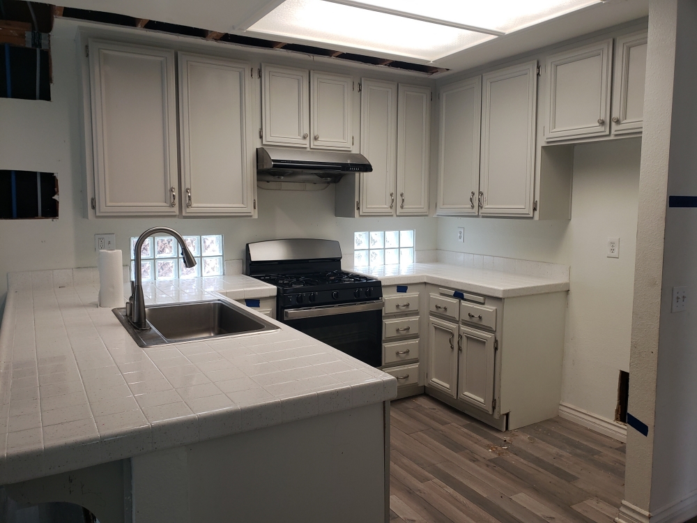
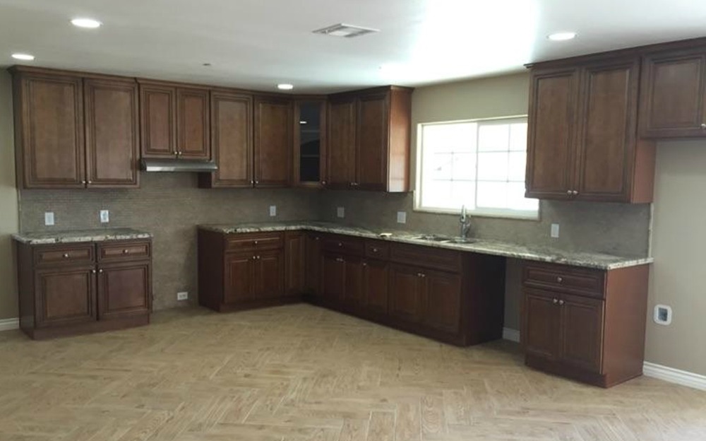
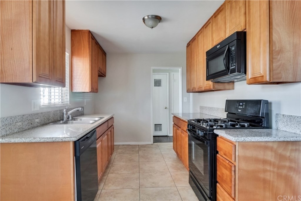
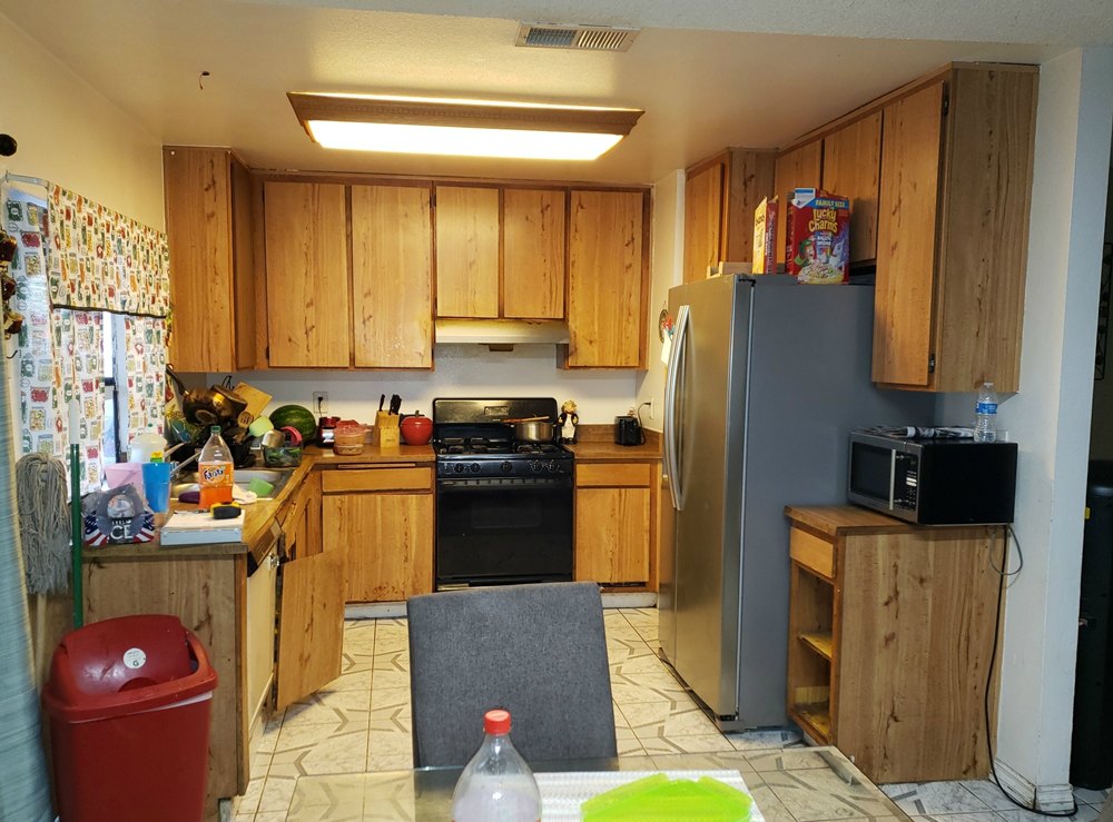
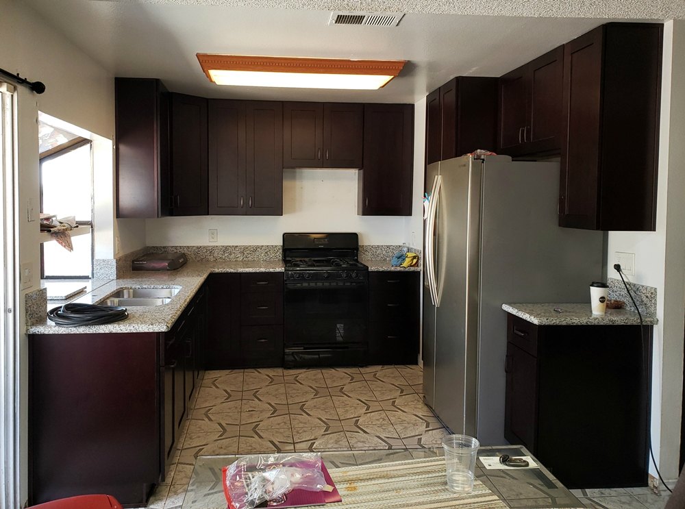
Espresso Shaker cabinets and Tiger Skin White granite – The original vinyl and particleboard builder grade cabinets were falling apart. The new dark shaker cabinets make the kitchen feel much more modern. The cream and brown countertop keeps the kitchen from feeling too dark.
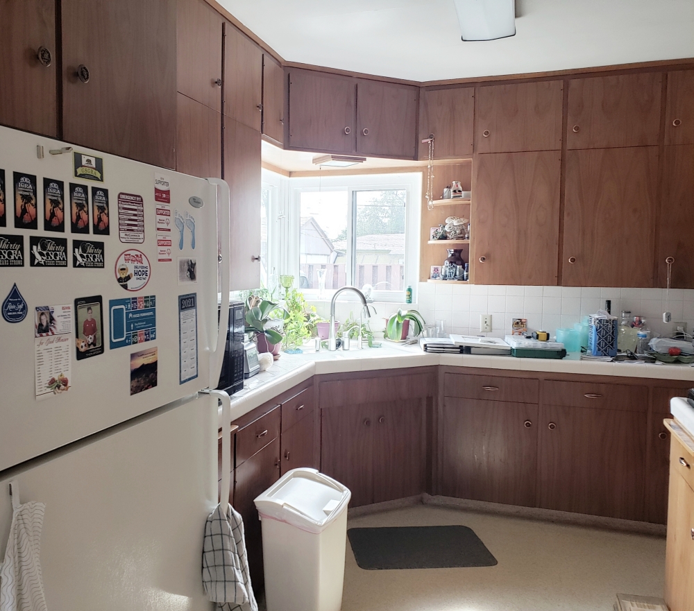
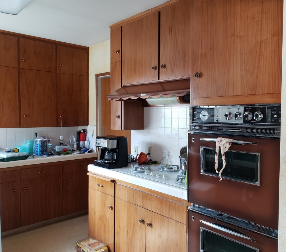
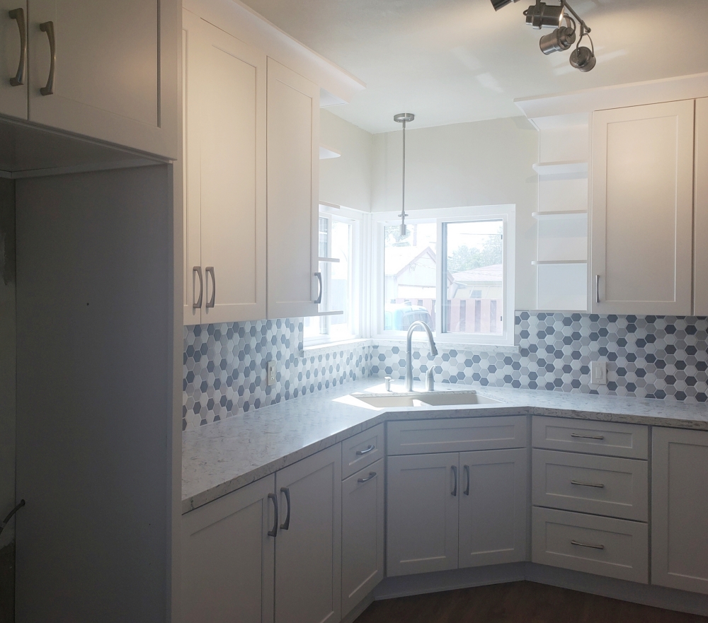
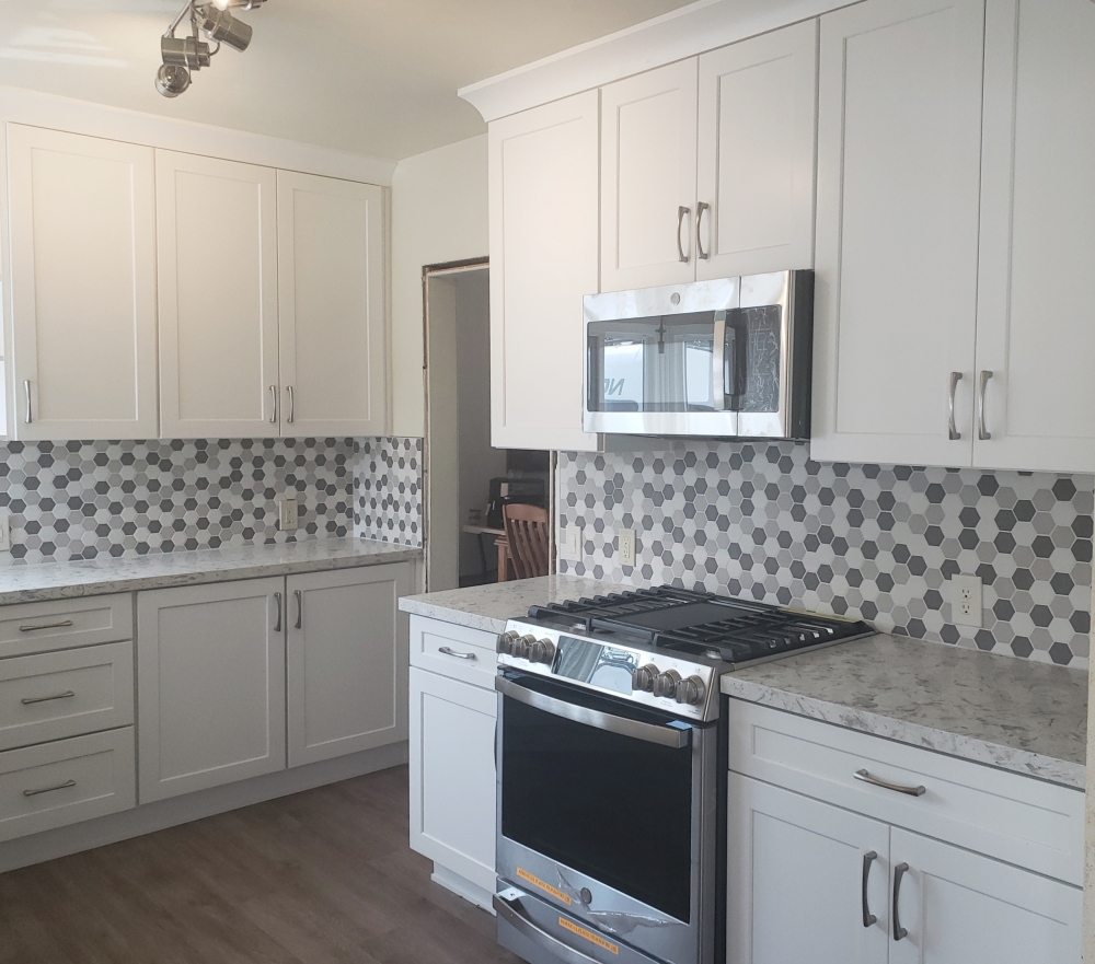
White Shaker cabinets with White Cloud quartz – Although the abundance of cabinets provided plenty of storage, their darker color made it feel that the walls were toppling down on you. By reversing the color scheme, and going with a brown floor and white cabinets, the room now feels much brighter. Replacing the original wall oven with a slide-in range provided additional countertop space and a way to get the microwave off the counter. The owner liked the shelves by he window, and we were able to make them taller when we removed the cabinet over the sink. A large crown molding gives a softer traditional finishing touch to the Shaer cabinets. The white and gray hexagon backsplash adds a touch of playfulness. The matte finish of the backsplash is a great counterpoint to the shine of the cabinets and countertop.
Crimson cabinets and Snow White quartz – The original cabinets had an old white washed finish and did not go up to the ceiling. The new cabinets go up to the ceiling for additional storage. The cabinets around the window were removed to give the kitchen a more open fealing. A new additional bank of cabinets was installed across from the stove to replace the storage lost by removing the cabinets on the window wall. That space had originally been designed to be an eating area, but was too small to properly function for that purpose. By making the sink cabinet slightly smaller, a lazy susan was able to be installed in the lower corner for better corner access.
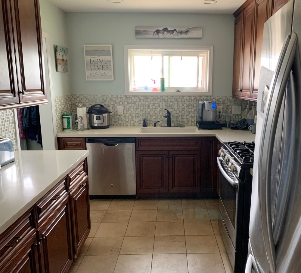
Ivory cabinets and Namib Green granite – At first glance, the “before” and “after” layouts look the same. However, there were several small changes made to increase the safety and functionality. The original kitchen had the stack of drawers to the left of the stove. This pushed the stove all the way to the door opening. Anyone walking through the dining room opening could knock into a pot handle. By moving the stack of drawers to the right side of the stove, this solves that safety concern. The original kitchen had a small dark countertop area to the left of the refrigerator. By switching the countertop area and pantry, the countertop area is now next to the main kitchen entrance, and a perfect spot to drop keys and mail. The cabinet over the refrigerator was increased in depth to match the pantry in order to give more storage space. The dark granite on the walls was replaced with a lighter tile backsplash to brighten up the kitchen.
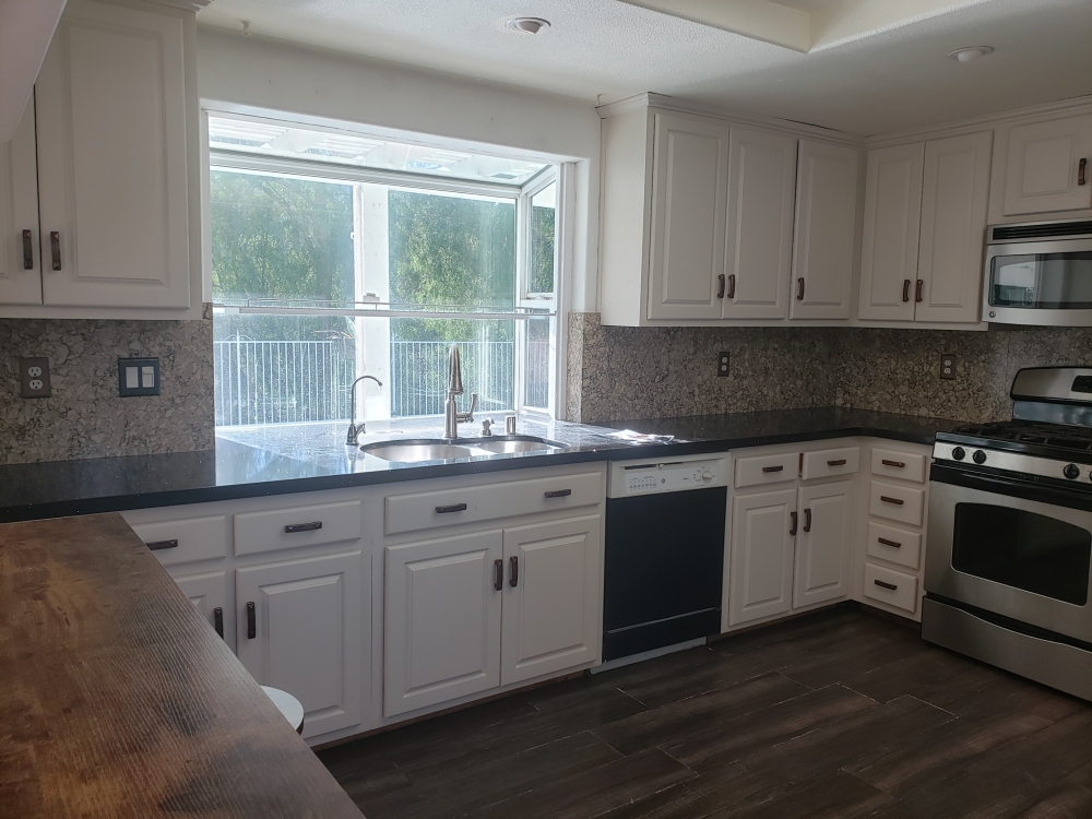
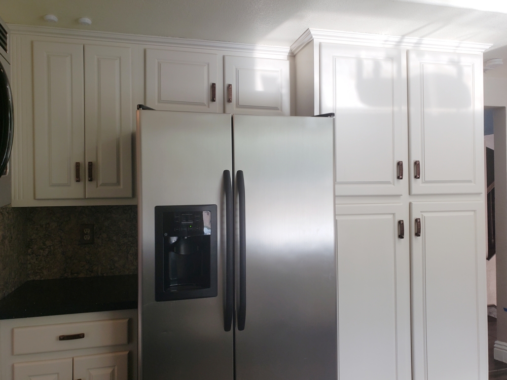
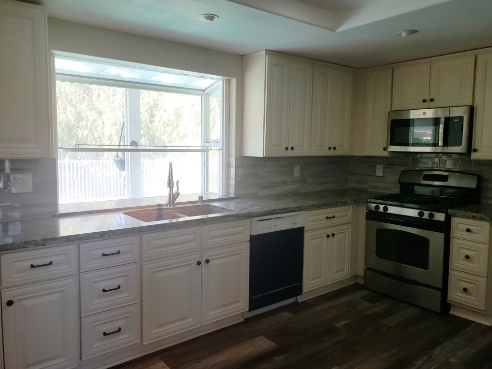
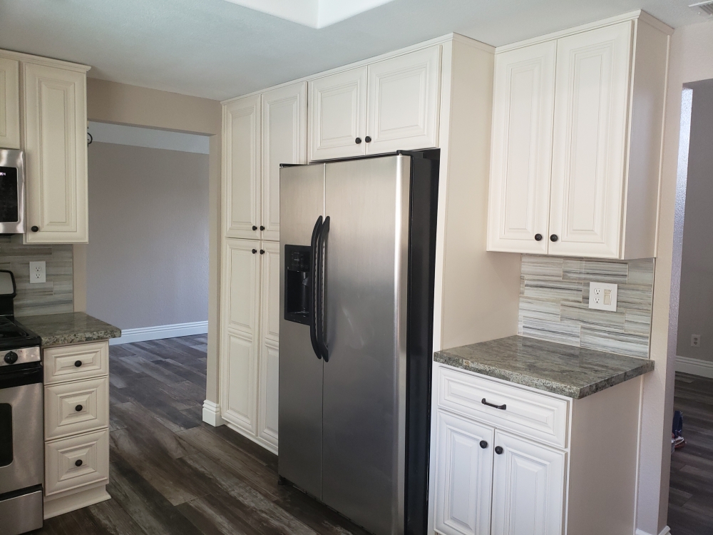
Amber cabinets and African Canyon granite – By removing the peninsula leg which divided the kitchen from the breakfast nook, the space now feels much larger. Separating the cooktop (facing the sink) from the oven (facing the breakfast area) allows for multiple cooks to easily work in the new kitchen.
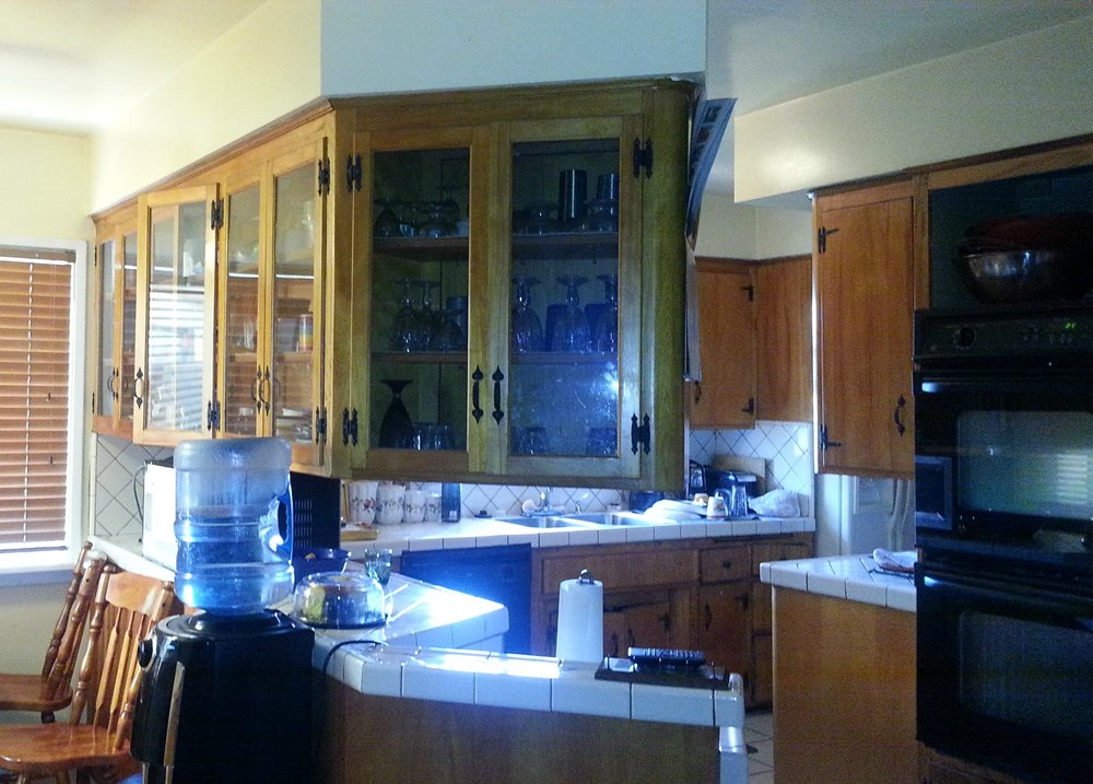
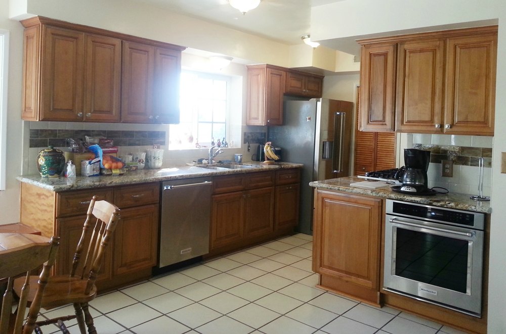
Cherry Glaze cabinets and New Venetian Gold granite – Although the wall between the kitchen and dining room had a small pass-thru opening, both rooms still felt small. By removing the wall, both rooms can benefit from light flowing between them. We removed the old soffit in order to bring the cabinets up to the ceiling for extra storage. The new cherry cabinets, granite countertop, terrazzo floor and backsplash tile add an elegance to the kitchen. The glass tile “color stripe” in the backsplash adds a playful touch and ties all the colors together.
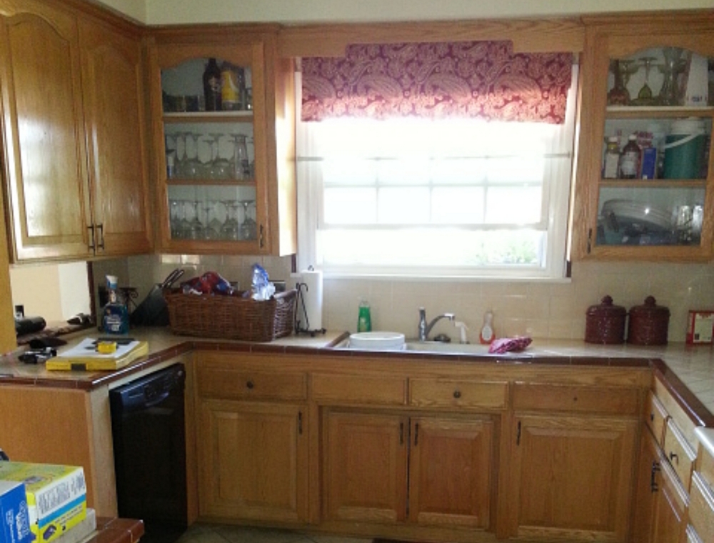
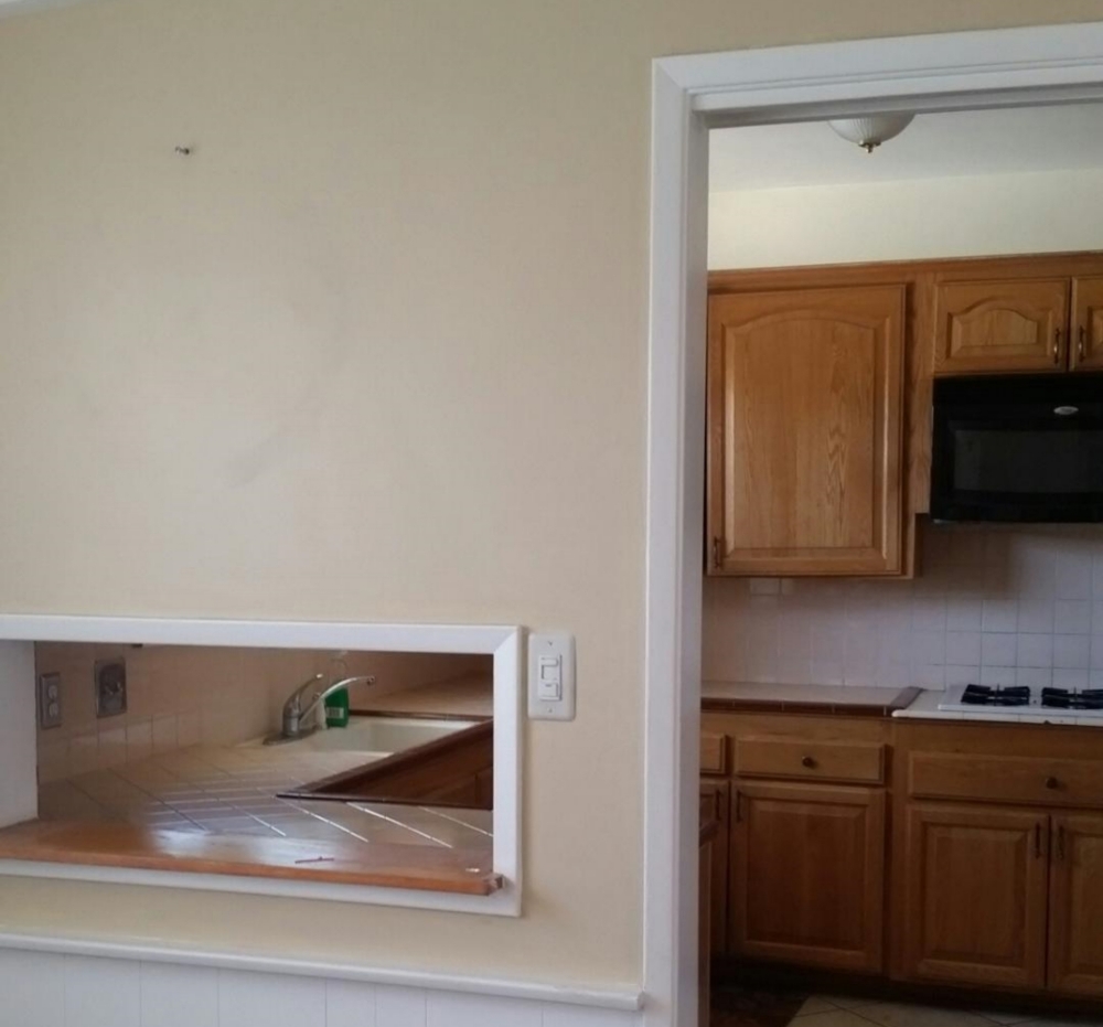
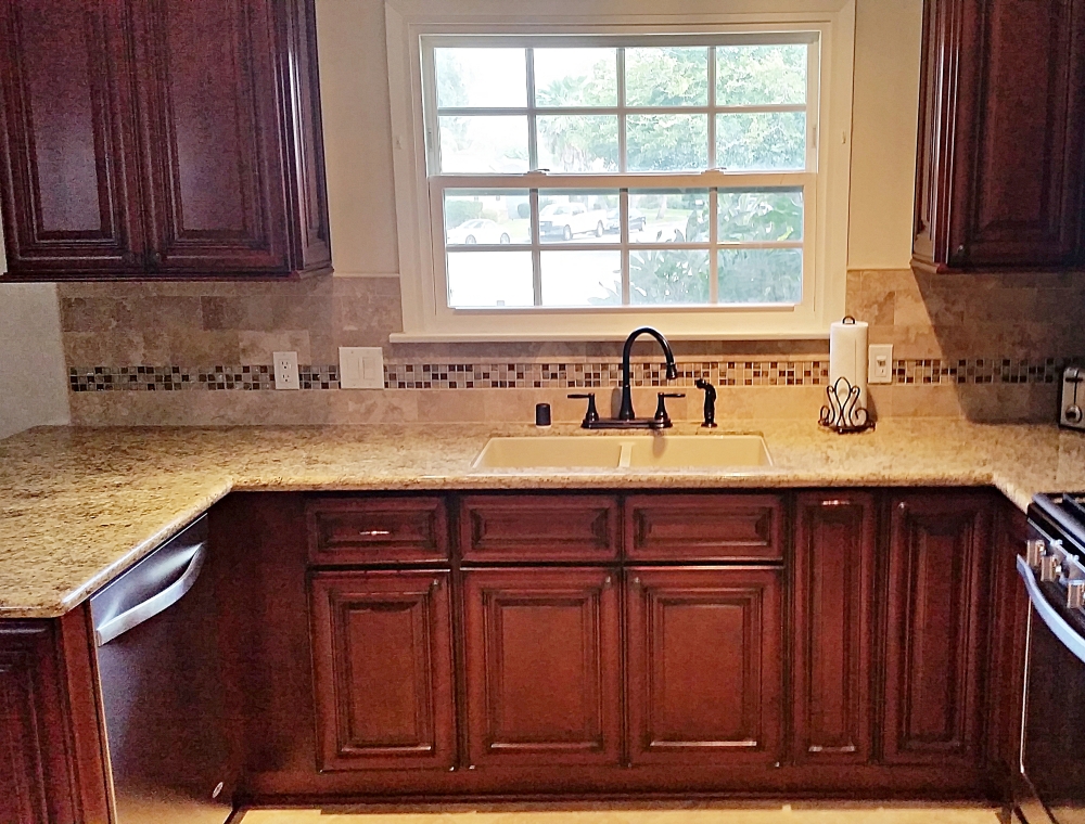
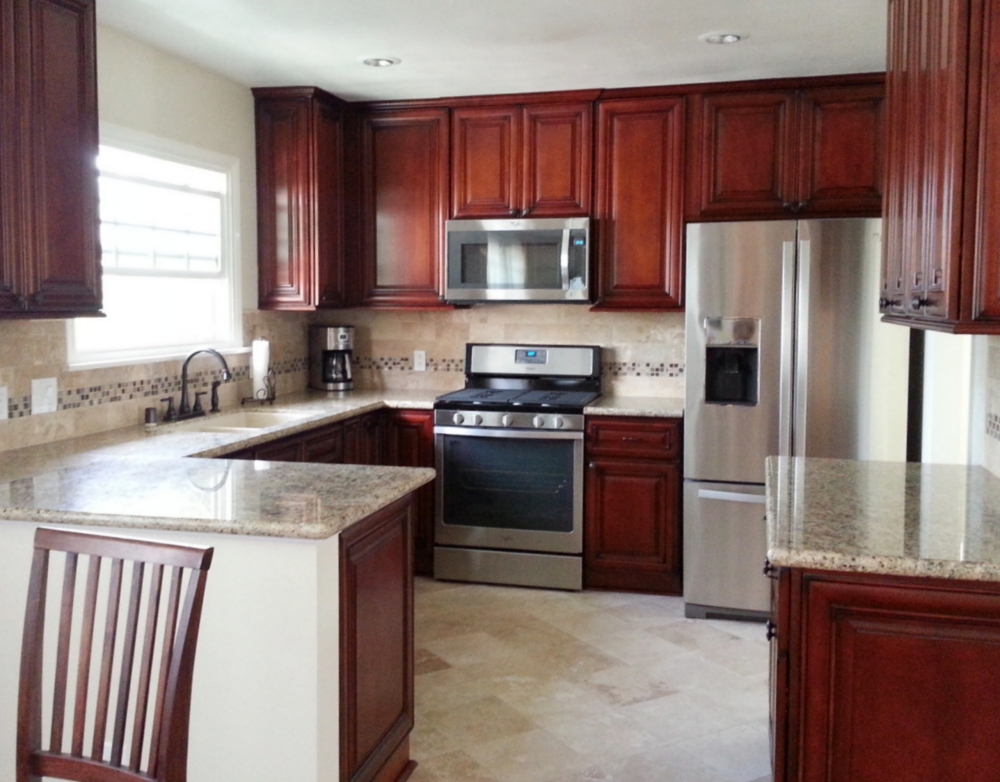
Natural Maple Arch cabinets and Imperial Gold granite – This 60 year old kitchen lacked countertop space, storage, and a functional floorplan. Since the original cabinets were only 21 inches deep, the homeowners could not have a dishwasher. And the “pocket” space for the old refrigerator was too small for their new refrigerator. By slighlty moving the door, we were able to get more wall space for a larger refrigerator as well as space for the standard deeper cabinets and dishwasher. The original kitchen also lacked countertop space adjacent to the stove. By relocating the refrigerator, we were able to wrap the cabinets around the corner and create an efficient “L” shaped floorplan. The old free-standing cabinet (in the lower left corner) was replaced with a deeper cabinet and breakfast bar overhang.
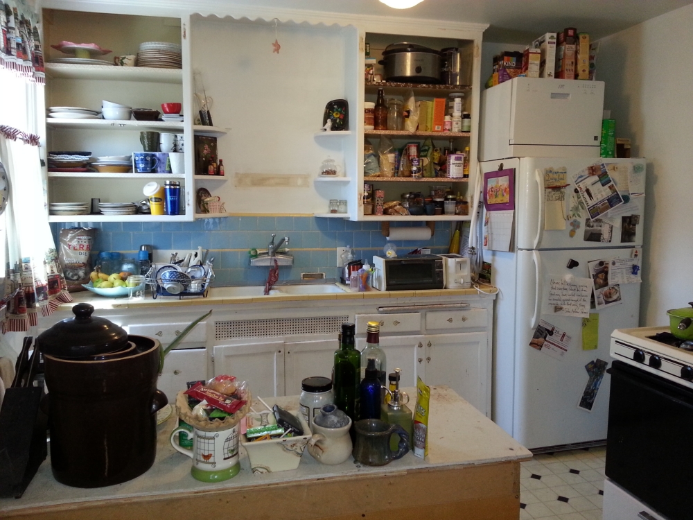
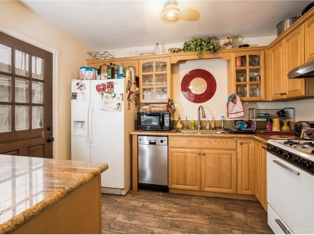
Sable Shaker cabinets and Sea Salt quartz – This 50 year old kitchen suffered from both a lack of countertop space and a lack of storage space. Although there were a lot of cabinets by count, they were all very narrow and did not utilize the space efficiently. Although there are fewer cabinets in the new kitchen, they allow easier access to more items since they are wider. By reducing the dishwasher from 24 inches wide to 18 inches (plenty for this small two bedroom house), we were able to place additional lower cabinets on the refrigerator wall. By removing the cabinets on the window wall, the kitchen now looks more airy and open. Removing the cabinets over the sink helps to eliminate the “tunnel” feeling, and allows the sunlight from the window to spread throughout the kitchen.
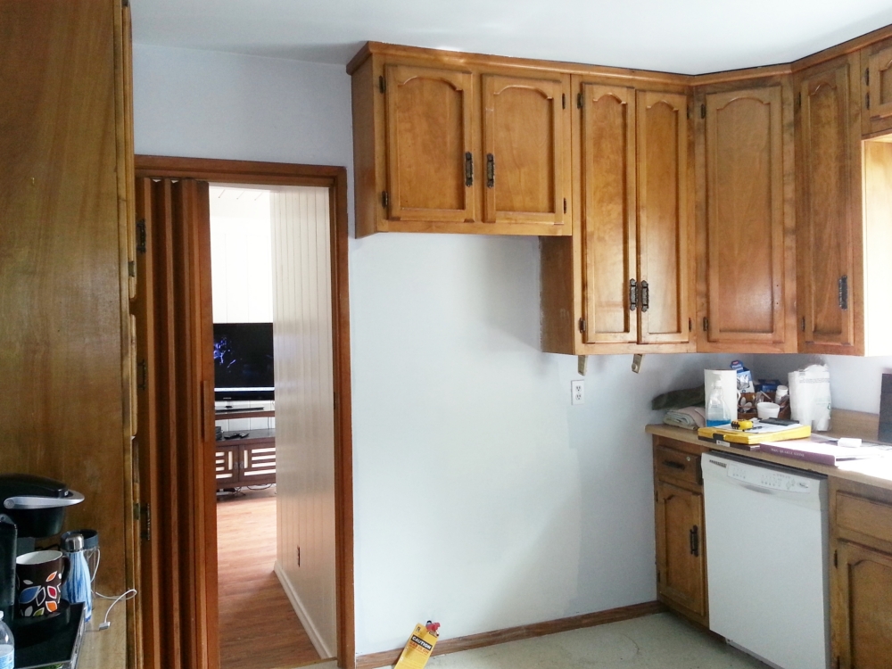
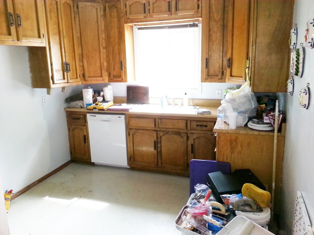
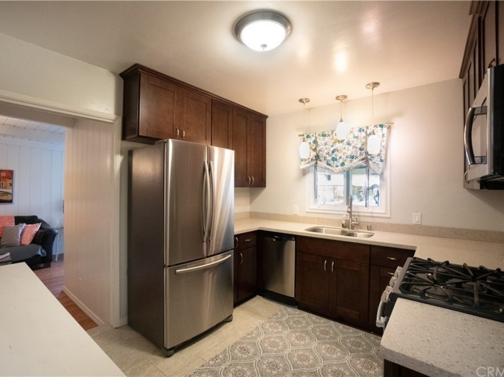
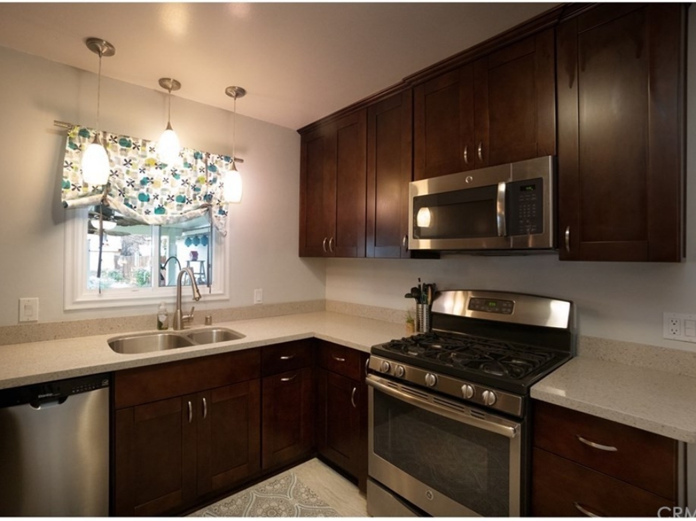
White Shaker cabinets and Black and White granite – This older original kitchen consisted of an “L” shaped plan with a very small eating area under the window. The refrigerator location (against the stud wall) made it difficult to open without hitting the dining chairs. By removing the wall between the kitchen and living room, light and air now flow much better between the spaces. The refrigerator was relocated to the window wall, and additional cabinets were added under the existing window (where the old dining area used to be). Ceiling can lights add to the new brighness. A new beam was added to compensated for removing the wall. A breakfast bar was able to be installed in place of the stud wall counter, and now doubles as the dining area.
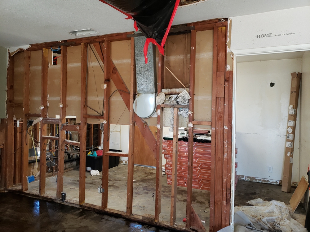
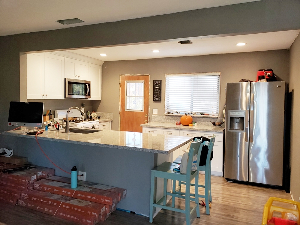
Red Oak Shaker cabinets and Multi-gray quartz – This small kitchen felt smaller than it was due to the original wall oven sticking out into the kitchen reducing the walking space. There was also a lack of functional storage due to most of the lower cabinets having no drawers, and many of the upper cabinets being short. The counters on each side of the refrigerator were different heights, and the breakfast bar area felt confined due to the dark overhead structure. We remedied these issues by raising the low cabinets to the left of the refrigerator to standard height (which gave more cabinet storage space), adding top drawers to the cabinets (which increased drawer storage), replacing the short cabinets with standard height cabinets (which added wall storage), removing the dark breakfast bar ceiling structure (which opened up the pass-thru), replacing the full depth wall oven and microwave with half depth pantries (which widened the walkway), and replacing the cooktop with a free-standing range and microwave (which made a more efficient cooking space). The brighter all wood cabinets replacing the darker particleboard cabinets gives a more modern feel, and will help assure that this rental kitchen lasts for years to come.
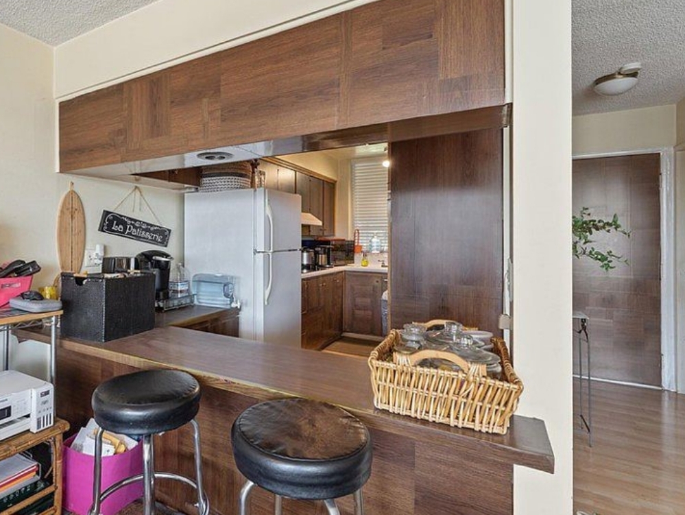
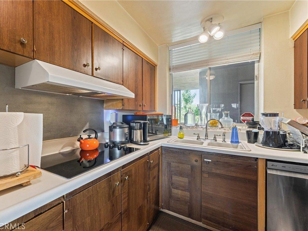
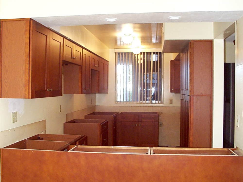
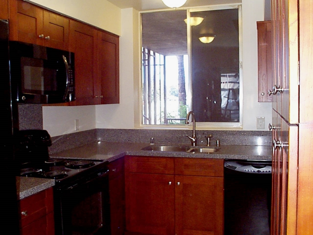
Natural Birch cabinets and New Venetian Gold granite – Although the kitchen only has one small window, it stays bright by using light colored cabinets, light colored counters, and a simple door style.
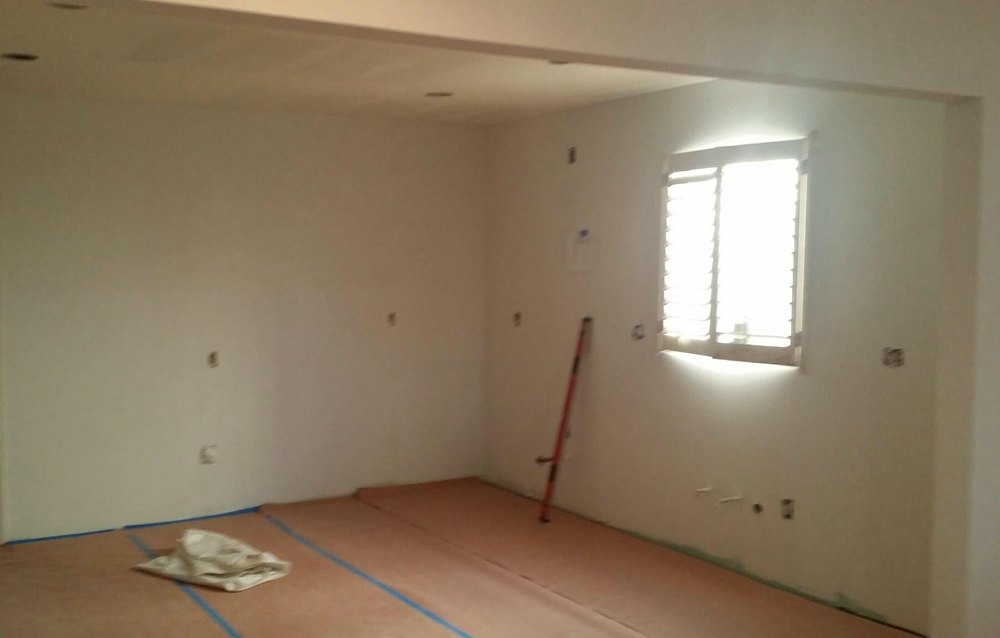
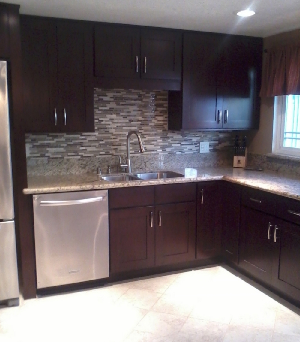
Espresso Beech Shaker cabinets and Giallo Ornamental granite – Darker cainets, stainless steel appliances, and a tile backsplash transformed the whole look of this kitchen by a couple of decades.
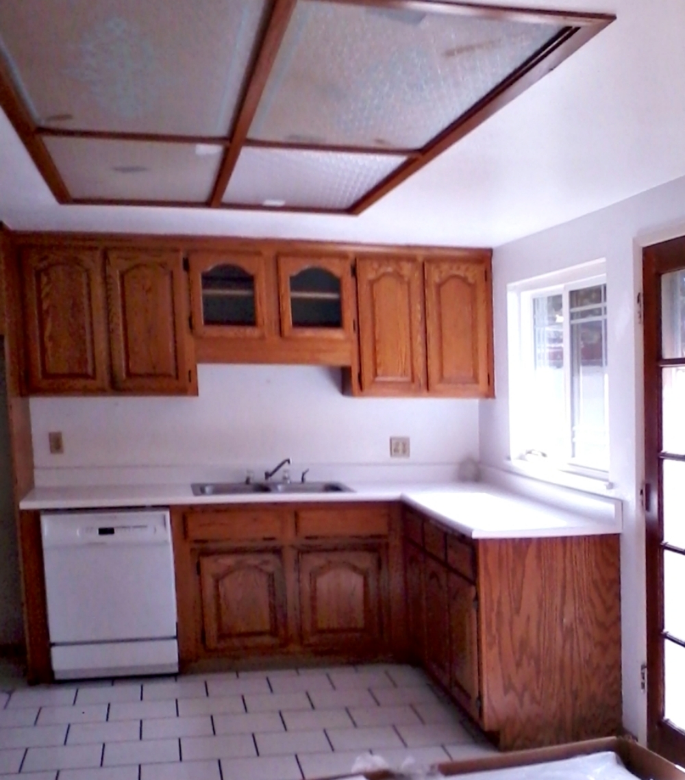
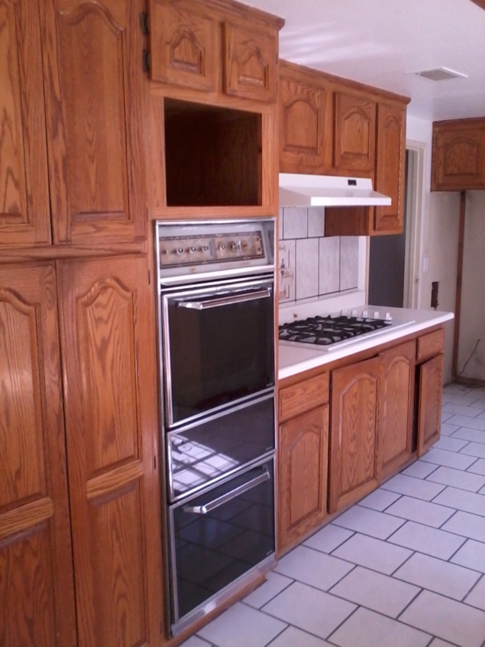
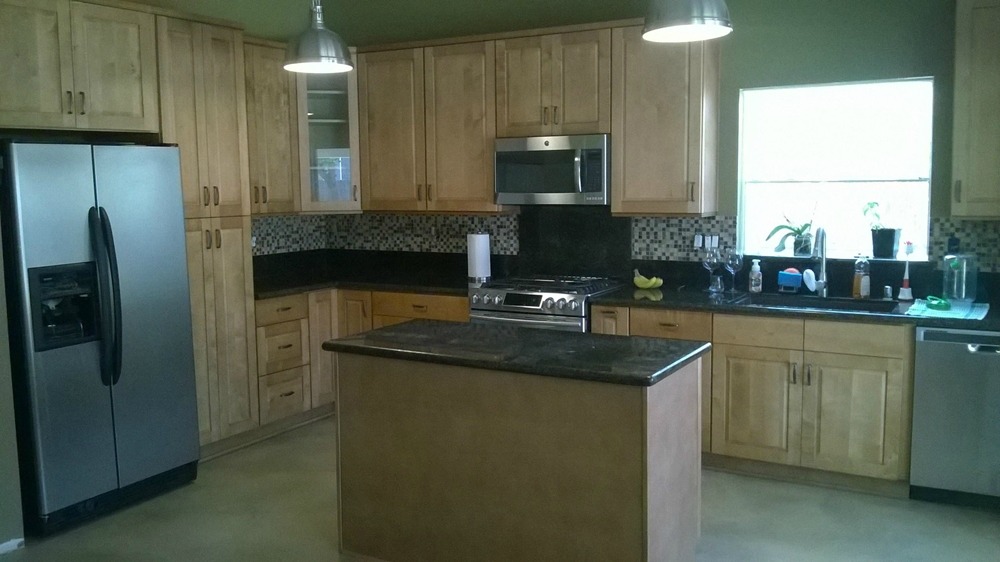
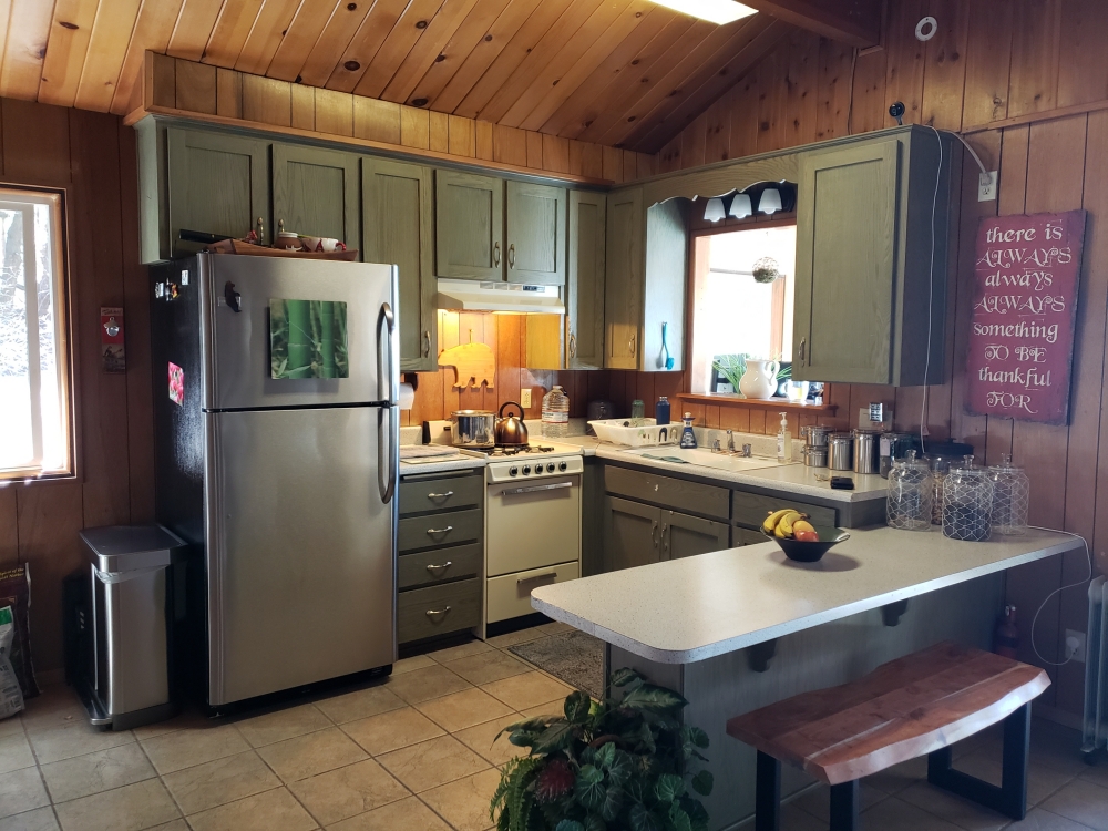
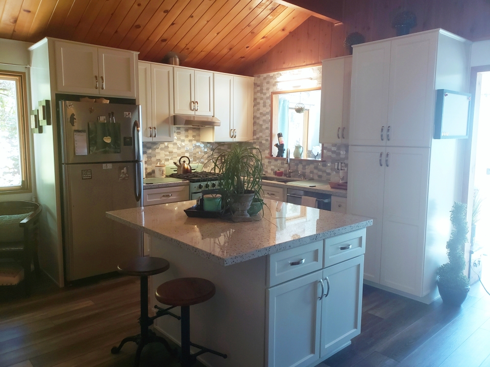
Coconut cabinets with White Sparkle quartz – It was time for this cabin to become a full time residence. The dark green cabinets were fine for the weekend cabin, but were dreary for full time living. The original cabin kitchen lacked both storage and countertop space. The low peninsula was replaced with an island. The island has cabinets on two sides for extra storage, and a breakfast bar overhang on the third side for quick meals. There is now a larger range (in mint green!), and a dishwasher to the right of the sink. The ends of this small kitchen are anchored by a large pantry and a refrigerator surround with a full depth cabinet on top for additional storage. The pantry and lower cabinets have roll-out shelves for easier access. A glass and stainless steel metal backsplash help to reflect the light.
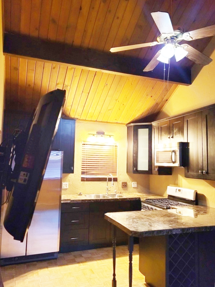
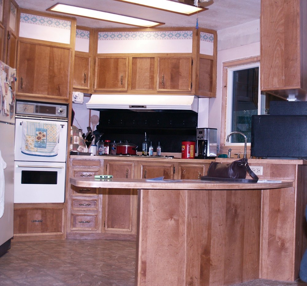
Sable Shaker cabinets and Bainbrook Brown granite – Removing the various angled walls from this manufactured home kitchen allowed for the creation of a more functional “L” shaped kitchen.
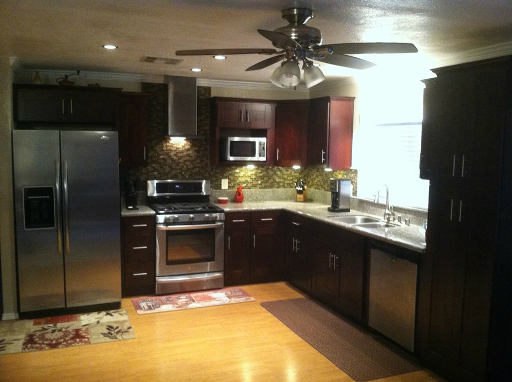
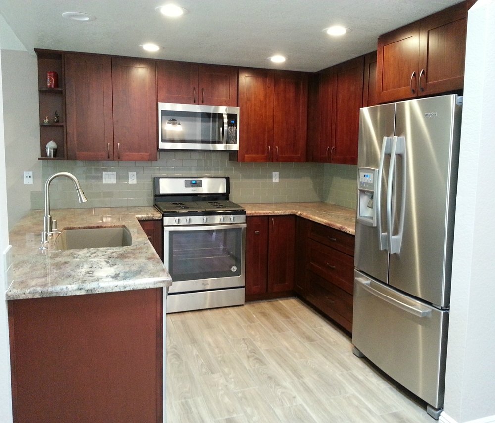
Crimson cabinets and Juparana Columbo granite – The layout on this kitchen remained similar to the original design. But the cabinets were dark and worn. The red cabinets and light granite brightened up the kitchen.
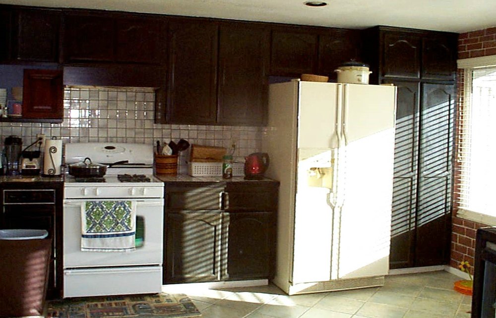
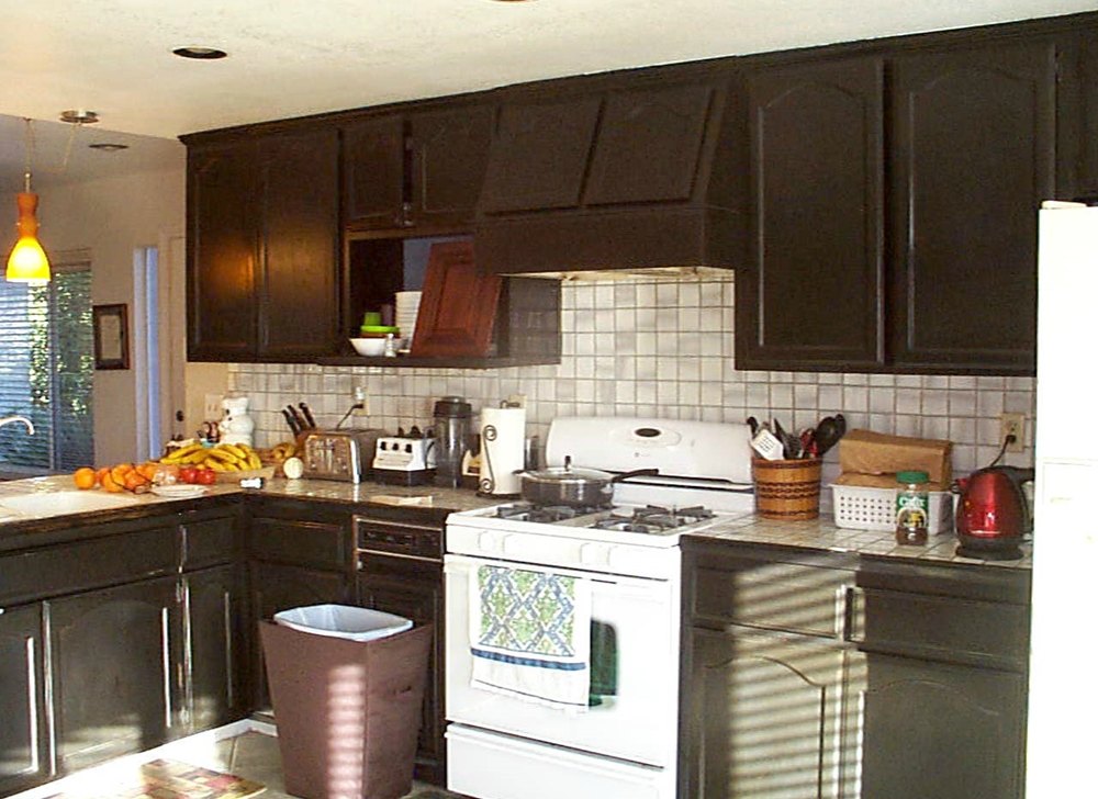
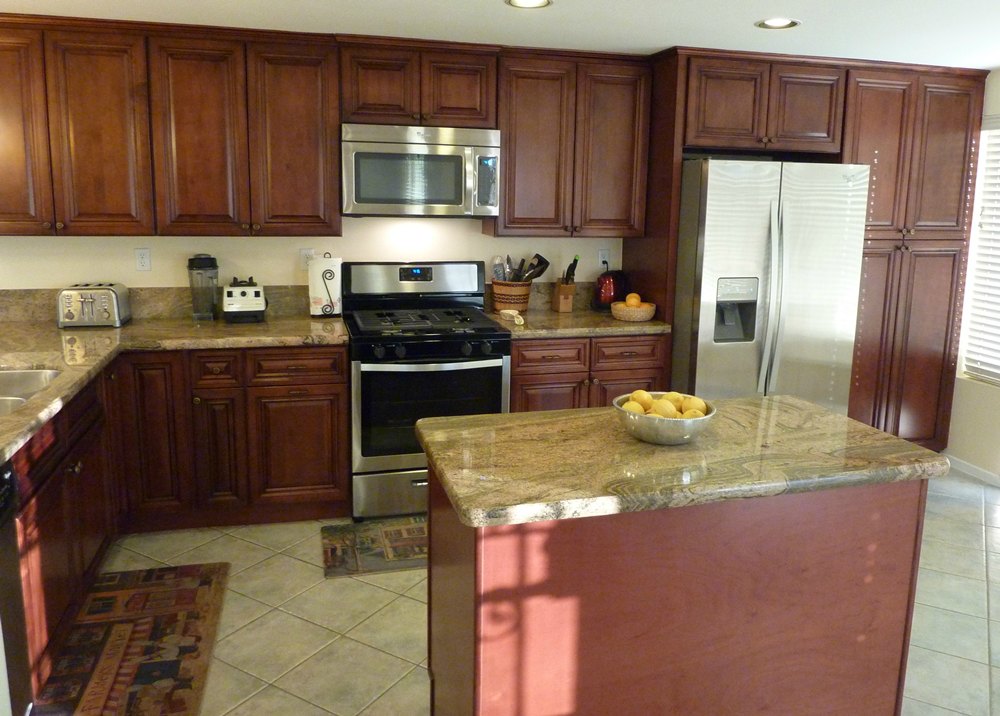
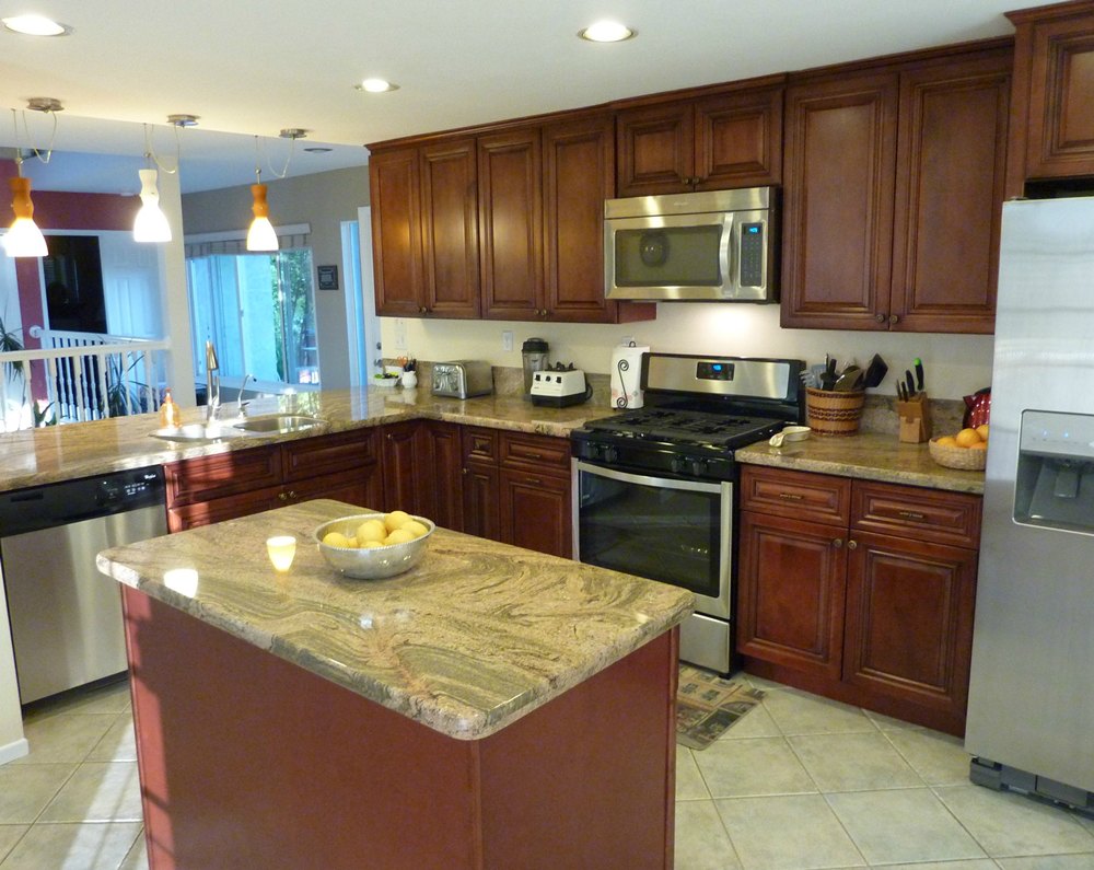
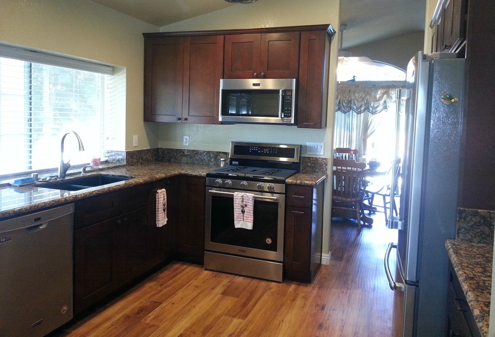
Cordovan cabinets and New Venetian Gold granite – Although the cabinets and appliances remained in their original locations, the kitchen looks very different with new darker cabinets, tile flooring, lighting, granite counters, and a lighter backsplash with a “color stripe”.
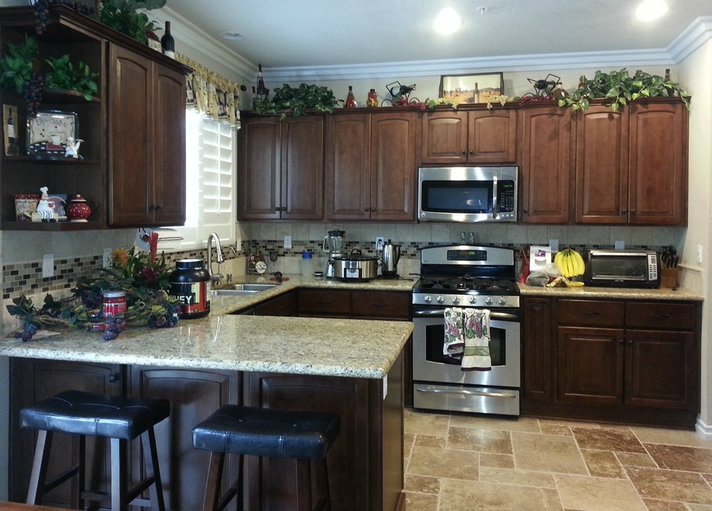
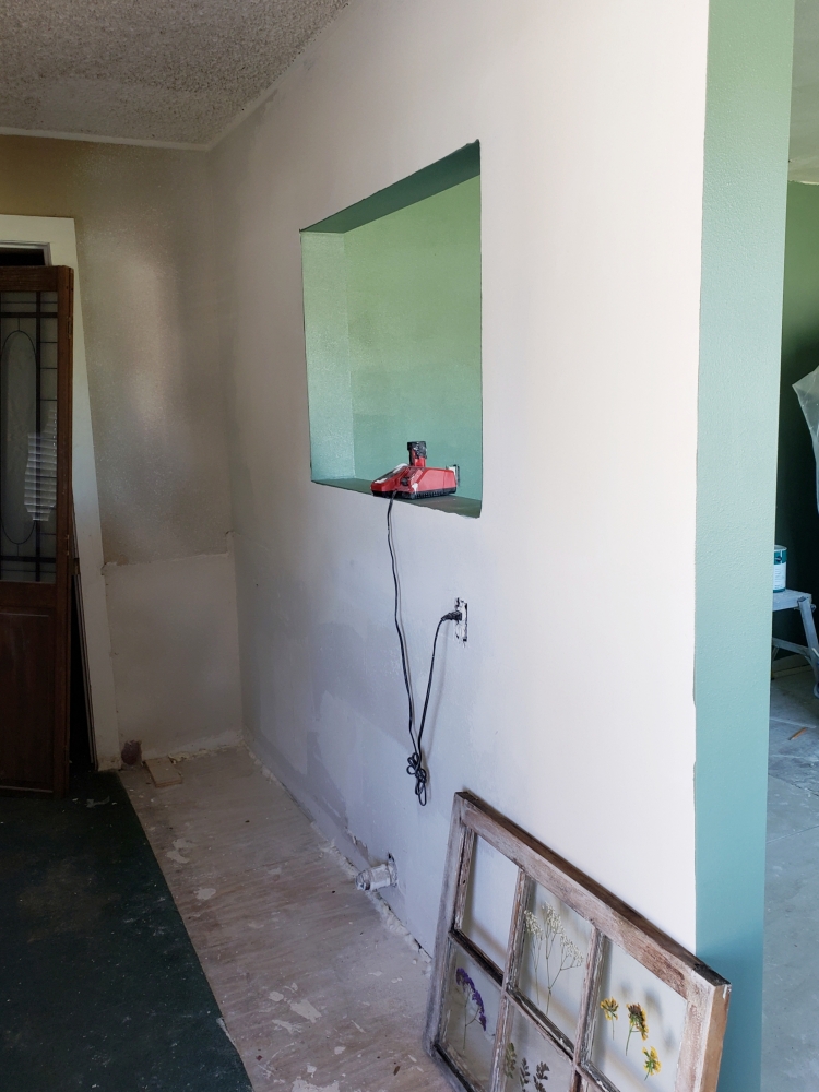
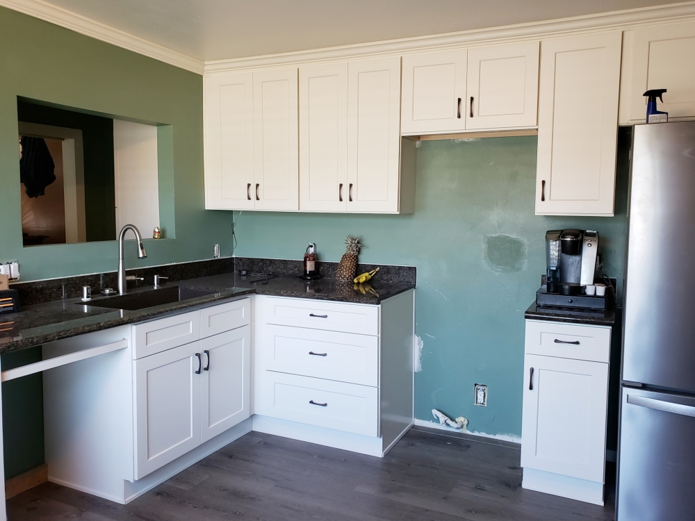
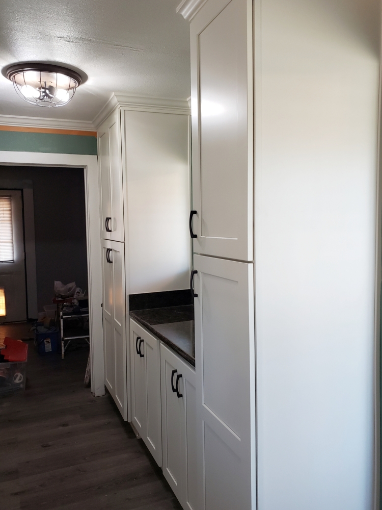
Cream Shaker cabinets with Santa Fe Brown granite – This older home needed to have the kitchen completely gutted. The floor, ceiling, and walls all needed to be leveled. The opening over the sink faces into a wide hallway with an adjacent laundry area. In the hallway, we added both pantry storage and a countertop for folding clothes. This keeps the pantry storage close by, but out of the small kitchen itself.
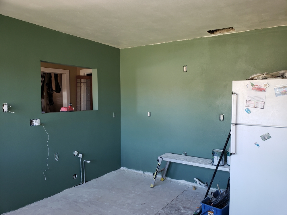
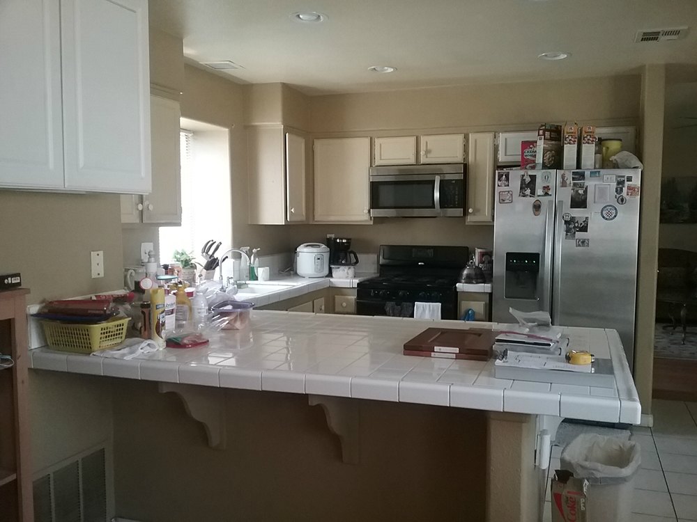
Cinnamon Shaker cabinets and Solarius granite – The owners had long ago extended the life of these original builder cabinets with paint. But the layout problems, soffit, worn tile, and under used breakfast bar still existed. The breakfast bar peninsula and soffit were removed, and replaced with a double-sided work island and cabinets all the way to the ceiling. This retained the same amount of counter work space, but resulted in more accessible storage by removing the dead corner. The new dishwasher is ergonomically located adjacent to the sink instead of in the peninsula.
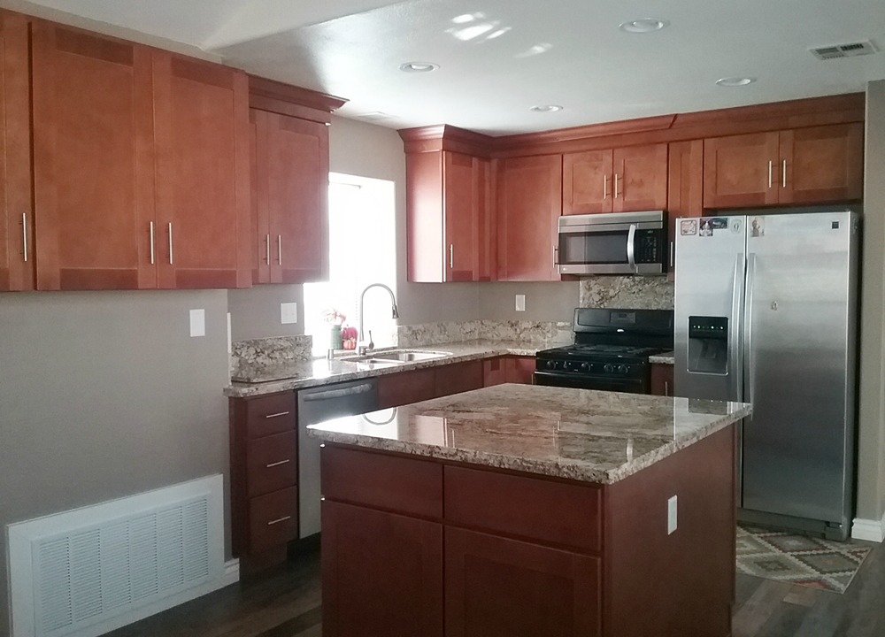
Bronze cabinets and Baltic Brown granite – This kitchen looks much richer with the darker cabinet and granite countertops vx. the builder’s original light oak and white tile countertops. The wine rack between the pantry and the refrigerator space makes a great entertaining space.
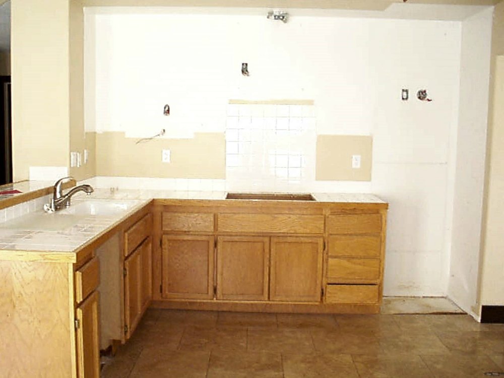
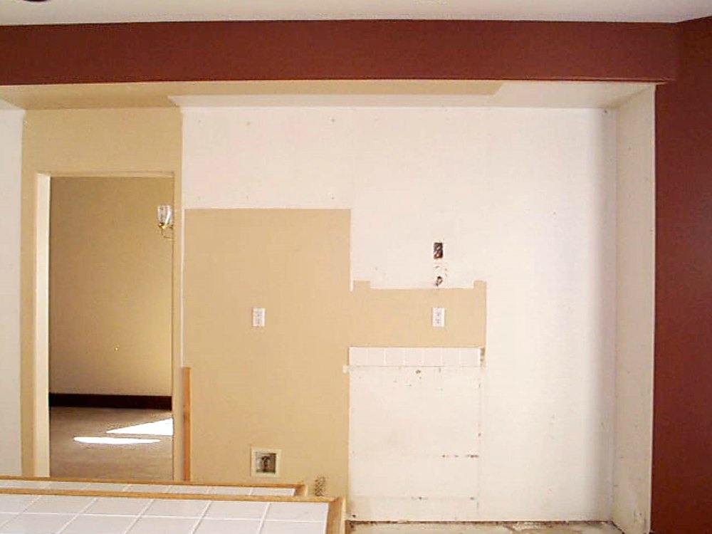
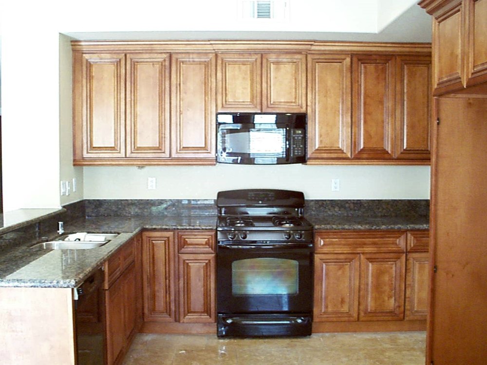
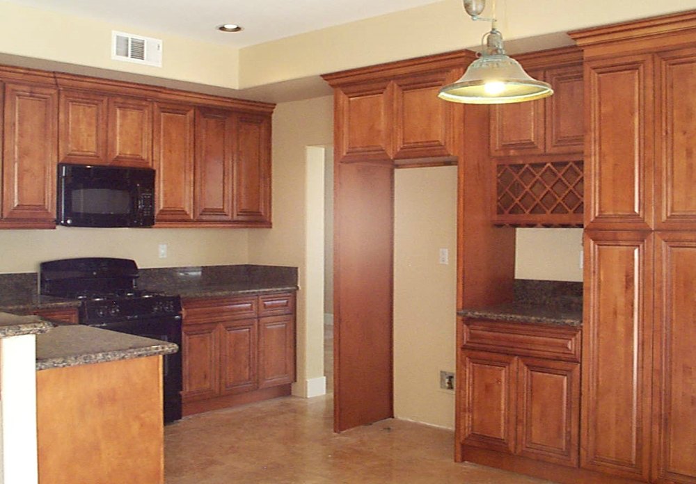
Chocolate Oak cabinets and New Golden Garnet granite – These black painted cabinets were peeling and looking worn. A sink flood provided the perfect time to upgrade to new cabinets with crown molding.
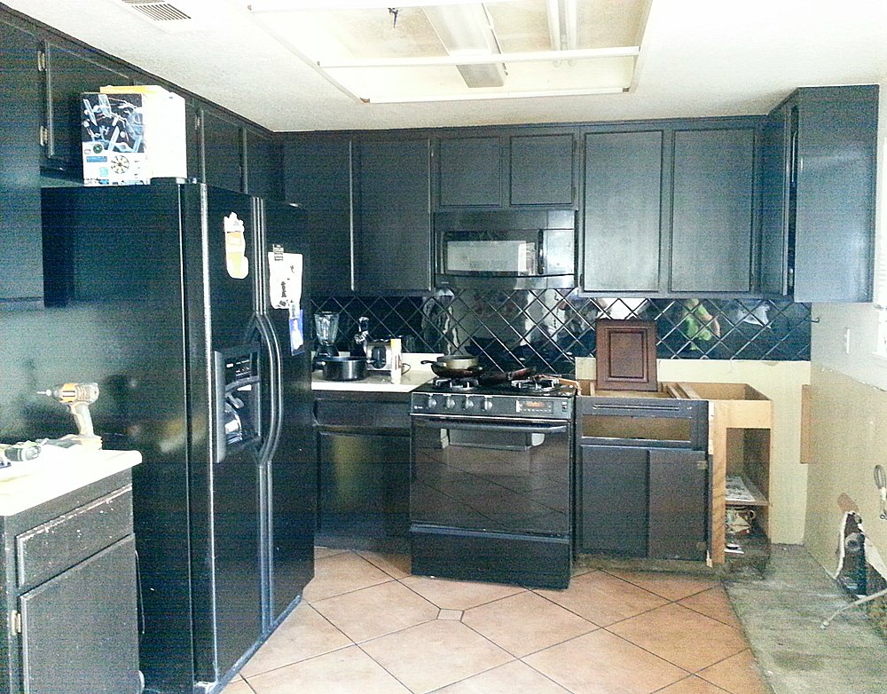
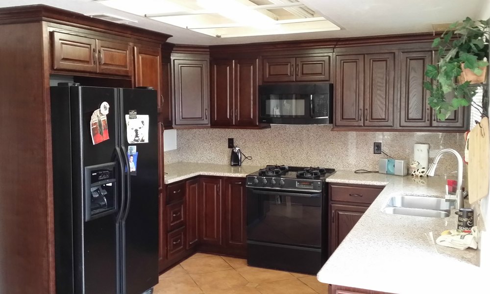
Polar Shaker cabinets and Africa Persa granite – It was important to keep this condo kitchen bright since it has no windows. The patterned granite helps to keep this all white kitchen from being too sterile.
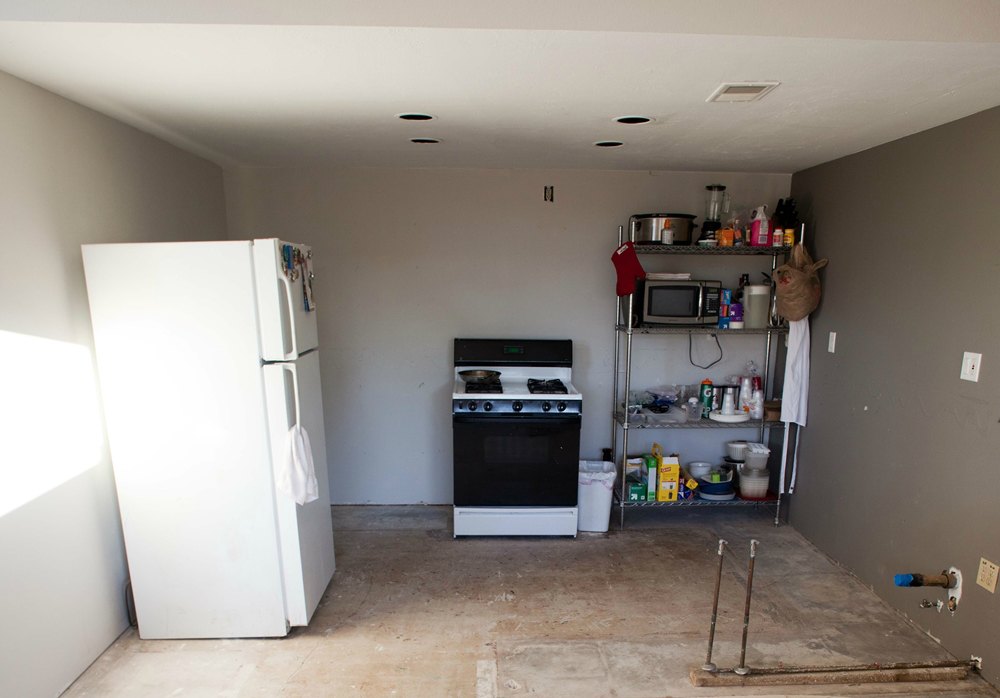
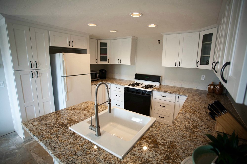
Cinnamon Shaker cabinets and New Golden Garnet granite – The old cabinets (which had been stained several times and were well worn) were replaced with simple Shaker style cabinets in a medium brown color. This results in a lighter and more modern looking kitchen.
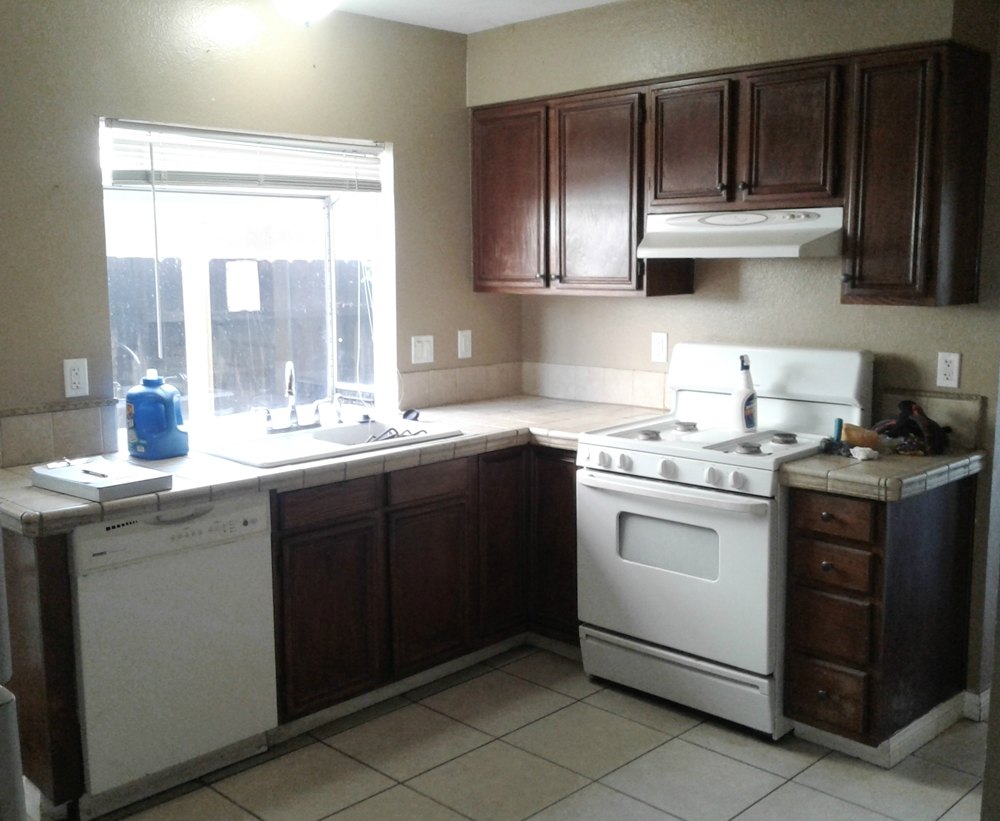
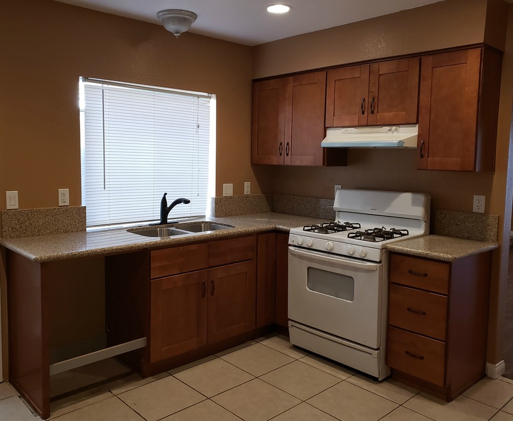
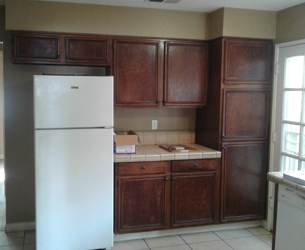
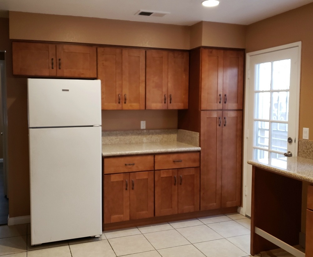
Gray Shaker cabinets and White Sparkle quartz – Removing the perimeter soffit allowed the new cabinets to go up to the higher ceiling for more storage. The cabinets along the backside of the peninsula (they run the entire wall length) add additional storage. Exchanging the old wall oven and cooktop for a new slide in range increased the countertop space, and the microwave is now off of the countertop. The island chimney hood provides for better ventilation. The stained concrete floors, recessed can lights, and Shaker cabinets add a modern look. The brightly colored tile backsplash makes this a child welcoming space for young chefs.
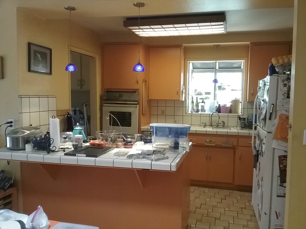
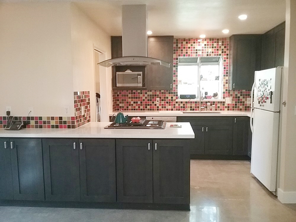
Oak cabinets and Golden Garnet granite – This rental kitchen had been well used over the previous 20 years, and was in need of an update. Although the layout remains the same, the new kitchen will wear better with all wood cabinets and stone countertops.
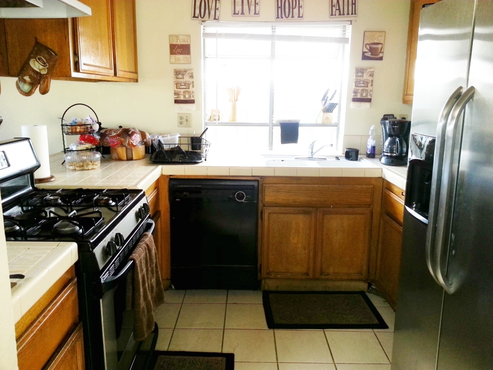
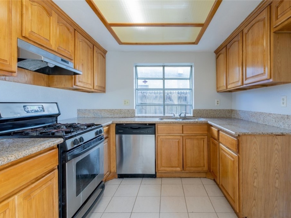
Coffee cabinets and Giallo Fiorito granite – The original peremiter ceiling soffit was removed to allow the cabinets to go up to the ceiling. The original wall oven was replaced with a slide-in range and an under counter microwave. The pass-thru opening on the stove wall was enlarged to allow views into the living room and the city lights through the sliding doors beyond. Since the sink does not look out a window, a bright stone and glass backsplash was added for some interest and color.
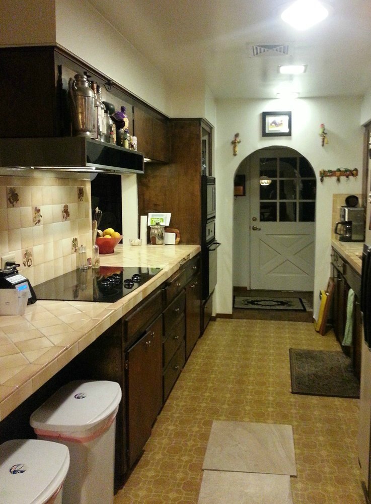
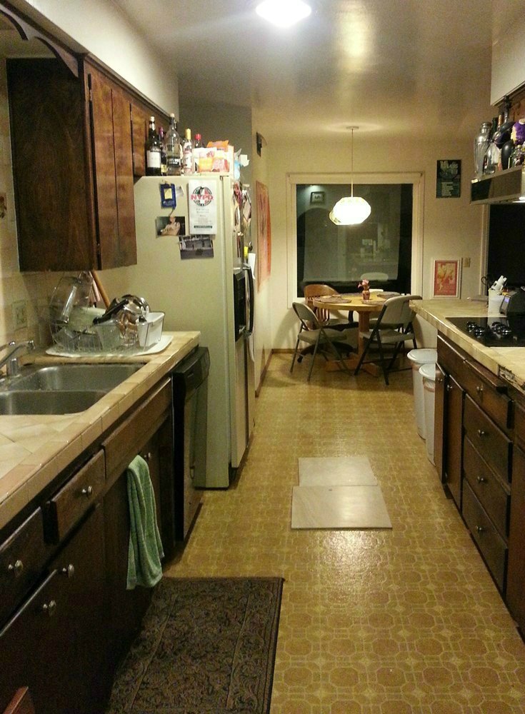
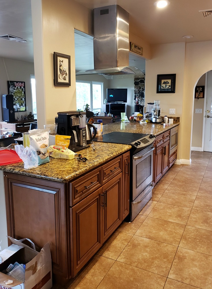
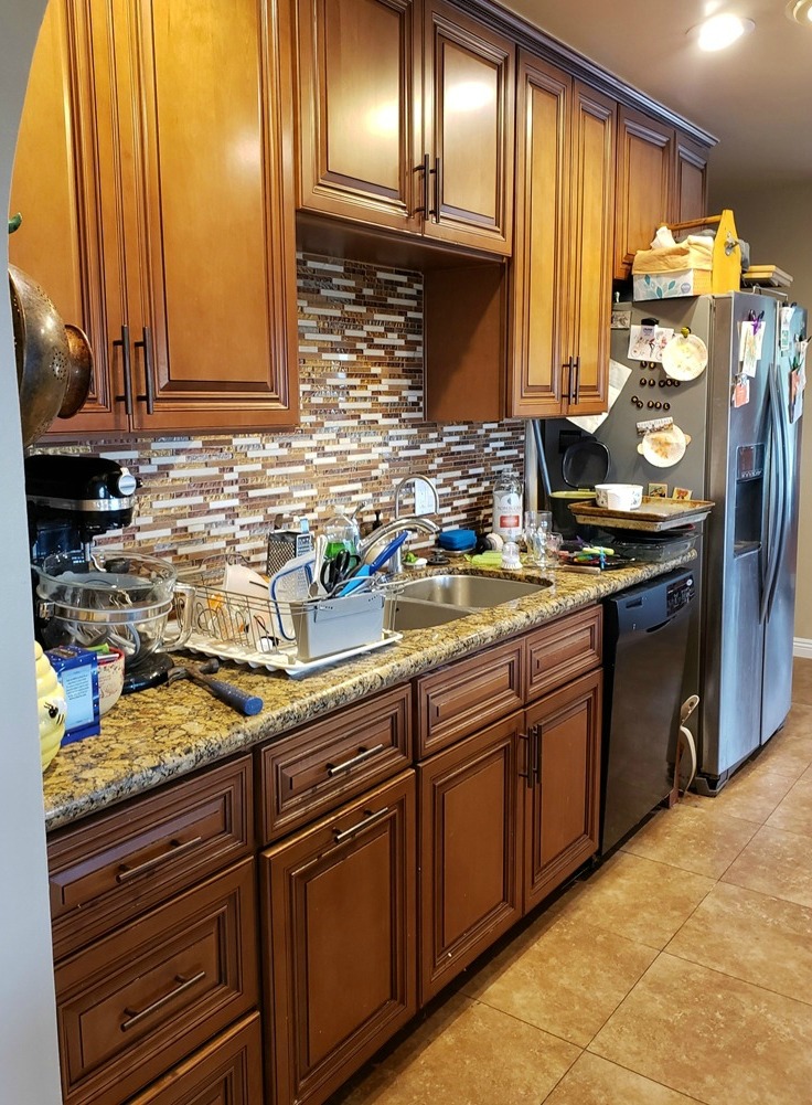
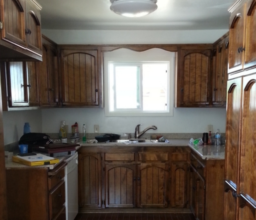
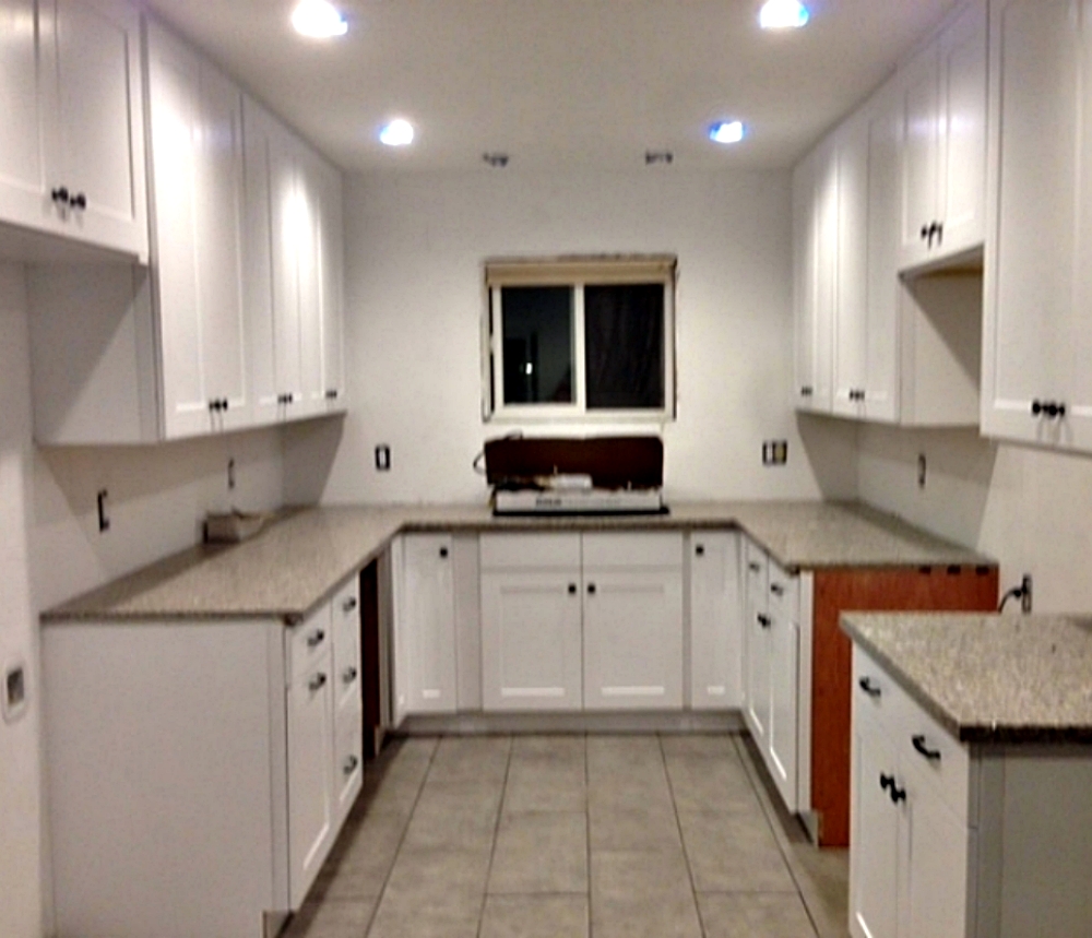
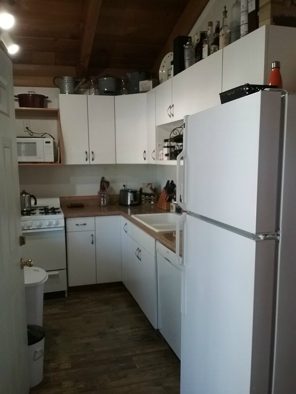
Buckskin cabinets and Royal Yellow quartz – This small cabin kitchen is less than 6 feet wide! The old layout lacked usable storage and was difficult to work in. By making smart choices, the owner now has a small kitchen that functions like a full size kitchen. We increased the range from 20 inches to 24 inches wide, we changed the sink to a single bowl (for more counter space), and we got rid of the dishwasher. A larger refrigerator was possible by recessing it into a closet. The pantry was added at the end to hide the side of the refrigerator and seperate the kitchen from the dining room. Most of the cabinets also contain pull-outs to maximize usable storage. A mosaic over the sink add some visual interest.
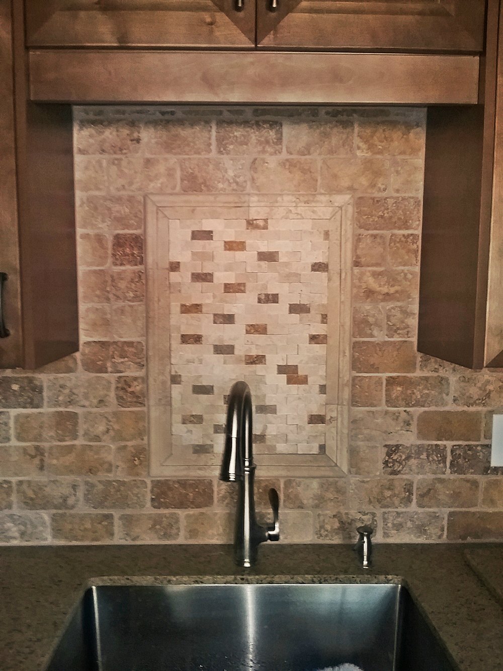
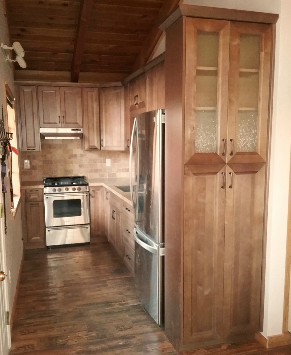
Various other projects completed between $10,000-$15,000
© The Cabinet Lady 2021
Site built by The Social Garden
