Wood Cabinets at
Particleboard Prices

CA Lic.# 1048615
Before and After over $25,000
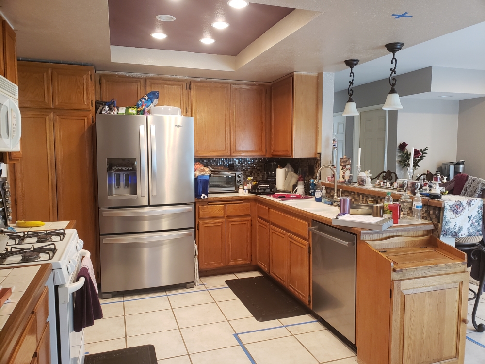
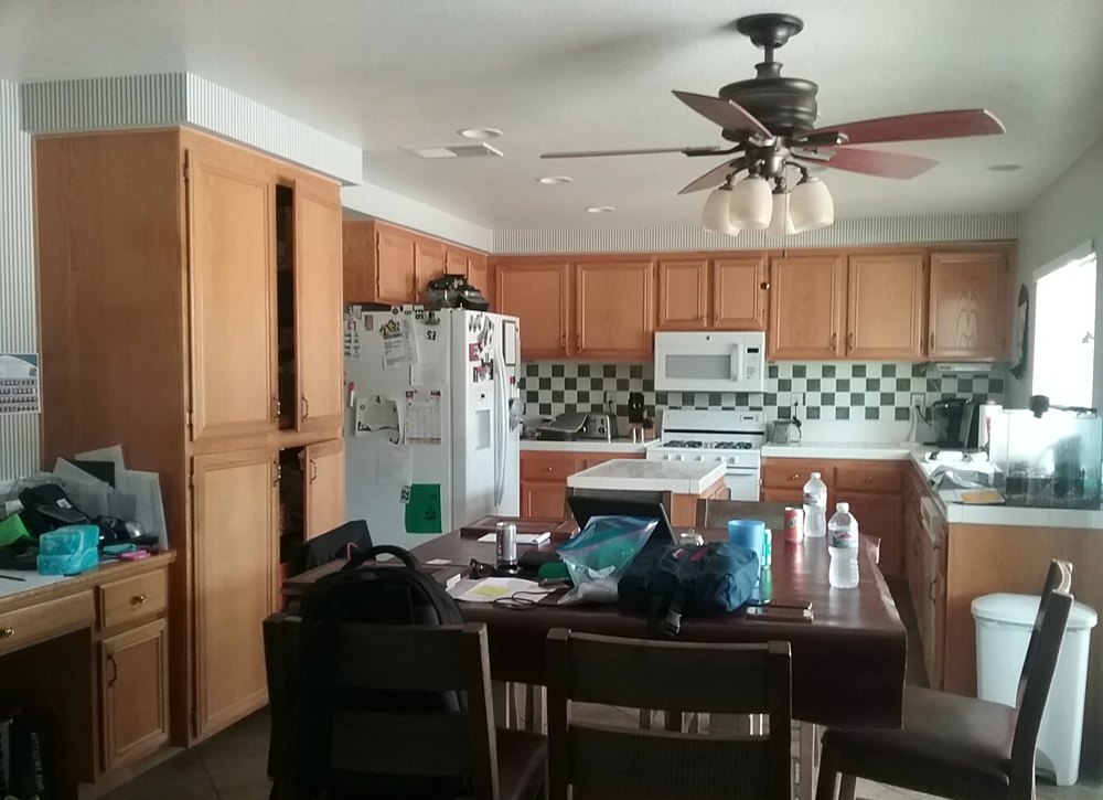
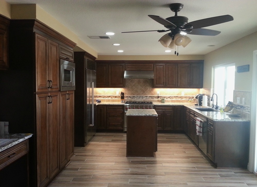
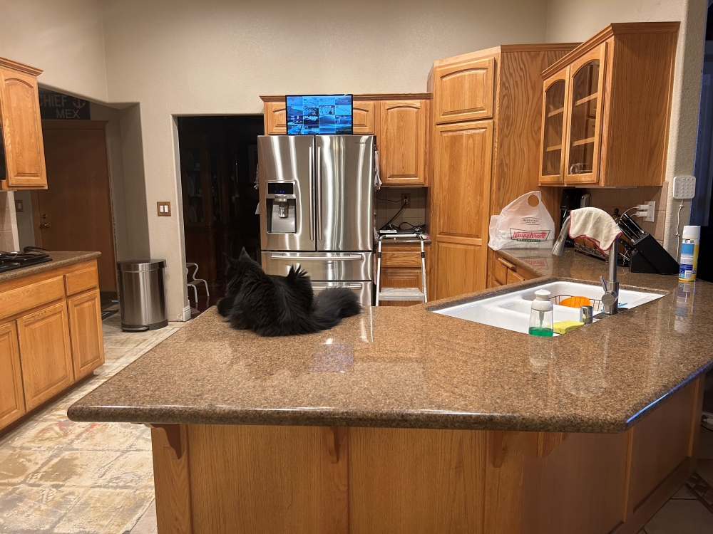
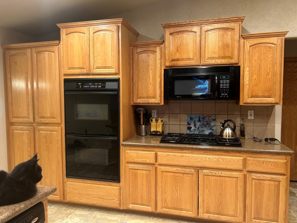
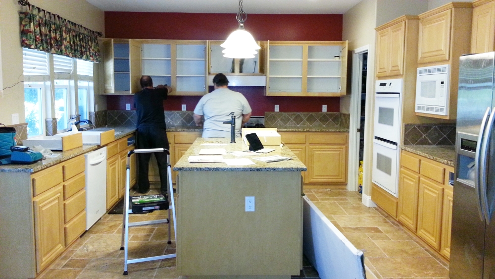
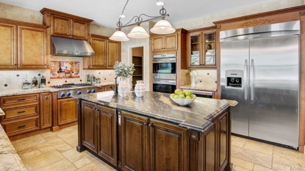
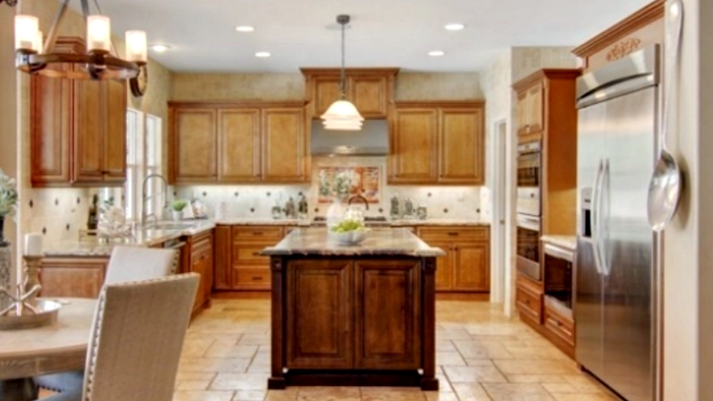
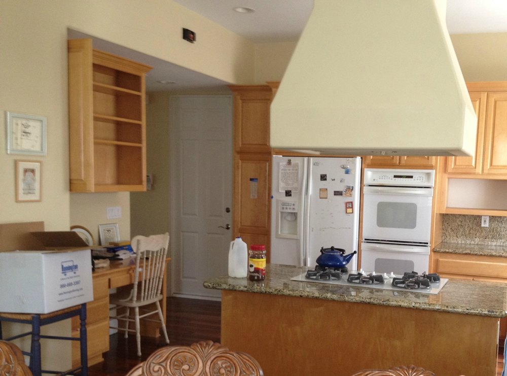
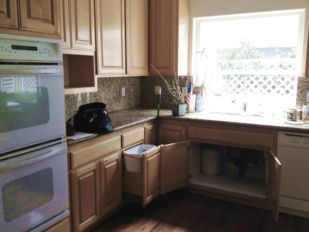
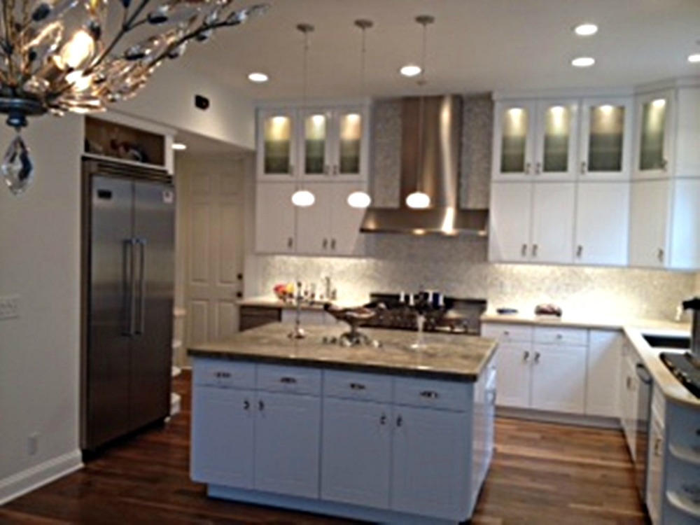
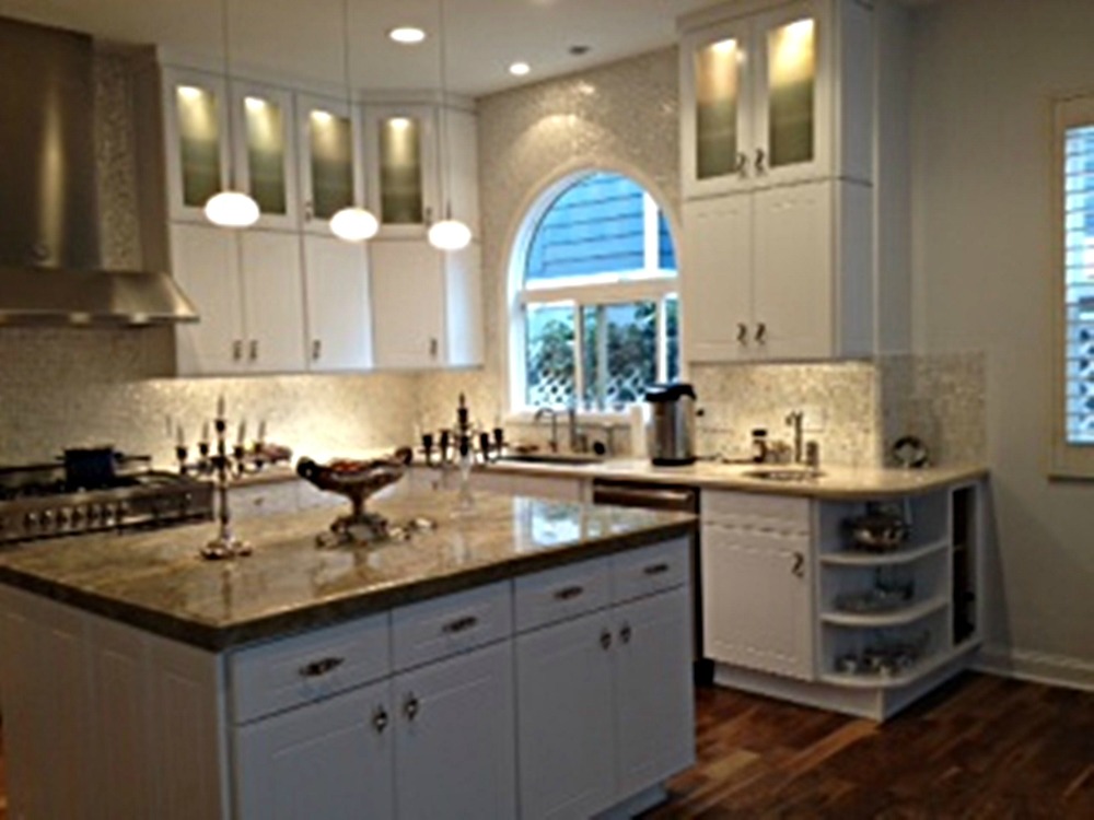
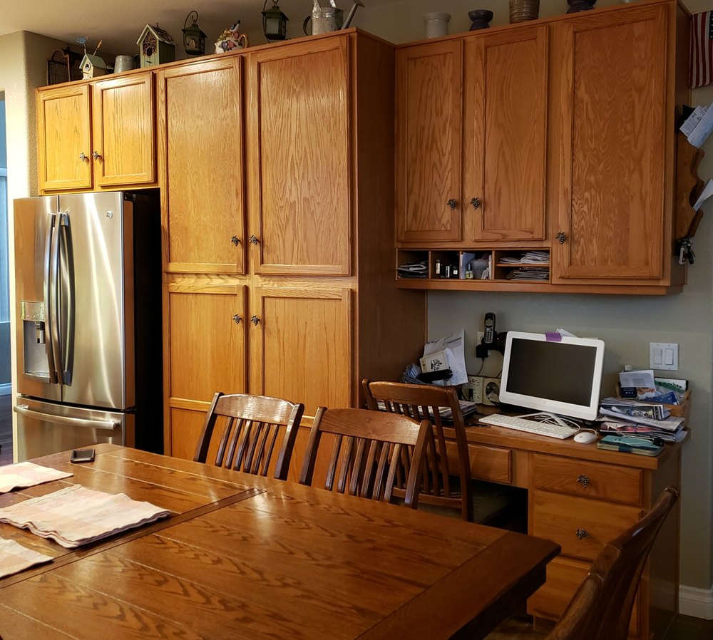
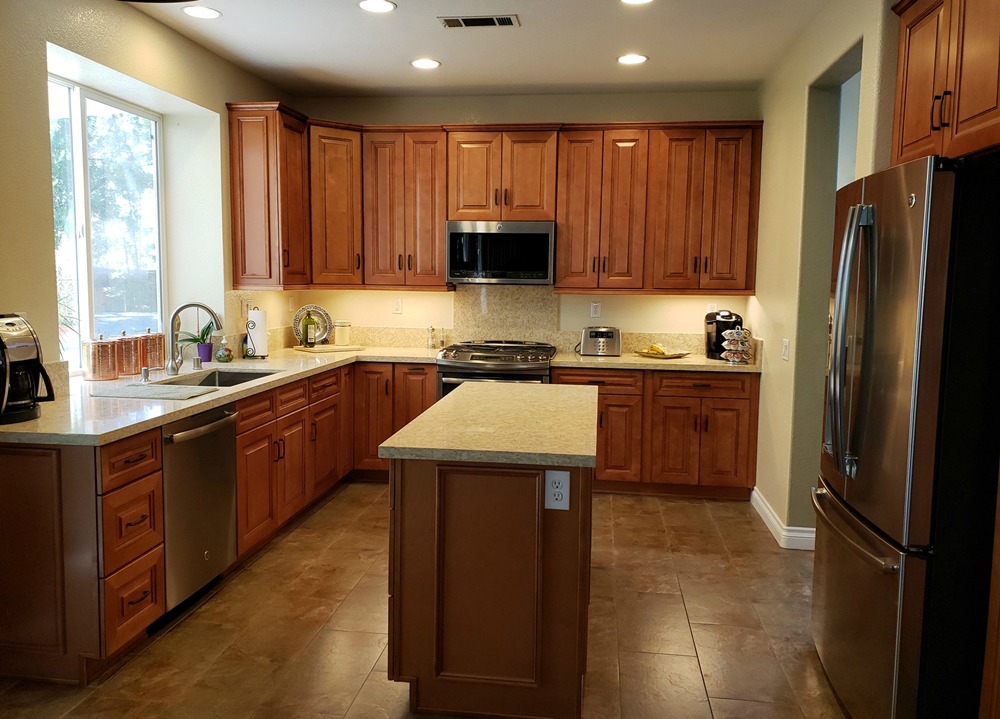
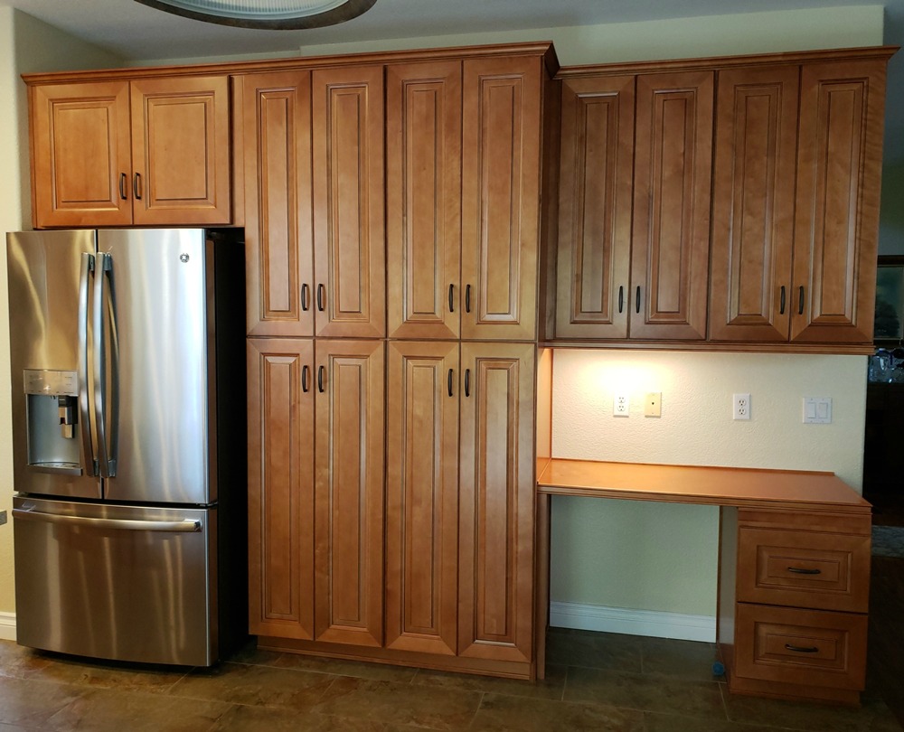
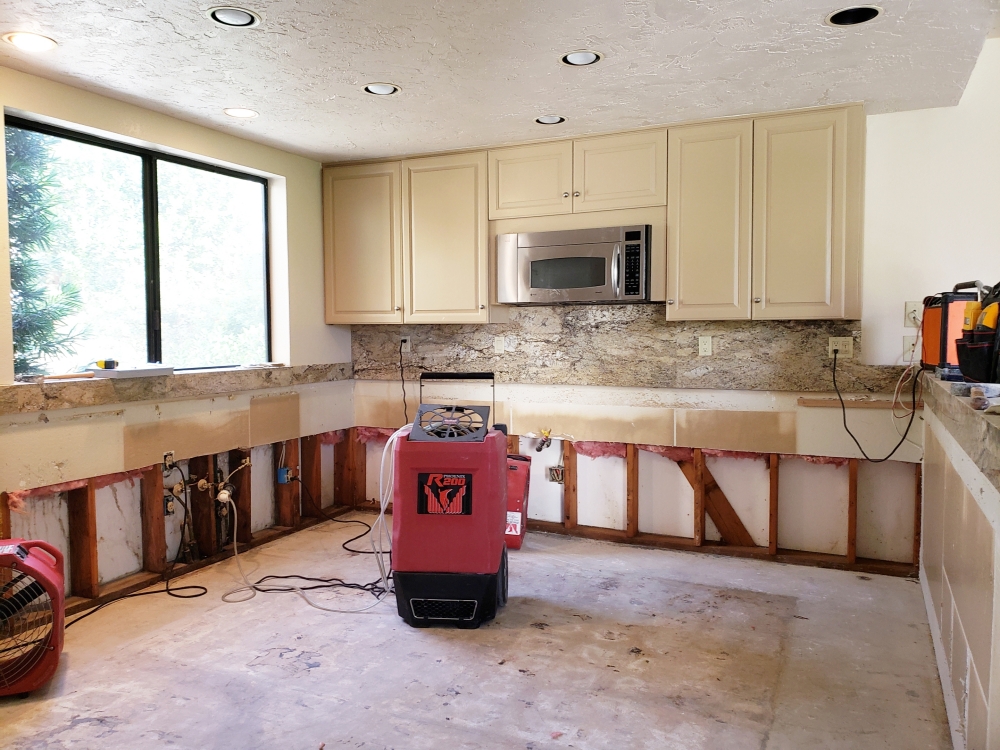
The “before and after” photos below show some kitchens we have completed over $25,000. Prices are for cabinets, countertops, and installation only. Other elements (such as flooring, backsplash, lighting, paint, and appliances) were an additional price.
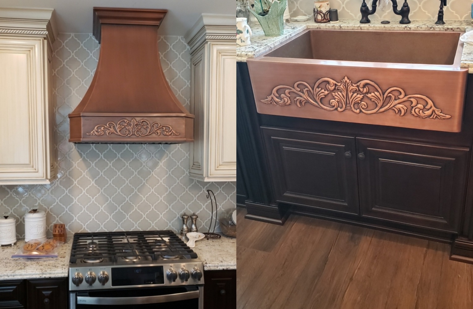
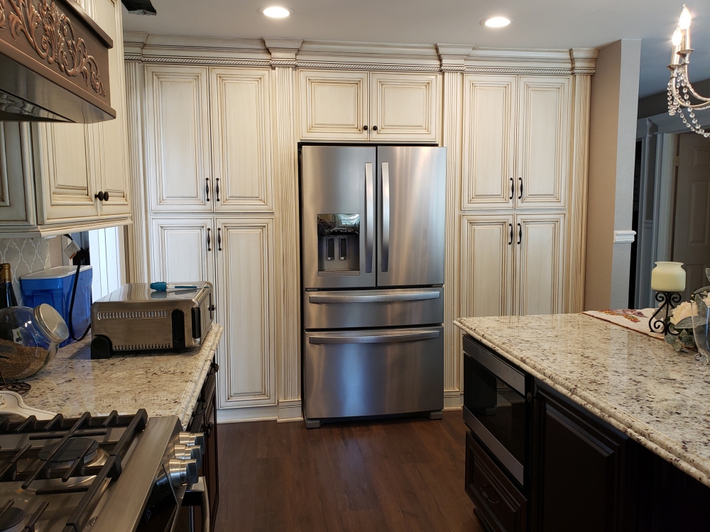
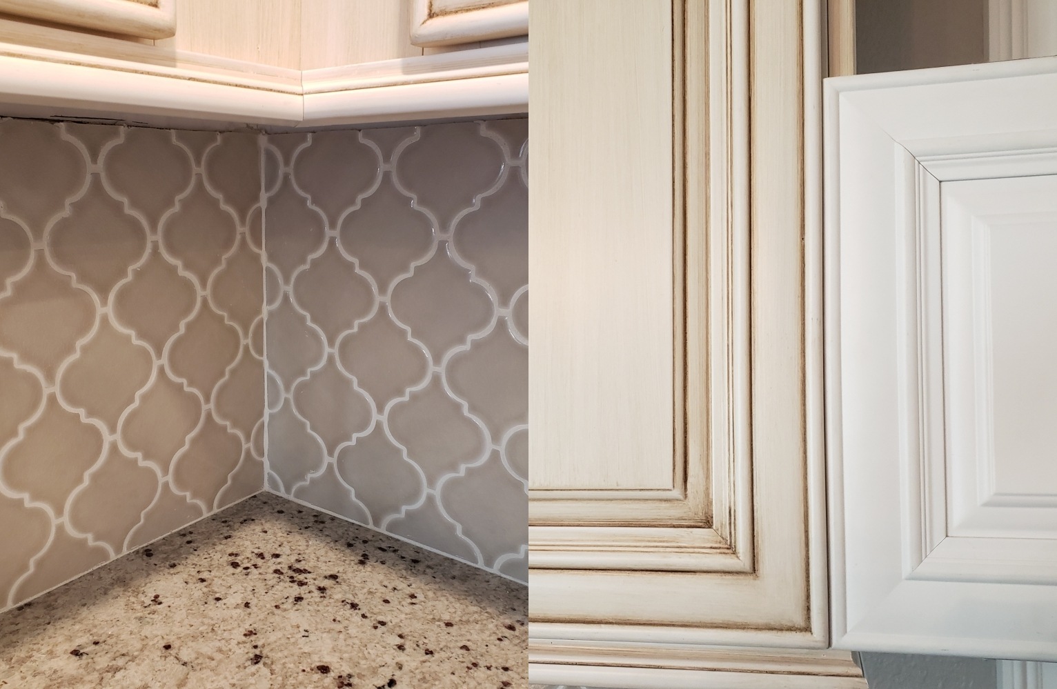
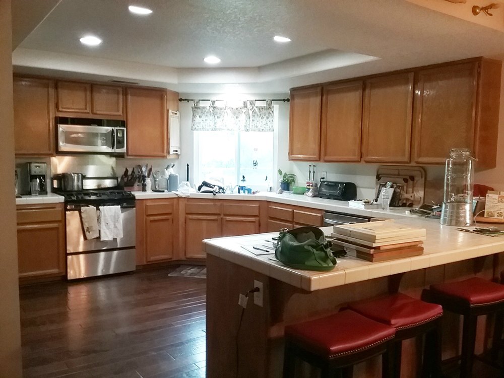
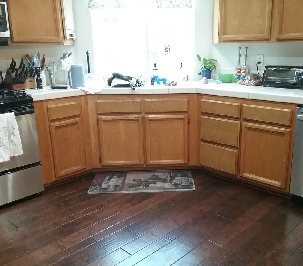
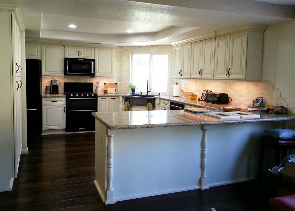
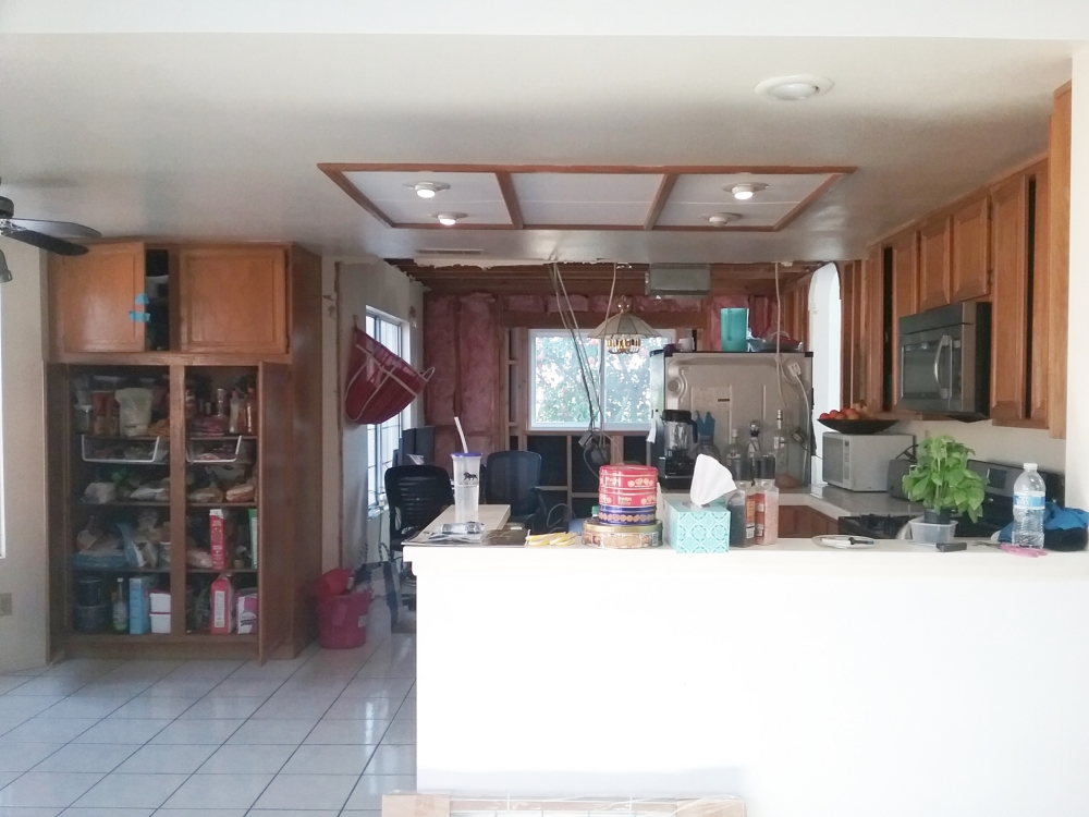
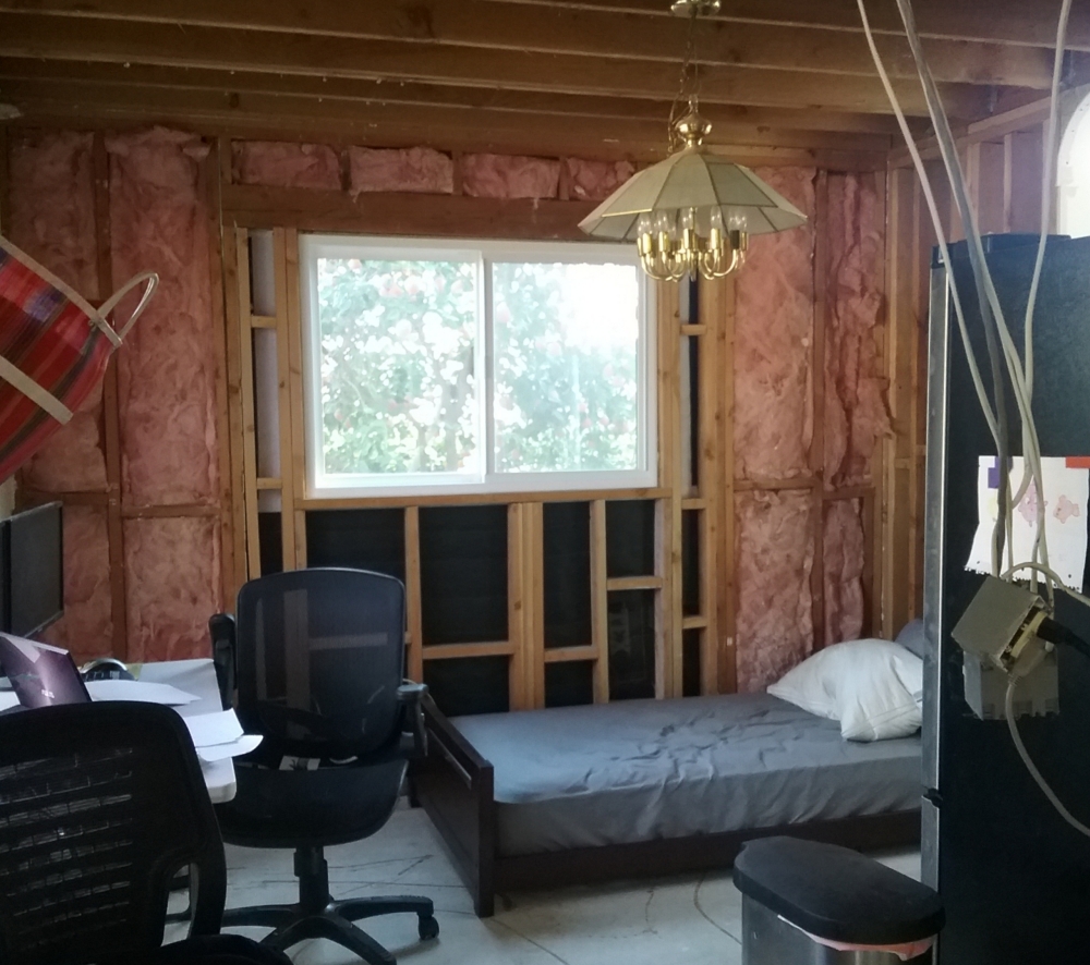
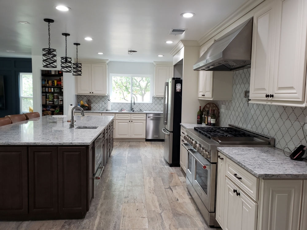
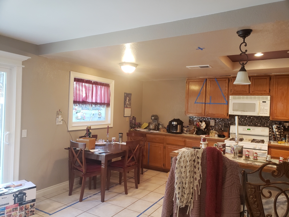
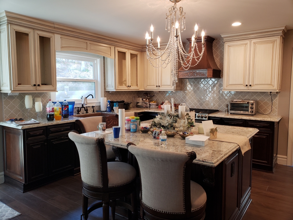
Custom glazed cabinets and Colonial White granite – These homeowners collect antiques and wanted their kitchen to reflect the rest of their home. We removed everything down to the stud walls, and removed the dropped ceiling to match the ceiling height of the adjacent family room. We removed the eating bar peninsula. This opened up the space to allow for an island. We relocated the sink to be under the window. The new copper sink has a large traditional valance on top. We moved the stove slightly to the left to allow for more countertop on the right side. The old microwave hood was replaced with a copper chimney hood. The microwave was relocated to be in the island. We centered the refrigerator on the back wall with large pantries and decorative columns on both sides. The tile backsplash is done in an Arabesque style, and beautifully wraps the corner as well as climbing the wall behind the hood. The extensive use of moldings, columns, decorative door panels, corbels, ogee countertop edging, custom glazing (they were originally plain white), copper sink, and copper chimney hood result in a very beautiful traditional design.
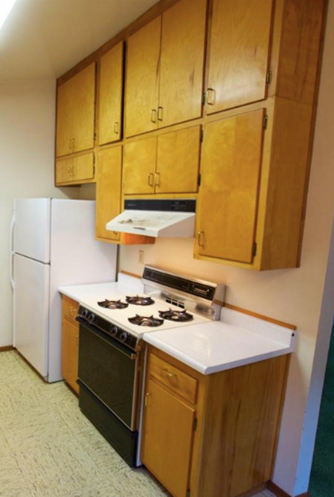
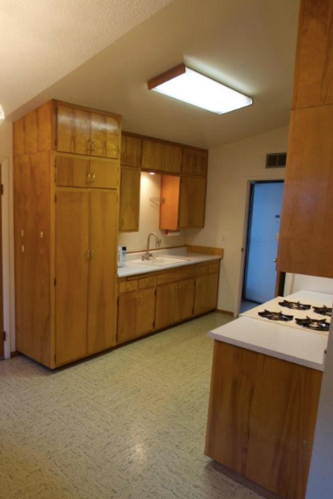
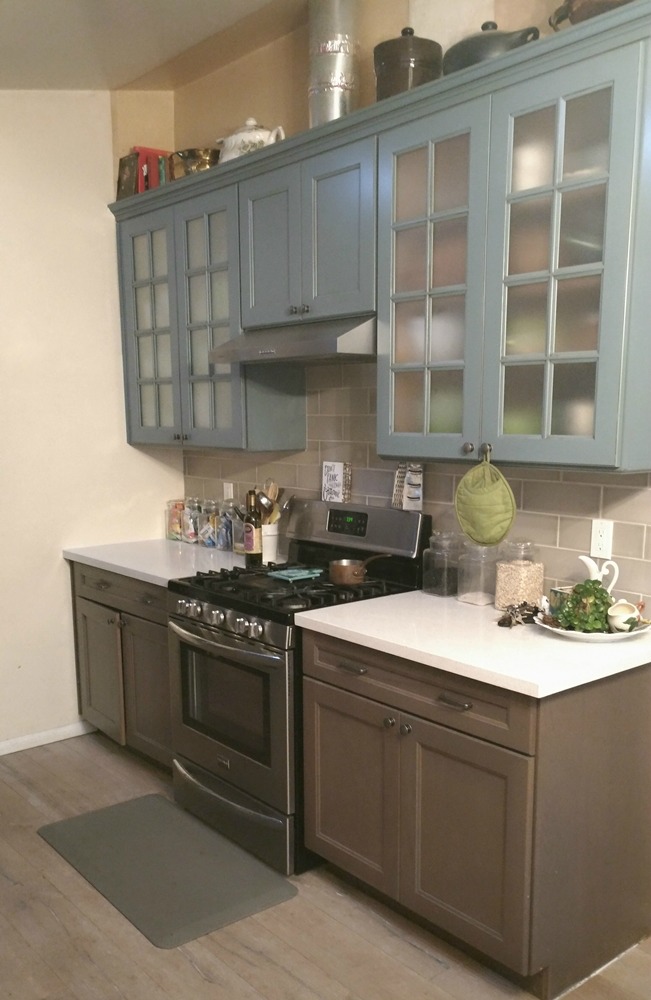
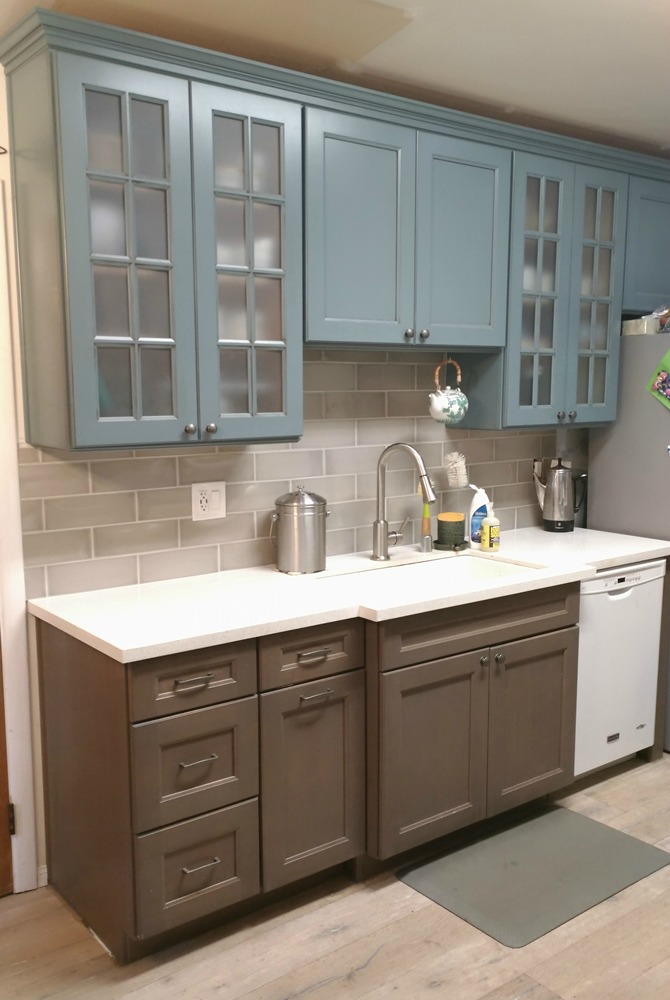
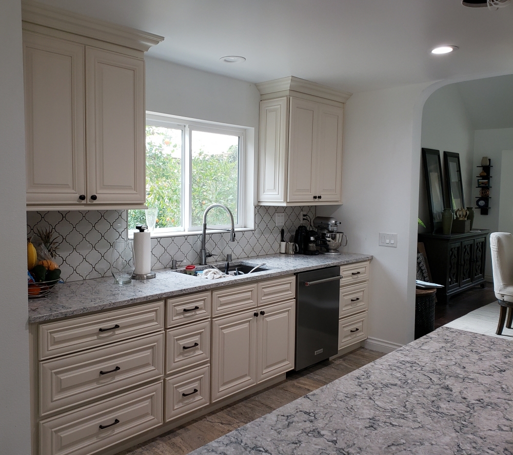
Semi-custom Julien glazed cabinets from Diamond Cabinetry and white sparkle quartz – The original slab cabinets were original to the house and lacked personality. The new lower cabinets are a more conservative brownish gray color to ground the kitchen and coordinate with the new driftwood gray floor. The new upper cabinets are an aqua with a brown wash. The multi-pane frosted glass windows add to the country feel. The sink was bumped out to mimic the bumped out stove across from it. The refrigerator was moved to the sink wall which allowed for easy access for an ice maker line. Without the refrigerator on the stove wall, the countertops on either side of the stove are much larger and more usable.
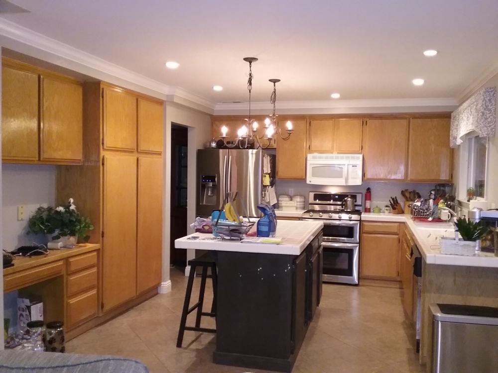
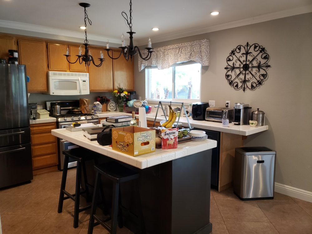
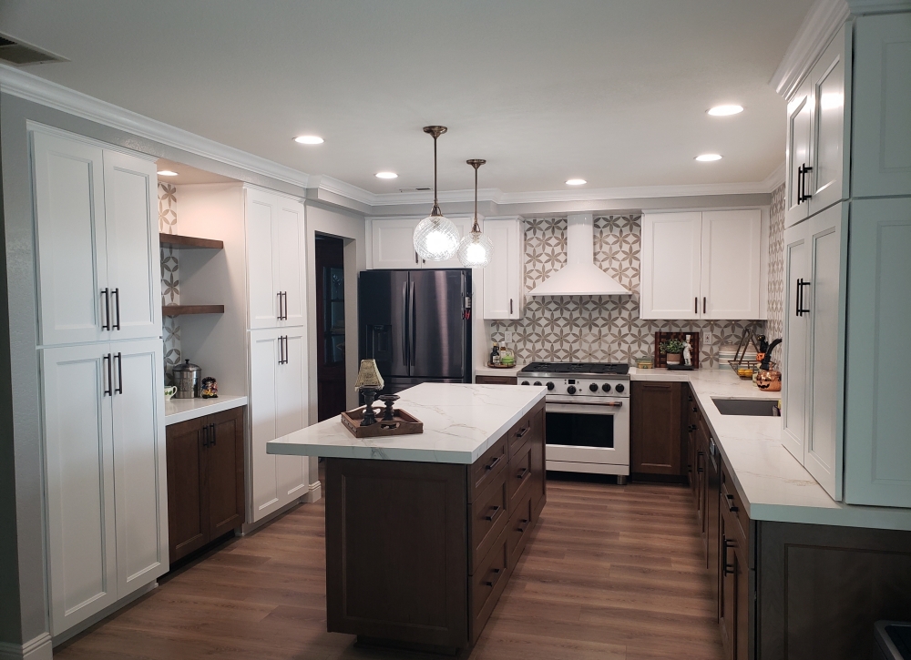
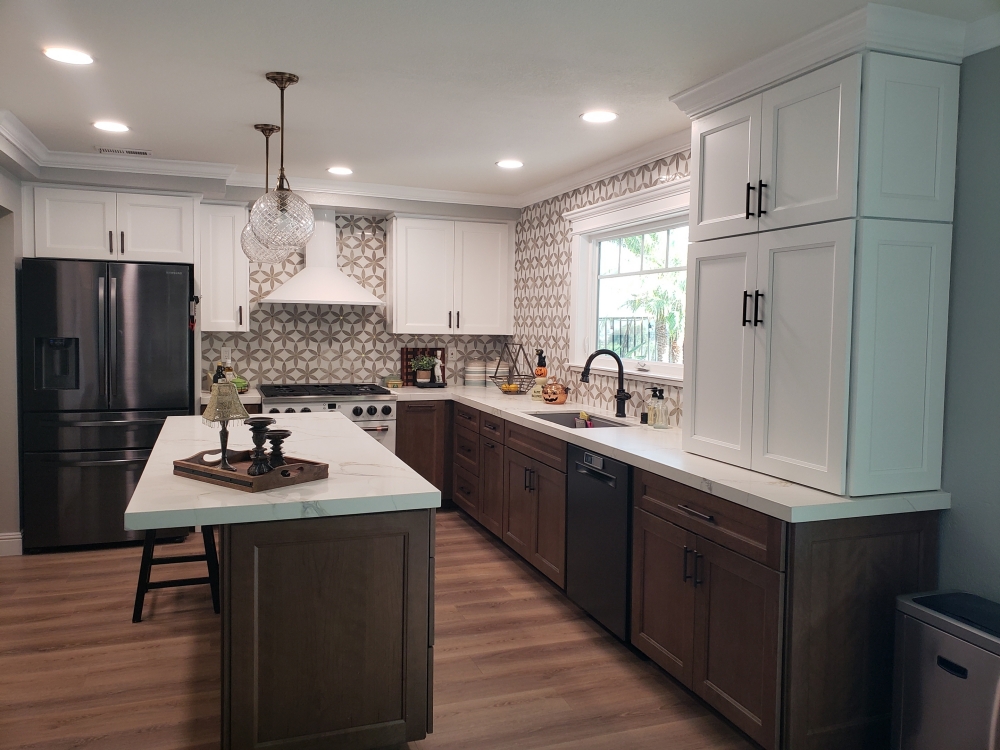
Marshmallow Cream cabinets (top) and semi-custom cherry wood Kemper Amstead cabinets (bottom) and Mina de Oro quartz – After 30+ years, the owners decided it was time for a new kitchen. The original kitchen had done a good job of raising the family, but now it was time for the parents to get a kitchen more in line with their personal preferences. By combining more expensive semi-custom stained cabinets with less expensive stock painted cabinets, they were able to get beautiful cherry wood grain and save money too. The seldom used desk and pantry wall was altered to dual pantries and a coffee bar area for more efficient storage. The sink wall was extended five feet towards the adjacent family room (two feet on the left of the sink and three feet on the right of the sink). The sink and window were then moved two feet to the right to center them on the new wall. The standard builder drywall window was exchanged for a new custom window with a custom window frame. To the left of the sink is a pull-out trash can, and at the end of the sink run is a large lower storage cabinet with roll-out shelf trays. Sitting on the countertop above that cabinet is an appliance garage. The bottom section is tall enough to hold large appliances, and has a shelf for their accessories. The 30 inch wide stove and above microwave have been replaced with a 36 inch wide stove and a chimney hood. On either side of the stove are pull-outs for holding trays and utensils. The microwave is now located in the island facing the stove. The island also has six large storage drawers. The beautiful backsplash tile consists of two colors of marble with gold foil star centers. It was placed on all the exposed kitchen walls to add some drama. Crown molding, glass ball pendant lights, and decorative doors complete the look of this transitional kitchen.
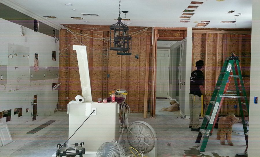
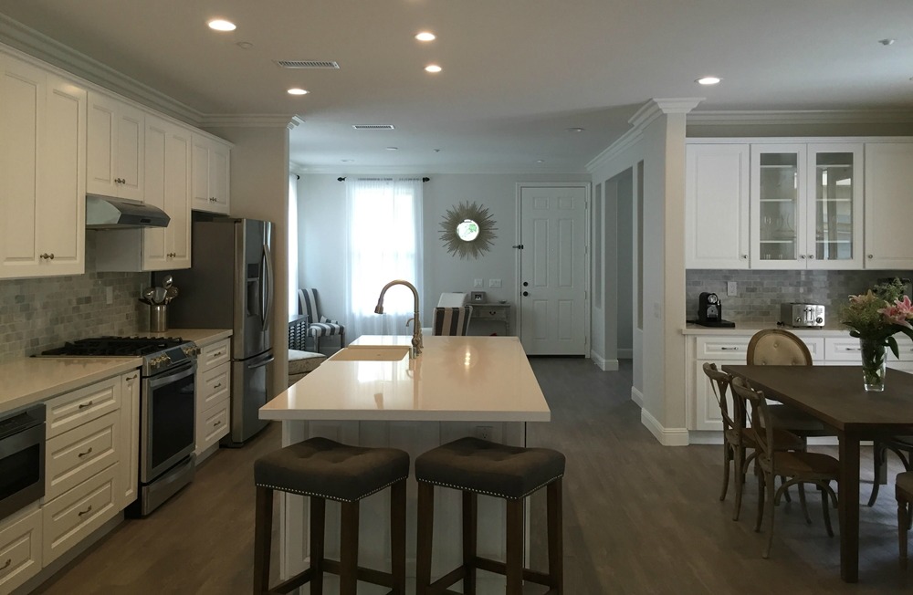
Snow Traditional cabinets and Pure White quartz – Removing the wall between the kitchen and living room allows light to flow thoughout. Adding cabinets in the adjacent breakfast area makes up for the cabinets lost from removing the wall, and creates an entertaining space. An overhang for stools was added to the end of the island (instead of the back). This allows for more cabinet storage on the back of the island, and a uninterrupted walkway. The microwave was moved under the countertop which is a much safer location than over a hot stove (we are doing this a lot now).
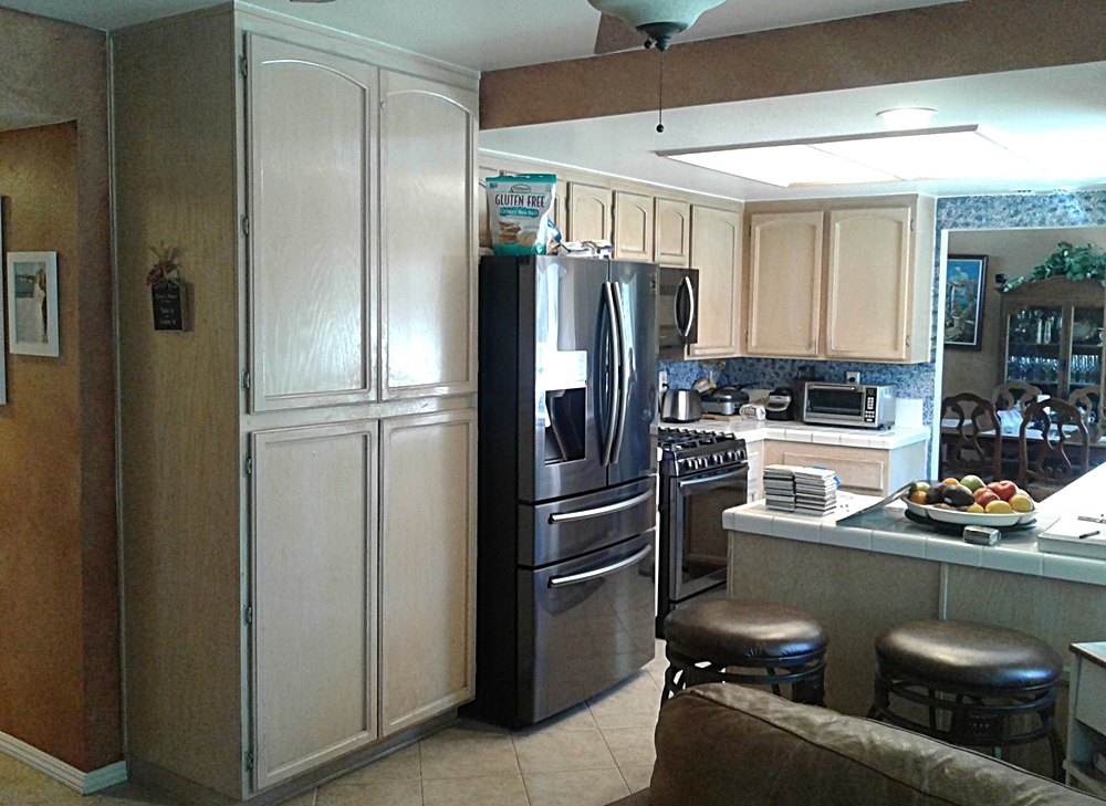
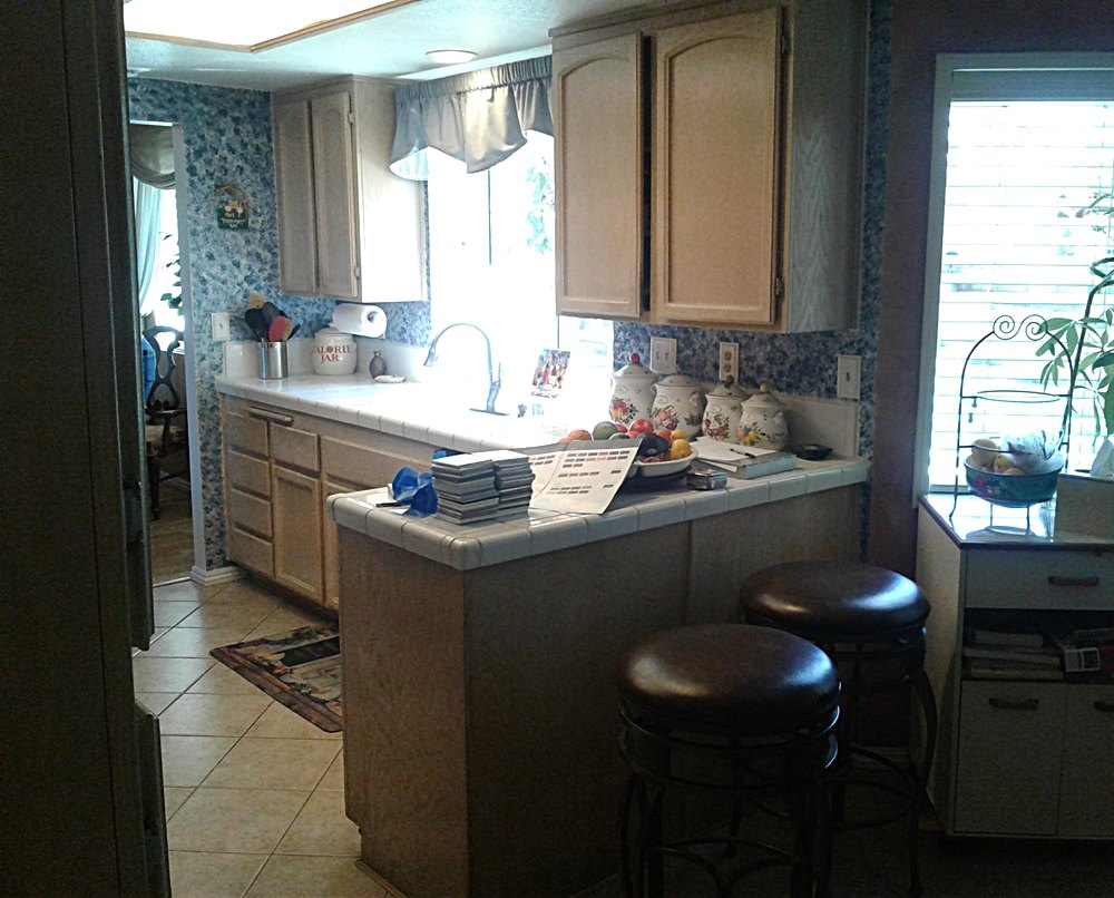
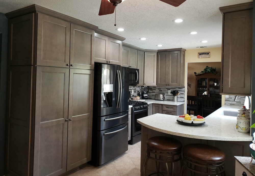
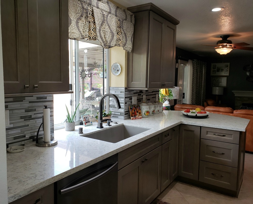
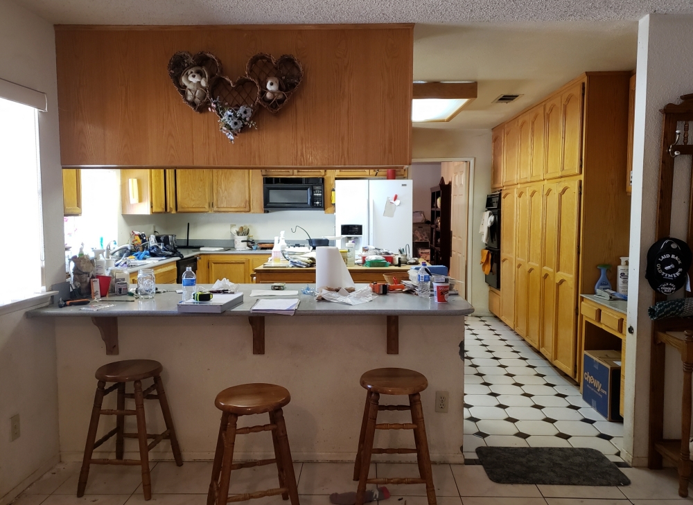
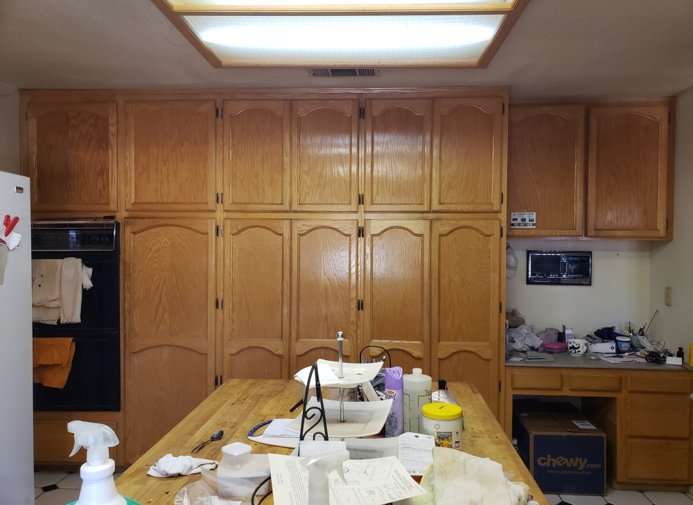
Semi-custom Caldera cabinets from Diamond Cabinetry with Silver Sea quartz – The cabinets were updated from the original builder’s white wash arched cabinets to a more contemporary seal color with square doors. The dropped ceiling was removed and replaced with recessed can lighting which allowed for taller cabinets and crown molding. Having the ceiling at one height allows the kitchen to flow into the breakfast area. The new pantry is a custom depth of 27 inches to block more of the refrigerator side. The quartz peninsula back has been extended and rounded to create an actual two stool breakfast bar. The mixed media narrow stacked backsplash has colors to blend the cabinets and the stainless steel appliances.
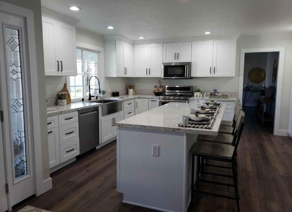
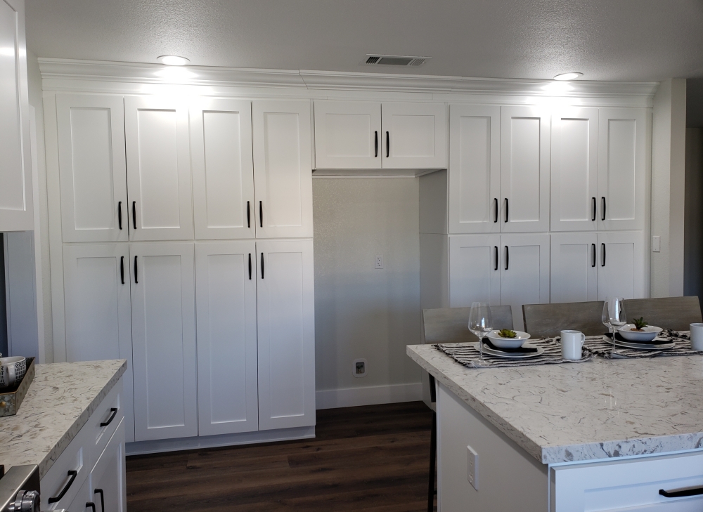
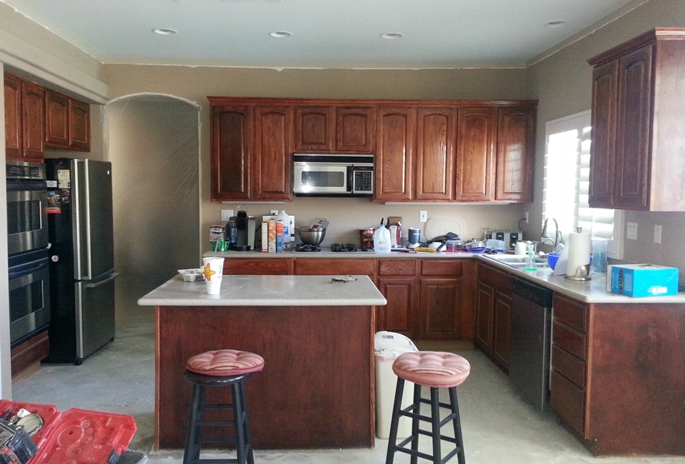
White Shaker cabinets with White Cloud quartz – The original breakfast bar peninsula and upper cabinets were removed to open the kitchen to the family room. The non-sitting prep island was turned 90 degrees, and a breakfast bar overhang was added. The wall oven and non-used desk were removed. The refrigerator was relocated to the back wall with pantries on either side for a symetrical storage wall.
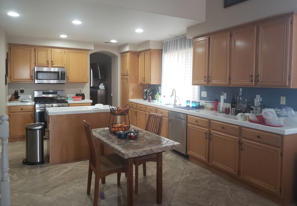
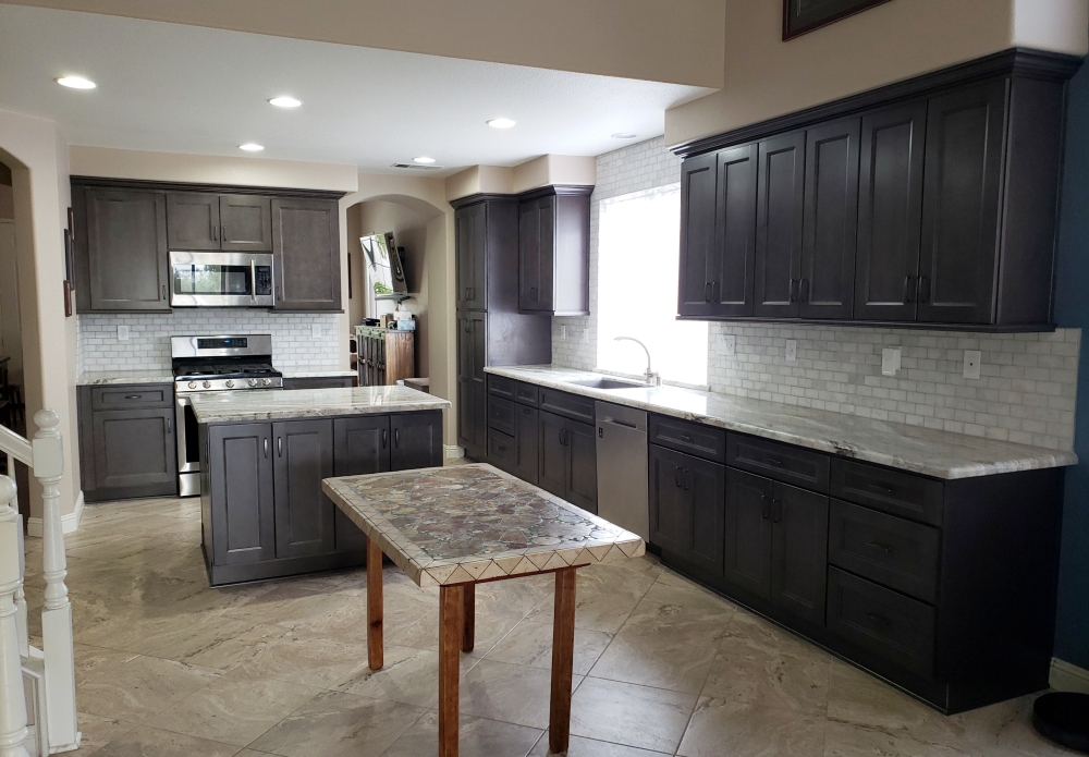
Shadow cabinets and Brown Fantasy dolomite – Although the floor was beautiful, the builder cabinets were ready to be replaced. The layout for the most part remained the same. The new dark gray cabinets pull out the darker elements out of the floor (instead of the lighter cabinets accenting the lighter elements). The pantry was widened for additional storage space. The island is now wider with additional cabinets opening on the back side. A marble backsplash was brought up around the window for a nice dramatic focal point. The unique color of the dolomite countertop adds beauty to this mostly neutral color scheme.
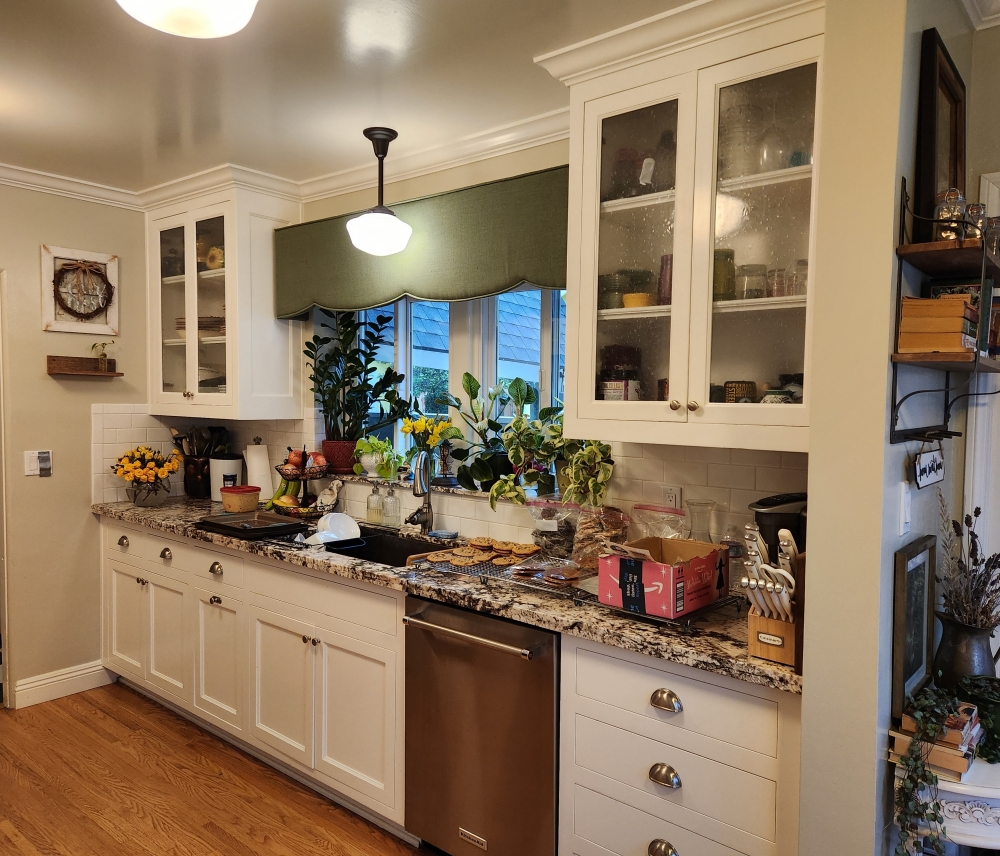
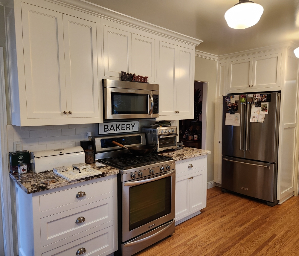
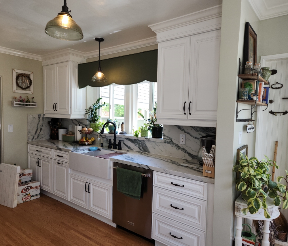
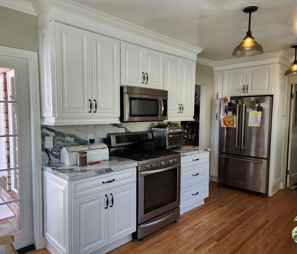
Alabaster cabinets and Royal Green quartz – Removing the Shaker style cabinets and replacing them with a more traditional style went better with the overall architectural style of the house. Although the kitchen footprint remained the same, small details were added which make a big impact. The sink was replaced with an apron front sink, the crown and under cabinet moldings are more prominant, and the white subway tile was replaced with a full splash matching the countertop.
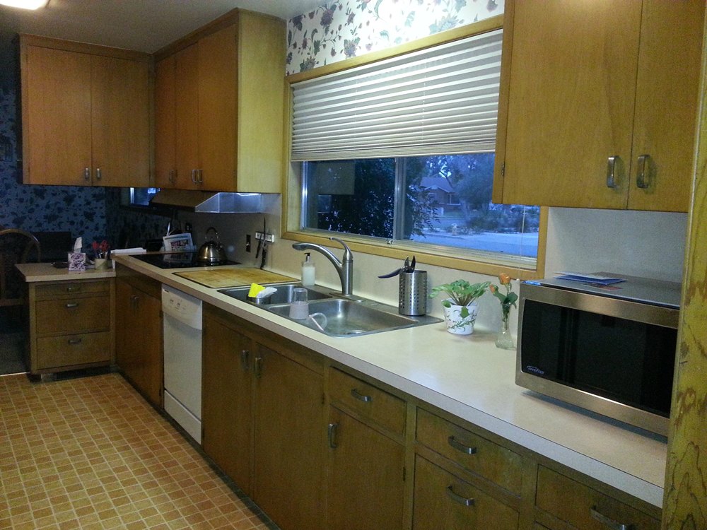
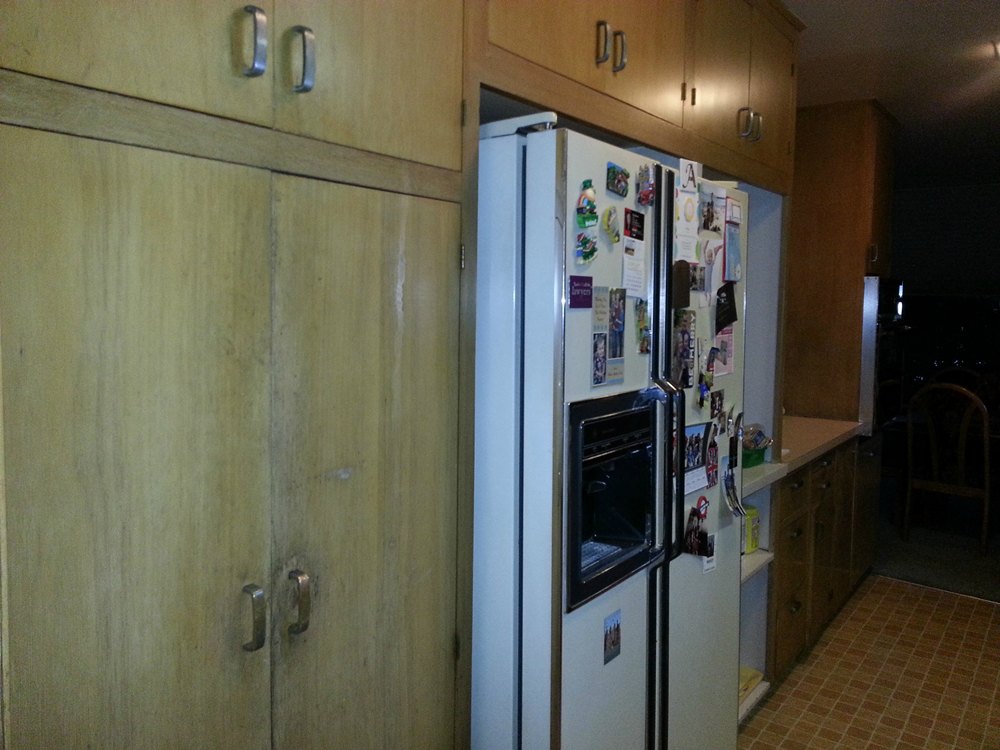
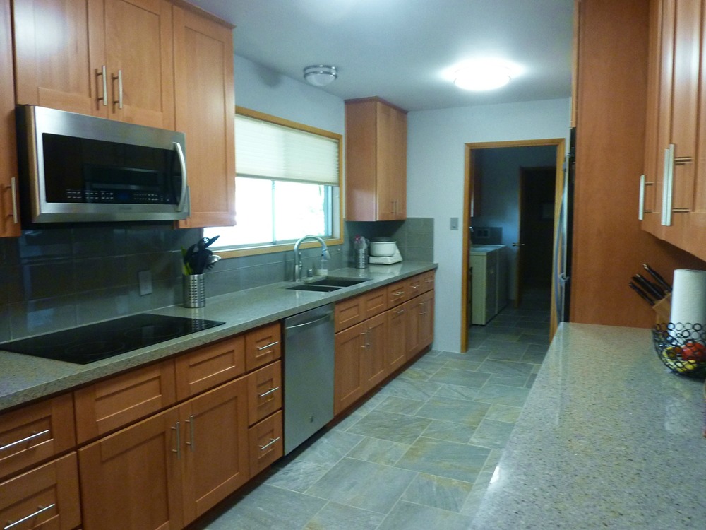
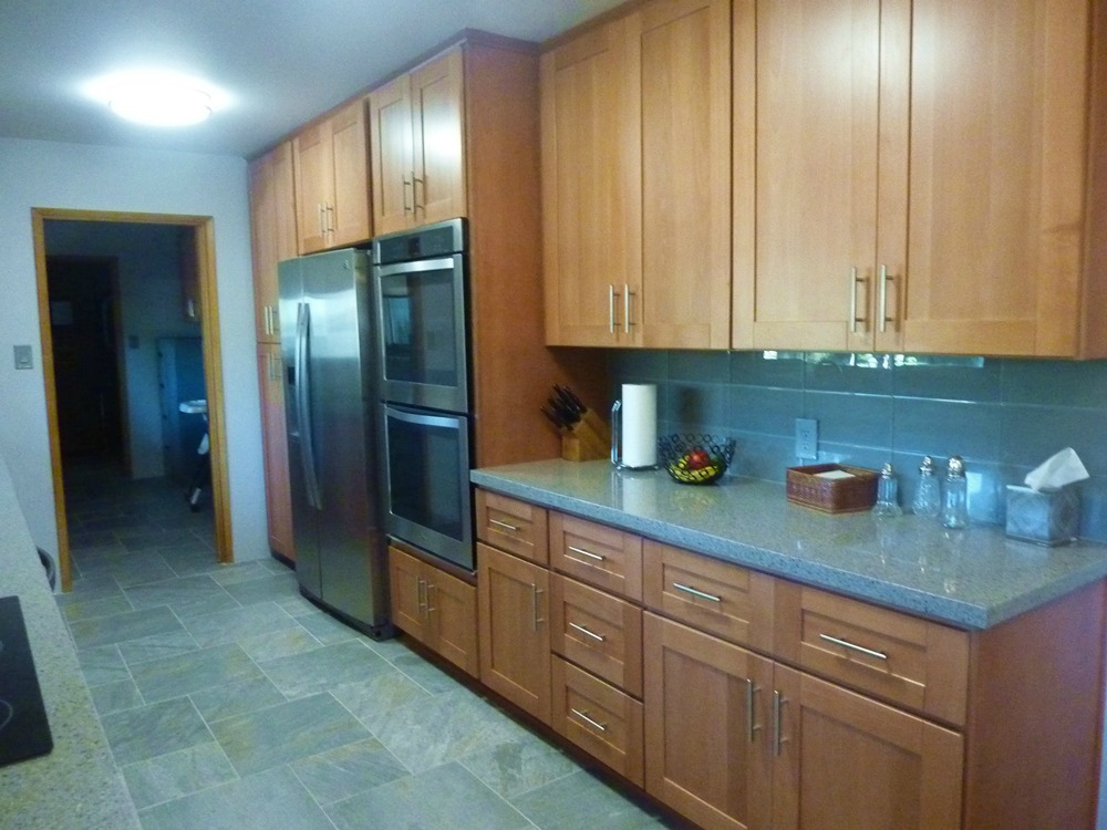
Light Beechwood Shaker cabinets and Saltoro Cliff quartz – Removing the tiny peninsula return cabinet resulted in a galley design. The cabinets were updated to a lighter color, and the door style adds some interest. The countertop is blue-gray with copper specks, and the floor tile is blue-gray with tan accents. The back splash tile is a solid blue glass (so as not to compete with pattern of the countertop). All of the elements work together without being overwhelming.
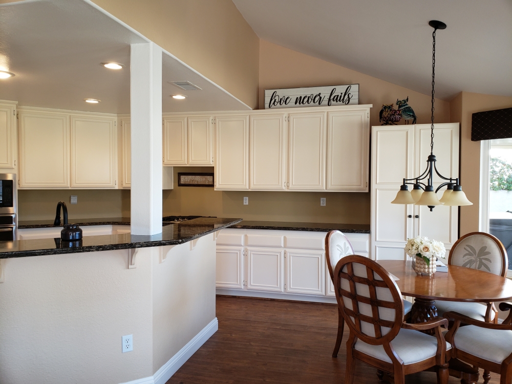
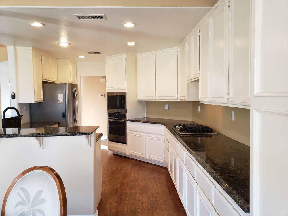
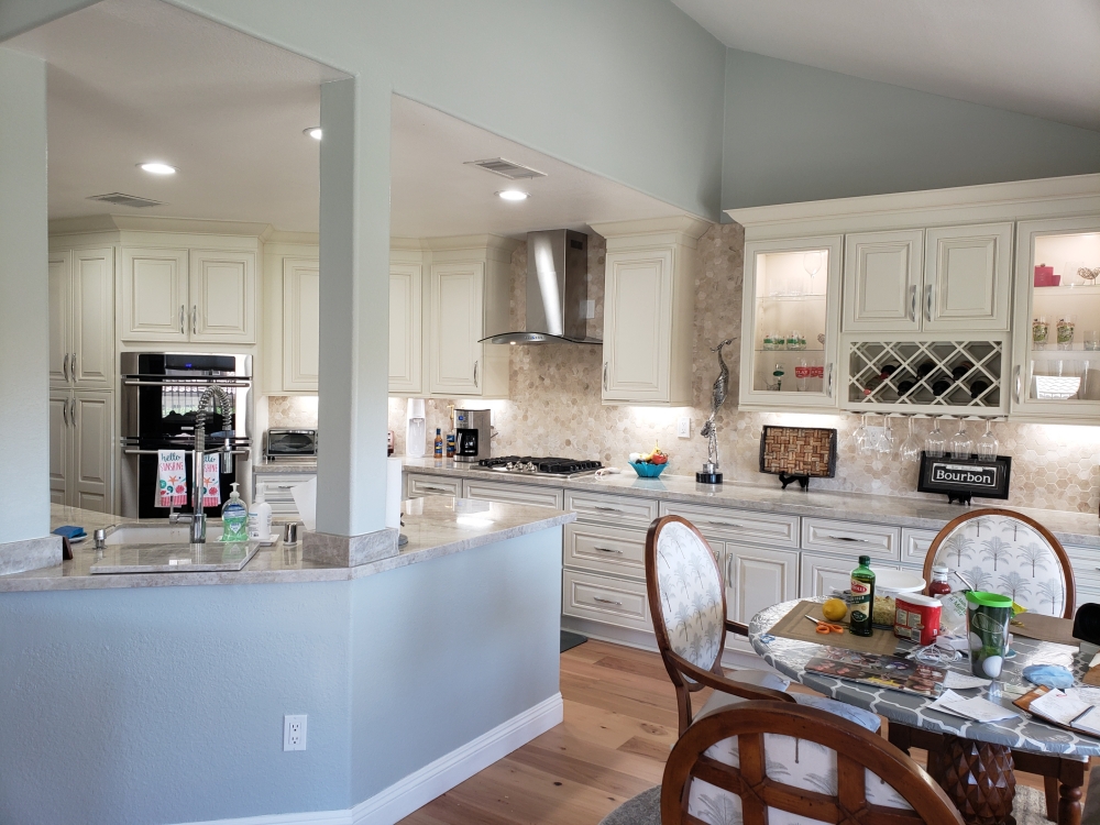
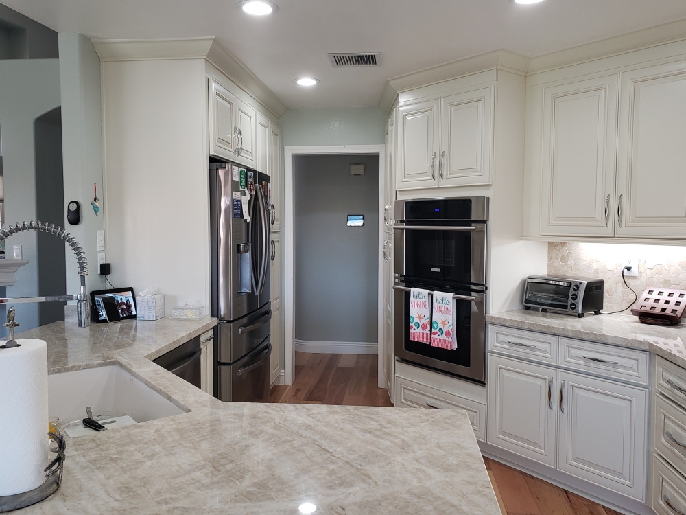
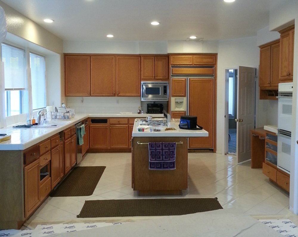
Moscato cabinets with Taj Mahal quartzite – The original maple Builder-grade cabinets had received a coat of white paint in the past, but they still retained their plain design and particleboard construction. The new owners decided that it was time for an upgrade. The original kitchen had a raised breakfast bar surrounding the sink, but any stools placed there interferred with the walkway and the breakfast area. The breakfast bar was removed and the wall lowered to create better sight lines. The original breakfst area pantry had once been a desk area, but the previous owners had placed a free-standing pantry in that spot. The new owners decided to create an entertaining space along that wall complete with display cabinets and a wine rack. Separating the wall cabinets reinforces that this section has a separate function. The new cabinets and quartzite countertop are actually a soft cream color, and the backsplash of mixed cream marble ties all the kitchen colors together very elegantly.
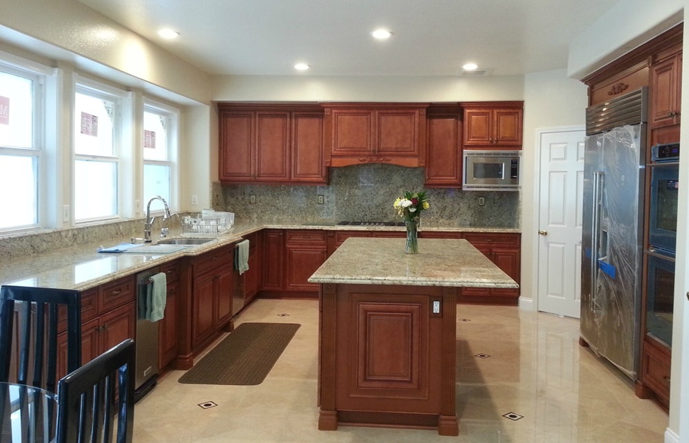
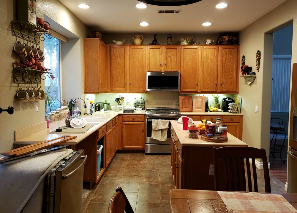
Portobello cabinets and Bianco Delicatus granite – The original builder installed kitchen was dated and lacked many of the upgraded standard features of today’s cabinets. The original lower blind base cabinets were replaced with lazy susan corner cabinets for easier access. A pull-out trash can cabinet and roll-out shelves add convenience. The freestanding range and hood were increased to 36 inches wide. The refrigerator was changed to a built-in to allow for more space around the island. The pantry was enlarged and designed to hold a built-in microwave since it is no longer over the stove. The crown molding, under cabinet lighting molding, darker cabinet color, and natural stone backsplash all add elegance to this remolded kitchen.
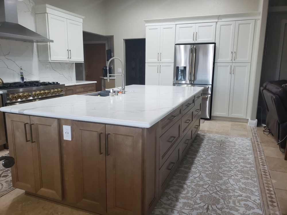
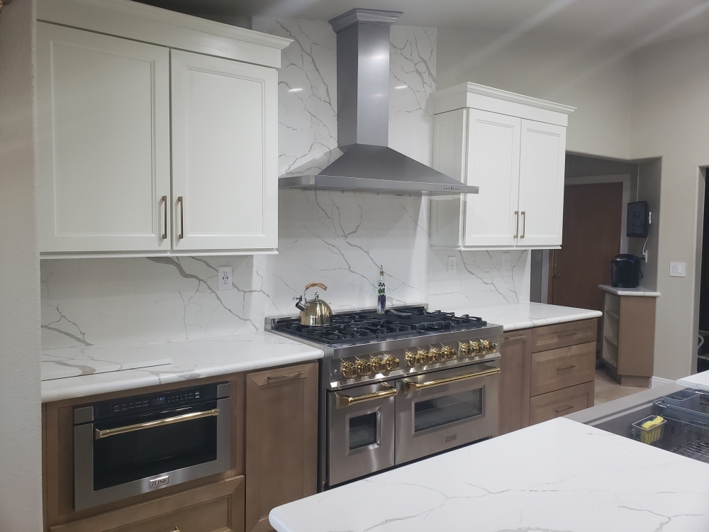
Marshmallow cabinets (top) and Latte cabinets (bottom) and Calacatas Dorada quartz – The original kitchen felt very enclosed due to the angled breakfast counter which restricted walking space from the adjacent family room. By removing most of the wall between the kitchen and family room, the spaces now feel like one large room. By replacing the “L” shaped sink peninsula with a large island, the owner was able to get lots of large drawer storage. The original double oven and over cooktop microwave has been replaced with a 48 inch wide professional range with a chimney hood above. The new quartz countertop runs along the entire backsplash area and up behind the chimney hood to the ceiling. The microwave is now located under the countertop. On either side of the new range are pull-outs holding spices and utensils. The original kitchen had an awkward corner pantry which was acessed through a narrow door (too small to step into and too deep to reach into). The new kitchen has matching pantries with roll-out shelf trays framing the refrigerator for a built-in look.
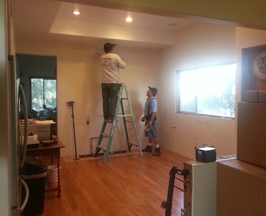
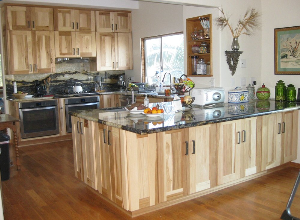
Hickory Shaker cabinets and Purple Dunes granite – The storage in this kitchen is increased by adding cabinets on the back side of the peninsula. A small prep sink was also added in the peninsula. Both ovens are placed under the countertop instead of stacked for additional countertop workspace. A granite backsplash makes cleaning easier, and the Purple Dunes pattern results in a wonderful focal point.
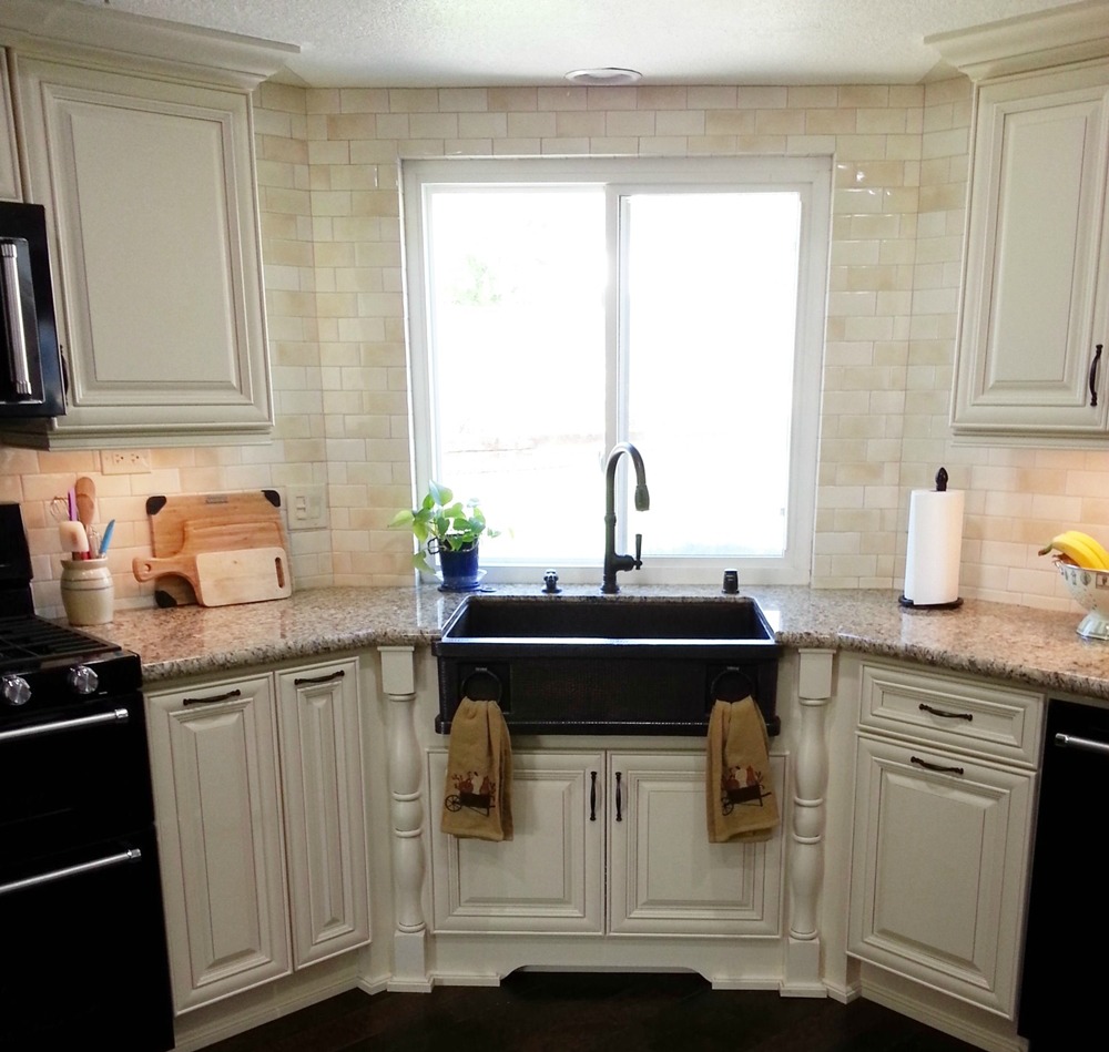
Riesling cabinets and New Venetian Gold granite – The cabinet style was changed from the builder’s oak to a traditional cream color. The angled corner sink area was highlighted with a copper apron sink, decorative posts, and a bottom valance. Lots of detailing interest was added through crown molding, under cabinet light molding, floor molding, split posts, and upgraded handles. The backsplash tile in multiple cream colors was installed up around the window for a seamless focal point.
Acorn Rope cabinets (perimeter) and Leather cabinets (island) with Copenhagen granite (perimeter) and Sedna granite (island) – Although the original kitchen was ample size, it still had its builder grade maple cabinets. The rest of the home had been upgraded beautifully over the years, and it was time to do the kitchen. The new sink and cooktop were designed with bumped-out decorative legs to give them more presence. The cooktop also has a pull-out spice rack and tray rack on either side. The cabinet above the hood was raised to the ceiling to draw the eye upwards. The microwave was placed below the countertop to allow for some glass door decorative space above. The island was completed in darker colors to add a focal point. Decorative legs, moldings, and onlays were added to dress up the cabinets. The “dog bone” shaped island countertop adds a unique touch.
Modern white cabinets and Fusion quartzite – This kitchen has a high ceiling, but the old cabinets did not take advantage of it. Running the cabinets up to the ceiling with solid doors would feel oppressive. By replacing the top doors with frosted glass, the kitchen feels lighter but still has additional storage space. The refrigerator was moved to the under used desk area. The cooktop and wall ovens were replaced by a range along the back wall. This allowed us to get rid of the large central hanging hood which visually opened the kitchen to the dining room. The lighter feel is further enhanced by breaking up the cabinets on the stove wall with a chimney hood. Cabinets on the back side of the island provide needed storage space for the adjacent dining room. A narrow wine rack (located behind the open base shelf) takes advantage of an odd wall jog.
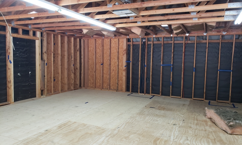
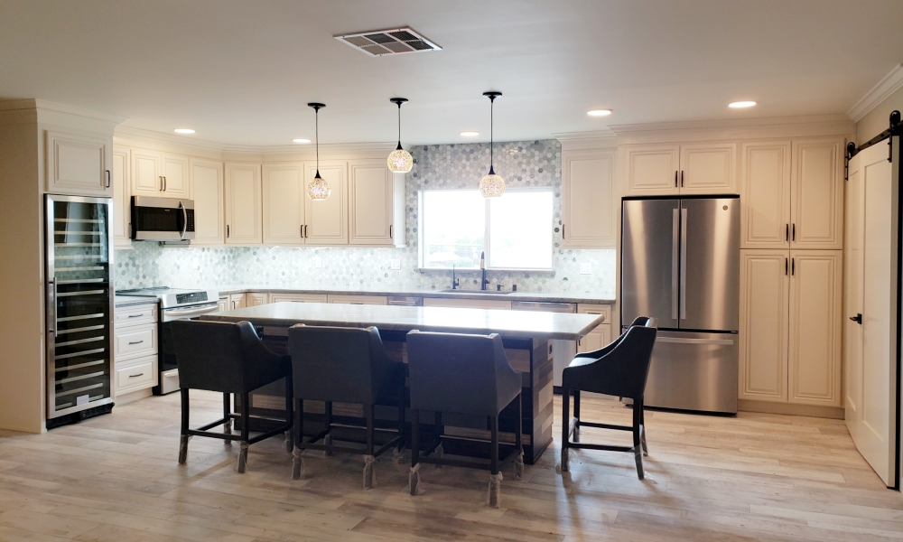
Linen cabinets and Leblon quartzite – What started out as a storage loft was converted into a two bedroom apartment. Adding a large window in the rear wall allows lots of natural light to enter the main space. A large island with an eating overhang on two sides, easily allows for four person seating and conversation. A large pantry allows for ample storage, and a tall wine cooler allows for great entertaining. The entire backsplash area (including around the window) was tiled in a multi-hued green and white marble hexagon pattern for a dash of fun. The large doors on the right conceal a washer and dryer.
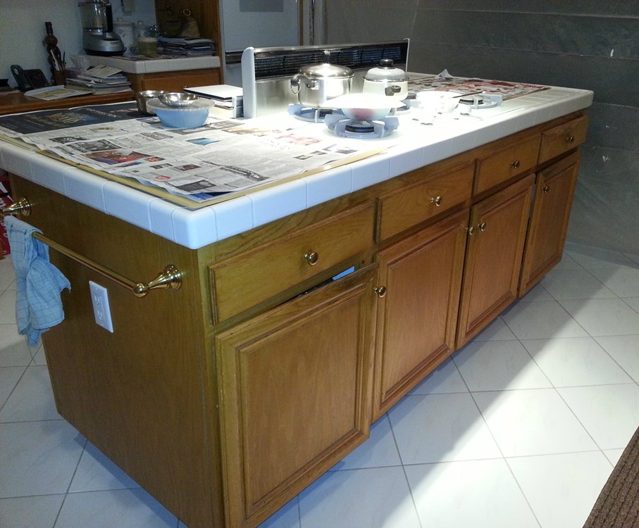
Copper Rope cabinets and New Tunas Green granite – Although we usually try to reduce costs for the homeowners by keeping the appliances in their original location; sometimes they must be moved to make the kitchen more functional. In this case, the cooktop was moved from the island to an exterior wall which allowed for better venting. The refrigerator was moved to an under used desk area which allowed for more countertop space around the new cooktop location. The island now is more functional instead of being broken up by the cooktop in the middle. A small vacuum unit was mounted in the toe kick area of the new island. The new kitchen was dressed up with lots of millwork details. The granite material of the countertop was also used on the stove wall for ease of cleaning and no grout lines.
Ivory cabinets and Pietra quartz – The rear wall of this home was removed to allow for an enlarged kitchen and a new family room adition. Since everyting was being gutted, the owners were free to design a layout that worked best for them. All of the appliances were relocated (except for the range due to venting issues in this two story house), and upgraded in size. Both the range and refrigerator were increased to 48 inches wide (still waiting on the backordered refrigerator in this photo). Pull-out spice racks flank the stove, and a pot filler is in the wall above. A second sink, a warming drawer, a pull-out trash can, and a drawer microwave are located in the large island. The darker color of the island pulls the darker accents from the floor. The large crown molding, under wall cabinet molding, decorative doors on the cabinet sides, and a raised panel cabinet door all add to the traditional feeling of this kitchen.
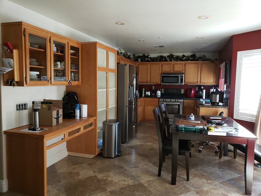
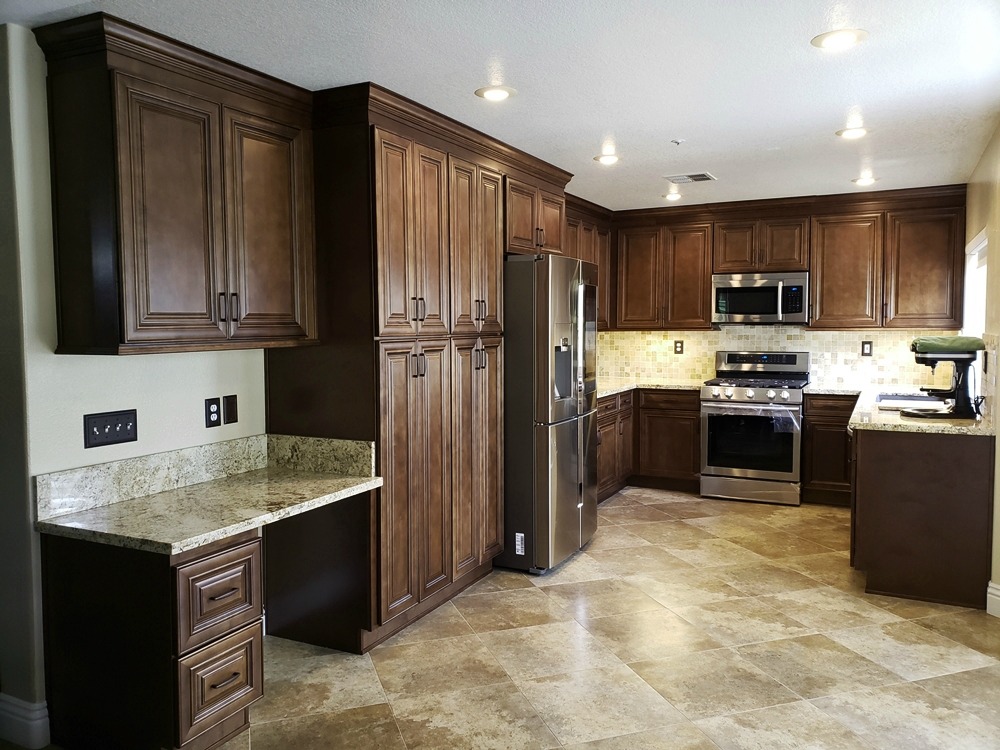
Portobello cabinets and Solarius granite – The new darker cabinets are richer looking with door detailing, stacked crown molding, light rail molding, and decorative handles. The pantry was enlarged to replace a portion of the oversized desk, and the cabinet over the refrigerator was made full depth for extra storage. The granite is a light golden color, and works beautifully with the travertine floor and backsplash.
Toffee cabinets and Spring Gold quartz – Sometimes small changes can make a big difference. In this case, the owners decided to keep their existing floor and a similar layout. The older color had gone well with the floor, and they wanted to stay with something similar. The new cabinets stay in the same warm medium brown tones while adding some raised center panel detailing. The layout was updated to include a lazy susan cabinet in the corner, a pull-out spice rack next to the stove, and wide pot drawers for the island. The island back and exposed ends have decorative molding. The crown molding, end molding, and under cabinet light molding have the same black accent highlights as the cabinet door style.
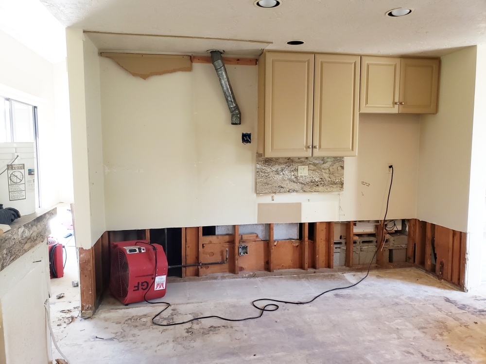
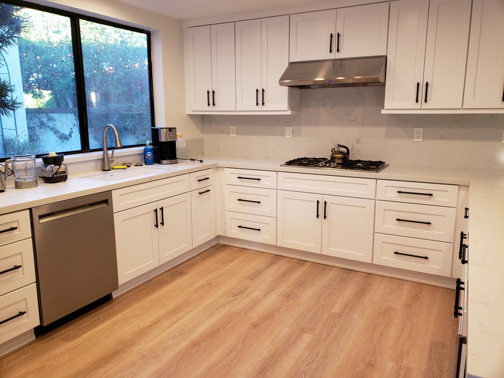
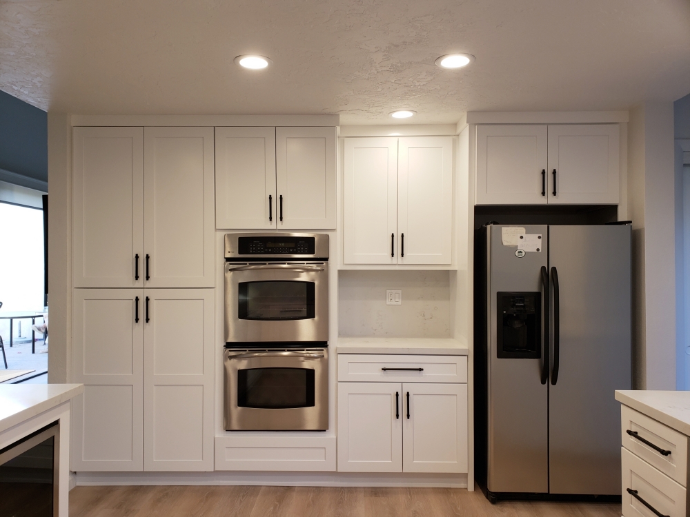
White Shaker cabinets with Carrera Marble quartz – It is never a plesant experience to have a flood, but it becomes a great time to get a new kitchen. Although the floorplan is similar to the original layout, the overall feel is much more modern. The original ivory traditional style cabinets have been replaced with a bright white Shaker style, and the multi-color granite has been replaced with a simple white and gray quartz. A molding was added both above and below the wall cabinets, and the knobs were swapped for long thin handles. These small details keep the kitchen from being sterile.
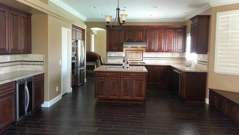
Walnut cabinets and Giallo Ornamental granite – Many small additions make this kitchen more functional. The old double wall ovens were replaced by one oven and a microwave. This gave more space over the cooktop for some decorative tile work. The old microwave was not vented, but by adding a large crown molding we were able to run duct work on top of the cabinets and out the side wall. Adding cabinets to the back side of the island doubles its storage capacity. Replacing an old desk with cabinets and a bar fridge creates a beverage center. A built-in window seat (on the lower right corner) replaces the old breakfast bar overhang for sitting and chatting with the cook.
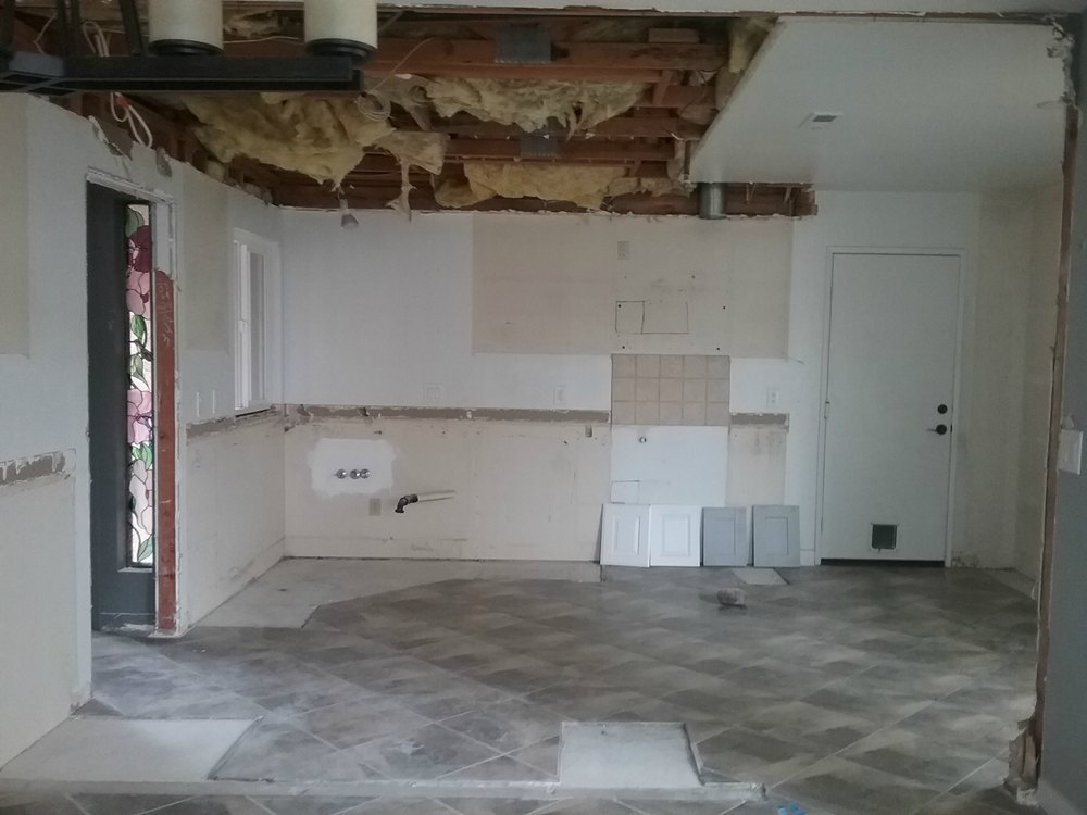
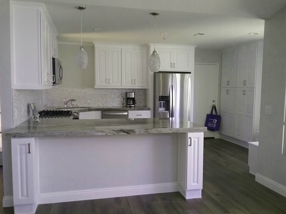
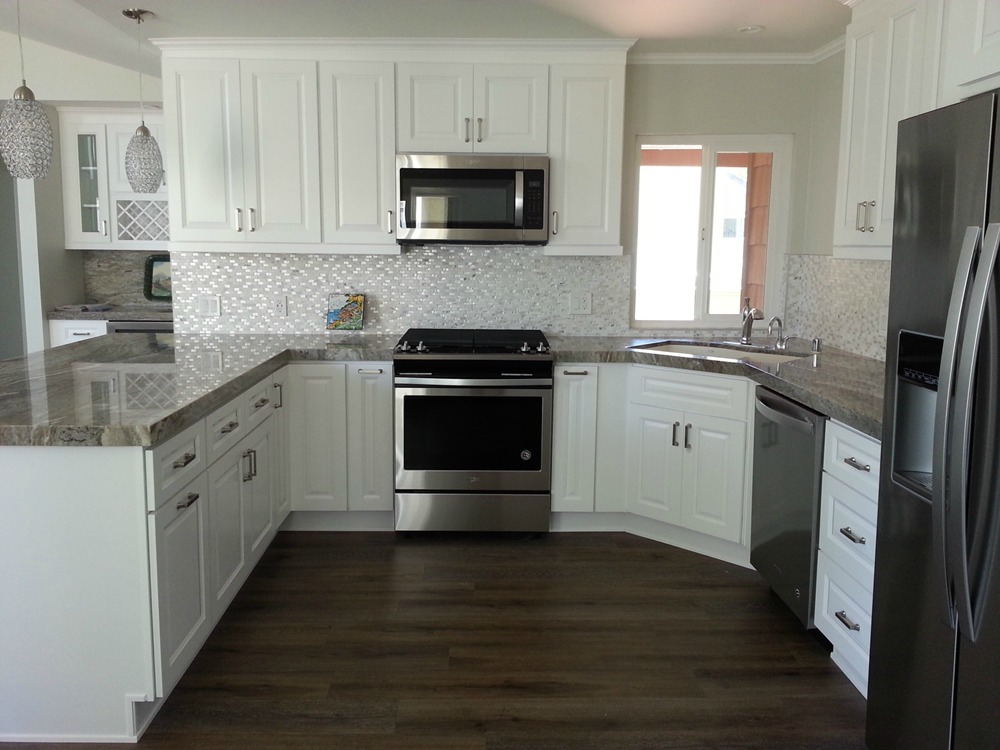
Snow Traditional cabinets and Mandala Supreme marble – The original kitchen had an additional full height wall (already removed in the before photo). There was only a narrow opening from the entry to the kitchen, and from the dining room to the kitchen. The full height wall was eliminated to allow for a breakfast bar. The breakfast bar legs are 9 inch wide cabinets to allow for quick storage cubbies for children toys. The new stove and microwave are located where the old entry opening had been. A bank of pantries by the garage door provide additional storage. In the lower right corner, you can see a peak of the corner storage bench (which is located under a window) to create a breakfast nook. In the bottom photo, you can see a portion of the beverage center which replaced an old coat closet.
© The Cabinet Lady 2021
Site built by The Social Garden
